Plotly 等值线图

本教程将讨论在 Python 中使用 Plotly 的 choropleth() 函数创建等值线图。
在 Python 中使用 Plotly 的 choropleth() 函数创建等值线图
等值线图是将数据表示为彩色多边形的地图。它用于绘制具有不同颜色的国家和州的地图。
我们可以使用 plotly.express 的 choropleth() 函数来创建等值线图。要创建绘图,我们必须在 choropleth() 函数内传递一个包含几何信息的 DataFrame 和一个我们想在地图上显示的特征列表。
例如,我们可以使用世界地图的内置数据来绘制一个像世界地图一样的简单地图,并突出显示美国德克萨斯州。请参阅下面的代码。
import plotly.express as px

fig = px.choropleth(locationmode="USA-states", locations=["TX"])
fig.show()
输出:
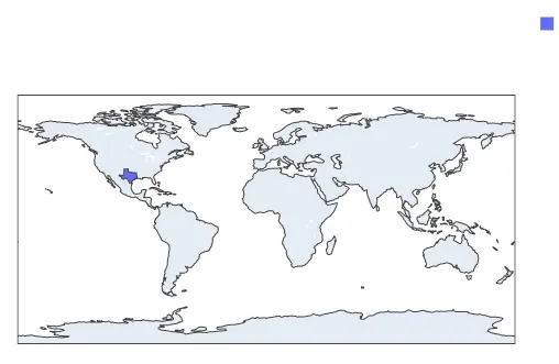
德克萨斯州在上图中以蓝色突出显示,但我们看不到它。我们可以使用 scope 参数显示像美国这样的部分,而不是显示整个地图。
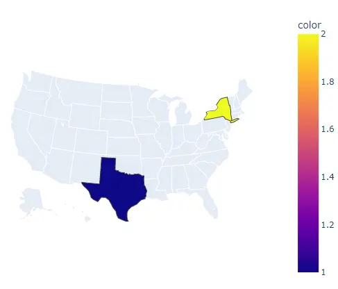
范围参数可以设置为世界、usa、europe、asia、africa、north 和 south america。例如,让我们只显示美国地图,突出显示两个州并使用 color 参数给它们不同的颜色。
请参阅下面的代码。
import plotly.express as px

fig = px.choropleth(
    locationmode="USA-states", locations=["TX", "NY"], scope="usa", color=[1, 2]
)
fig.show()
输出:
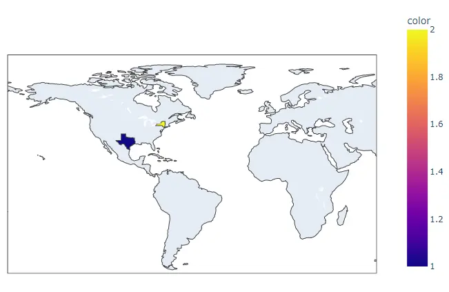
我们也可以使用中心点的经纬度来设置地图的中心。要设置地图的中心点,我们必须在 center 参数中传递纬度和经度。
例如,让我们将地图的中心点设置为德克萨斯。请参阅下面的代码。
import plotly.express as px

fig = px.choropleth(
    locationmode="USA-states",
    locations=["TX", "NY"],
    color=[1, 2],
    center=dict(lat=32, lon=-109.9),
)
fig.show()
输出:
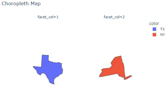
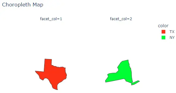
要将直方图转换为在每个子图中包含单个 bin 的一组子图,我们可以将 facet_row 用于行,将 facet_col 用于列,并将其值设置为用于设置名称的整数或字符串列表子图。
我们还可以使用 facet_row_spacing 和 facet_col_spacing 参数更改每个子图之间的间距,并将其值设置为从 0 到 1 的浮点数。我们可以使用 title 参数为直方图指定标题。
我们可以使用 width 和 height 参数设置绘图的宽度和高度。我们可以将 fitbounds 属性设置为 locations 以仅在地图上显示位置。
我们还可以使用 basemap_visible 参数隐藏基本地图并将其设置为 false。
例如,让我们更改上面提到的属性。请参阅下面的代码。
import plotly.express as px

fig = px.choropleth(
    locationmode="USA-states",
    locations=["TX", "NY"],
    color=["TX", "NY"],
    scope="usa",
    facet_col=[1, 2],
    title="Choropleth Map",
    fitbounds="locations",
    basemap_visible=False,
)
fig.show()
输出:
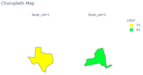
我们可以使用 color_discrete_sequence 参数更改默认颜色序列。我们可以将颜色序列设置为 Plotly 支持的颜色序列,如 Dark24 或 Light24。
例如,让我们更改上图的颜色顺序。请参阅下面的代码。
import plotly.express as px

fig = px.choropleth(
    locationmode="USA-states",
    locations=["TX", "NY"],
    color=["TX", "NY"],
    scope="usa",
    facet_col=[1, 2],
    title="Choropleth Map",
    fitbounds="locations",
    basemap_visible=False,
    color_discrete_sequence=px.colors.qualitative.Light24,
)
fig.show()
输出:
除了使用颜色序列,我们还可以使用 color_discrete_map 参数为每个位置赋予任何颜色。此参数用于覆盖默认颜色。
如果我们只改变几个位置,其余的将从颜色序列中分配。例如,让我们将第一个位置颜色更改为黄色。
请参阅下面的代码。
import plotly.express as px

fig = px.choropleth(
    locationmode="USA-states",
    locations=["TX", "NY"],
    color=["TX", "NY"],
    scope="usa",
    facet_col=[1, 2],
    title="Choropleth Map",
    fitbounds="locations",
    basemap_visible=False,
    color_discrete_sequence=px.colors.qualitative.Light24,
    color_discrete_map={"TX": "yellow"},
)
fig.show()
输出:
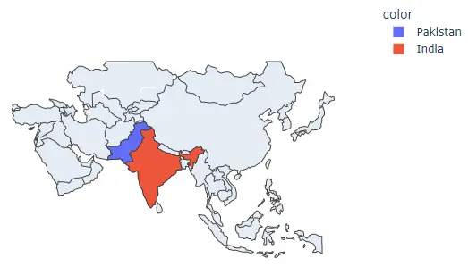
除了使用州作为位置,我们还可以通过将 locationmode 参数设置为国家名称并在 locations 参数中传递国家名称以在图中突出显示它来使用不同的国家名称。
例如,让我们重点介绍两个亚洲国家。请参阅下面的代码。
import plotly.express as px

fig = px.choropleth(
    locationmode="country names",
    locations=["Pakistan", "India"],
    color=["Pakistan", "India"],
    scope="asia",
)
fig.show()
输出:
我们还可以使用数据框来创建等值线图。
例如,让我们读取一个预先存储的 2007 年世界不同国家的预期寿命数据,如果可以创建等值线图的国家使用名称,使用预期寿命数字,我们可以为每个国家赋予不同的颜色。
请参阅下面的代码。
import plotly.express as px

df = px.data.gapminder().query("year==2007")
fig = px.choropleth(df, locations="iso_alpha", color="lifeExp", hover_name="country")
fig.show()
输出:

当我们将鼠标悬停在一个国家/地区时,hover_name 参数会显示国家名称。
