How to Create Choropleth Maps With Locationmode in Plotly
Data Science is a computer science branch that uses algorithms, processes, systems, mathematics, and scientific procedures to extract insights and knowledge from structured, unstructured, and noisy data and uses those learnings to solve business problems and craft learning-based solutions.
Python and R are two programming languages famous in the data science community because of the support and capabilities these languages offer.
Since data visualization is a key component of data science, Python offers a library, Plotly, that helps us create interactive charts and maps.
It supports various types of plots such as scatter plots, line charts, bar charts, pie charts, bubble charts, error bars, histograms, 2D histograms, heatmaps, candlesticks, Mapbox choropleth maps, clustergrams, etc.
In this article, we will talk about one of the plots that Plotly supports, namely, choropleth maps.
Choropleth Maps in Python
Plotly offers a method, choropleth(), that lets us create choropleth maps. This method has the following syntax.
plotly.express.choropleth(
    data_frame=None,
    lat=None,
    lon=None,
    locations=None,
    locationmode=None,
    geojson=None,
    color=None,
    scope=None,
    center=None,
    title=None,
    width=None,
    height=None,
)
The following Python code depicts how to use this method to plot a choropleth map.
import plotly.express as px

figure = px.choropleth(locationmode="USA-states", color=[2], scope="usa")
figure.show()
Output:
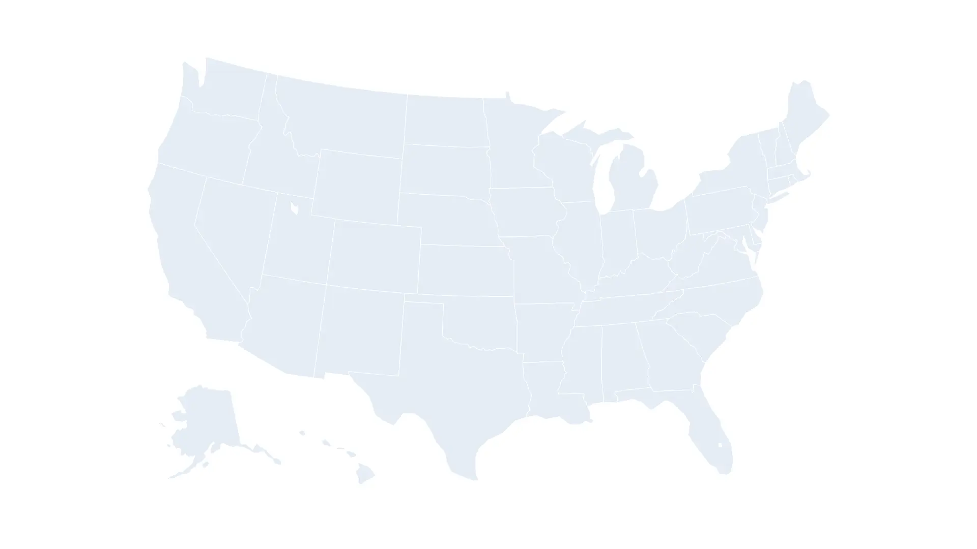
A new browser window will open on executing the code, displaying this interactive choropleth map. Upon hovering over the map, a few options appear in the top-right corner of the screen.
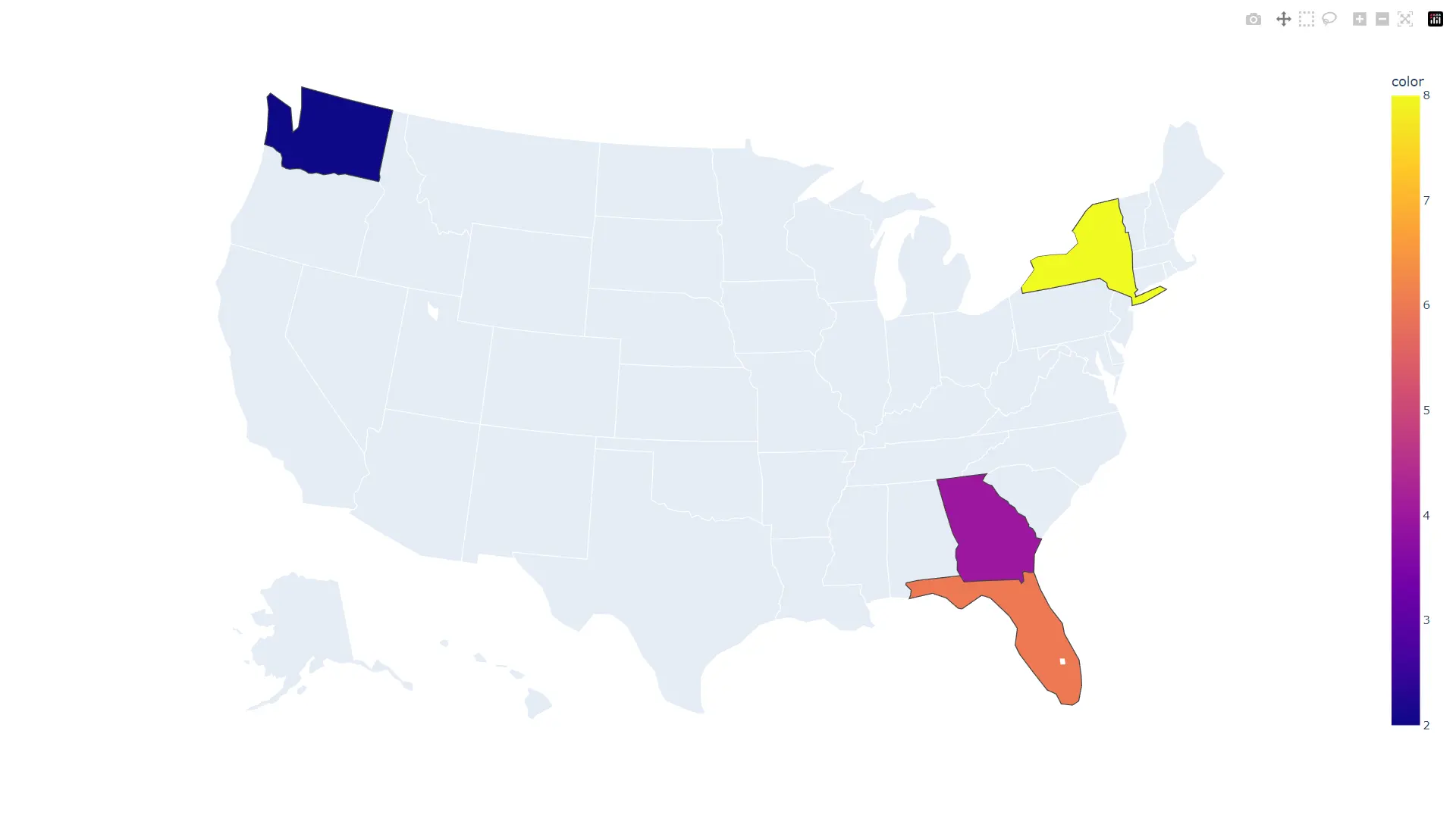
Highlight Areas on Choropleth Map
Areas on a choropleth map can be highlighted by specifying their names and color for each location. The following Python code depicts the same.
import plotly.express as px

figure = px.choropleth(
    locations=["WA", "GA", "FL", "NY"],
    locationmode="USA-states",
    color=[2, 4, 6, 8],
    scope="usa",
)
figure.show()
Output:
Plot Choropleth Maps Other Than USA
By default, Plotly only supports USA States. To plot other countries and their states, we need GeoJSON data for those countries and states.
GeoJSON is a format for representing geographical features. GeoJSON supports several types: Point, LineString, Polygon, MultiPoint, MultiLineString, and MultiPolygon.
Geometric objects and some additional details are known as Feature objects. A FeatureCollection is a set of Feature objects.
Let’s understand this further by plotting two choropleth maps.
Soybean Production in Brazil
To plot such a graph, we will need two databases; one for the shape or coordinates of Brazil and its states and another for soybean production. Once these two things are in place, we must ensure that we have a feature or column to map entries between the two tables.
Simply put, we need a way to know which data in the soybean database relates to which shape or coordinates data.
Once we have all this covered, we will use the choropleth() method to generate a choropleth map for the same. Refer to the following Python code for the implementation.
import json
import pandas as pd
import plotly as plt
import plotly.express as px
from urllib.request import urlopen

# Brazil coordinates / shape
with urlopen(
    "https://raw.githubusercontent.com/codeforamerica/click_that_hood/master/public/data/brazil-states.geojson"
) as response:
    brazil = json.load(response)

# Since the database doesn't have an ID or feature using which values will be mapped between the coordinate/shape database and soybean database, we are adding an ID ourselves.
for feature in brazil["features"]:
    feature["id"] = feature["properties"]["name"]

# Soybean database for states in Brazil
soybean = pd.read_csv(
    "https://raw.githubusercontent.com/nayanemaia/Dataset_Soja/main/soja%20sidra.csv"
)

figure = px.choropleth(
    soybean,  # soybean database
    locations="Estado",  # define the limits on the map/geography
    geojson=brazil,  # shape information
    color="Produção",  # defining the color of the scale via database
    hover_name="Estado",  # details to show on hover
    hover_data=["Longitude", "Latitude"],  # details to show on hover
    title="Soybean production in Brazil",  # title of the map
)
figure.update_geos(fitbounds="locations", visible=False)
figure.show()
Output:
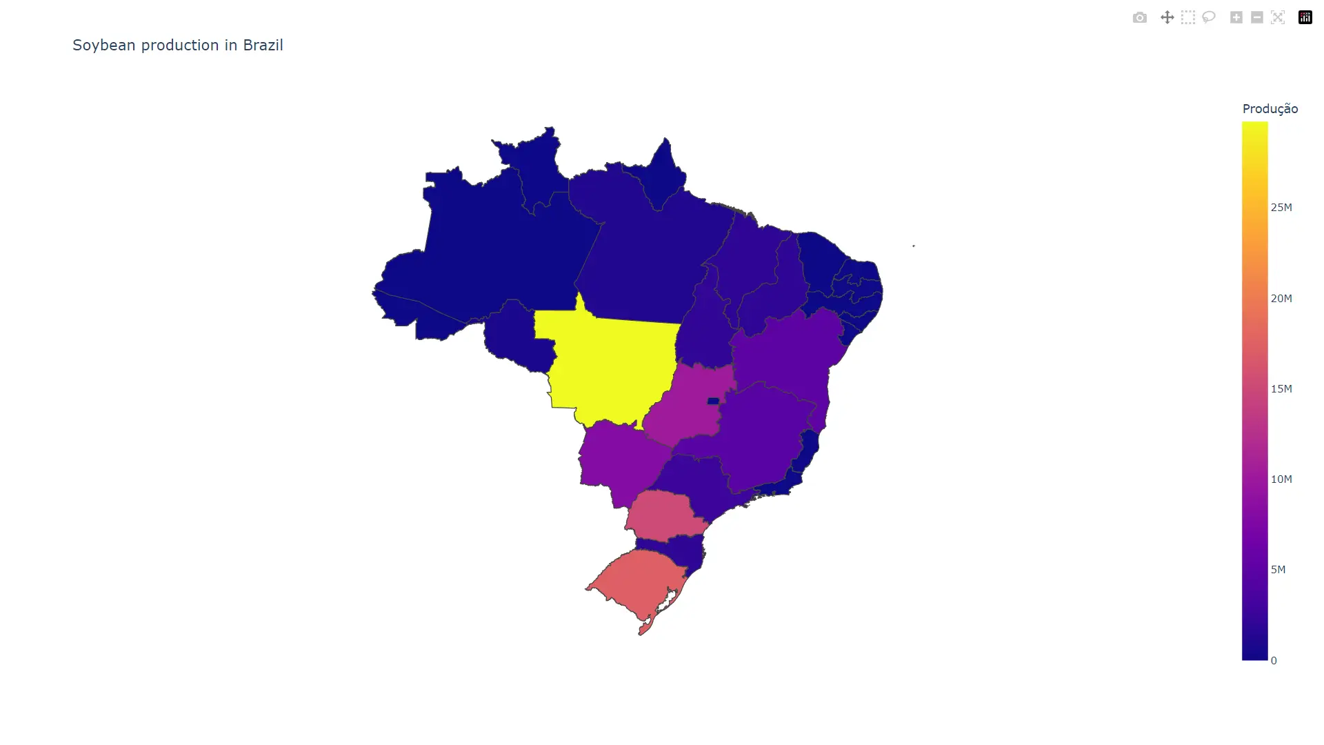
The hover_name and hover_data attributes can be used to specify what information should be displayed if a user hovers over individual parts of the map. fig.update_geos() trims everything around the main map (Brazil map), which we don’t intend to show.
Active COVID19 Cases in India
import pandas as pd
import plotly.express as px

cases = pd.read_csv(
    "https://gist.githubusercontent.com/jbrobst/56c13bbbf9d97d187fea01ca62ea5112/raw/e388c4cae20aa53cb5090210a42ebb9b765c0a36/active_cases_2020-07-17_0800.csv"
)
shape = "https://gist.githubusercontent.com/jbrobst/56c13bbbf9d97d187fea01ca62ea5112/raw/e388c4cae20aa53cb5090210a42ebb9b765c0a36/india_states.geojson"

figure = px.choropleth(
    cases,
    geojson=shape,
    # ID or feature to use for mapping values between the two databases
    featureidkey="properties.ST_NM",
    locations="state",
    color="active cases",  # a field in the COVID cases database used for the color
    color_continuous_scale="Blues",
)
figure.update_geos(fitbounds="locations", visible=False)
figure.show()
Output:
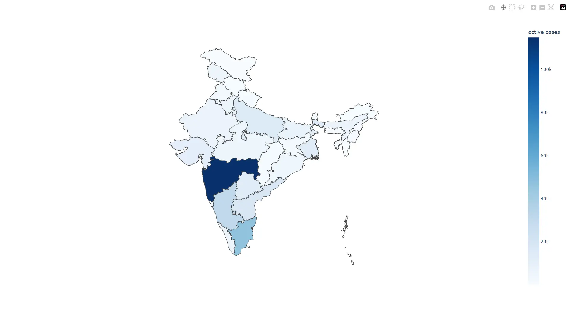
The cases and shape variables store COVID case data and the shape or coordinates of India and its states, respectively. The featureidkey is set to properties.ST_NM because every entry in the shape database has a state name (ST_NM) property inside the dictionary mapped to the properties key.

Vaibhav is an artificial intelligence and cloud computing stan. He likes to build end-to-end full-stack web and mobile applications. Besides computer science and technology, he loves playing cricket and badminton, going on bike rides, and doodling.