HOWTO · JavaScript
How to Close Modal in JavaScript
This article demonstrates you to close a modal with the help of JavaScript.
On this page
Bootstrap Modals are a customizable and responsive lightweight, multi-purpose JavaScript popup. A website can use it to display alert popups, videos, and photos.
This tutorial helps understand how to close a Bootstrap modal with the help of JavaScript.
Default Bootstrap Modal
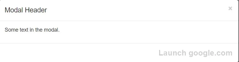
You can see the default Bootstrap modal below.
You’ll need to provide a link or a button to start the modal. The trigger element’s markup might look like below.
<button id="endmodal" class="btn btn-primary close" data-dismiss="modal">
  Launch google.com
</button>
You can use a data-dismiss property to notify Bootstrap to remove the element.
Bootstrap Modal Events in JavaScript
With a single line of JavaScript, you can call a modal with the id myModal.
Syntax:
$('#myModal').modal(options);
You may further tweak the Bootstrap modal’s default behavior by using various events triggered when the modal is opened and closed.
Syntax:
$('#myBtn').on('click', function() {
  $('#myModal').modal('show');
});
Here .modal('show') opens modal manually.
The modal is one of Bootstrap’s most useful plugins. It’s one of the easiest ways for a newbie designer to load material inside a popup screen without writing any JavaScript.
Example:
<!DOCTYPE html>
<html lang="en">
<head>
<title>Bootstrap Example</title>
<meta charset="utf-8">
<meta name="viewport" content="width=device-width, initial-scale=1">
<link rel="stylesheet" href="https://maxcdn.bootstrapcdn.com/bootstrap/3.3.7/css/bootstrap.min.css">
<script src="https://ajax.googleapis.com/ajax/libs/jquery/3.3.1/jquery.min.js"></script>
<script src="https://maxcdn.bootstrapcdn.com/bootstrap/3.3.7/js/bootstrap.min.js"></script>
</head>
<body>
<div class="container">
<h2>Activate Modal with JavaScript</h2>
<!-- Trigger the modal with a button -->
<button type="button" class="btn btn-info btn-lg" id="myBtn">Open Modal</button>
<!-- Modal -->
<div class="modal fade" id="myModal" role="dialog">
<div class="modal-dialog">
<!-- Modal content-->
<div class="modal-content">
<div class="modal-header">
<button type="button" class="close" data-dismiss="modal">×</button>
<h4 class="modal-title">Modal Header</h4>
</div>
<div class="modal-body">
<p>Some text in the modal.</p>
</div>
<div class="modal-footer">
<button id="closemodal" class="btn btn-primary close" data-dismiss="modal">Launch google.com</button>
</div>
</div>
</div>
</div>
</div>
<script>
$(document).ready(function () {
$('#myModal').modal('show');
$('#myBtn').on('click', function () {
$('#myModal').modal('show');
});
$("#closemodal").on('click', function () {
window.open("https://www.google.com", "_blank");
});
});
</script>
</body>
</html>
Output:
You will see a Bootstrap modal like below when you run the code.
After clicking on the button launch Google.com, it will open a new link like below.
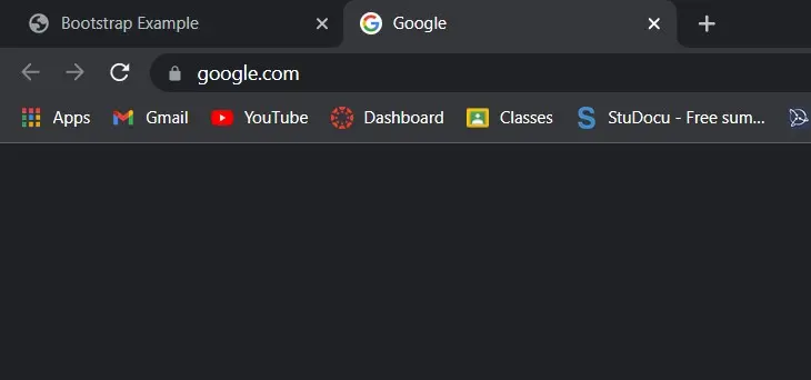
When you go back to the previous page, you will see the popup closed after clicking the link.