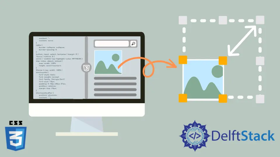
How to Resize Image in CSS
- Add an Image Using CSS
-
Resize Image With the Image
widthAttribute - How to Resize a Responsive Image Using CSS
- Testing the Responsiveness of the Resized Image
- Conclusion
Resizing images with CSS is crucial for optimizing web page performance and user experience. It ensures faster loading times by reducing file size, minimizing bandwidth usage, and maintaining a visually appealing layout.
Properly sized images also enhance responsiveness across various devices, promoting a seamless and professional appearance.
By employing CSS for image resizing, web developers can strike a balance between visual aesthetics and efficient webpage delivery, ultimately improving site speed and user satisfaction.
Add an Image Using CSS
Integrating images into your CSS allows for a more cohesive and integrated design strategy. Whether it’s a logo, background image, or an illustrative element, understanding how to add images in CSS is a fundamental skill for web developers.
Code Snippet to Add an Image:
.header {
  background-image: url('header-image.jpg');
  background-size: cover;
  color: white;
  padding: 50px;
}
The .header class uses background-image to set the background of the header to an image. The background-size: cover; property ensures that the image covers the entire header, and the padding adds space around the content.
Output:
 |
 |
|---|
The background image adds a layer of visual interest, and the overall design showcases the effectiveness of using images within CSS for a more engaging and dynamic web experience.
Resize Image With the Image width Attribute
By specifying the width of an image through the width attribute, we can strike a balance between visual appeal and optimal loading times. This method is particularly useful for responsive design, as it allows images to adapt to various screen sizes effortlessly.
Code Snippet Example Using Image width Attribute:
.img-resize {
  width: 100%; /* Set the width to 100% for responsiveness */
  max-width: 500px; /* Define a maximum width to maintain control */
  height: auto; /* Maintain the aspect ratio */
}
The width: 100%; CSS property allows the image to resize dynamically, adapting to the width of its container for responsiveness.
Adding max-width: 500px; prevents images from appearing disproportionately large on wider screens, maintaining an aesthetically pleasing design.
The accompanying height: auto; ensures that the image retains its original dimensions by automatically adjusting its height in proportion to the specified width attributes.
Output:
| Standard Browser Window Size | Small Browser Window Size |
|---|---|
 |
 |
The applied CSS will result in images resizing dynamically based on the width properties of their container, adapting seamlessly to different screen sizes.
How to Resize a Responsive Image Using CSS
With max-width and max-height Property
The CSS properties max-width and max-height play a pivotal role in achieving this balance, offering a way to resize images while maintaining control over their dimensions.
Code Example Using the max-width and max-height Property:
.img-resize {
  max-width: 100%;
  max-height: 300px;
  width: auto;
  height: auto;
}
The max-width: 100%; property ensures that the image dynamically scales to fit its container, maintaining responsiveness. Additionally, max-height: 300px; imposes an upper limit on the image’s height, preventing it from becoming excessively tall.
The subsequent width: auto; and height: auto; declarations preserve the original aspect ratio of the image.
By allowing both height and width properties to adjust automatically, the image adapts proportionally to changes in its container’s dimensions.
Output:
| Standard Browser Window Size | Small Browser Window Size |
|---|---|
 |
 |
The output of this code ensures that images, when assigned the .img-resize class, will gracefully adjust to varying screen sizes. The max-width property ensures the image doesn’t exceed its container’s width, while the max-height property prevents it from becoming too tall.
With object-fit Property
The challenge lies in handling images gracefully, especially when dealing with varying screen sizes. The object-fit property emerges as a versatile tool to address this challenge, allowing precise control over how images are displayed within their containers.
Code Example Using object-fit Property:
.resizable-img {
  width: 100%;
  height: 300px;
  object-fit: cover;
}
The width: 100%; property ensures that the image spans the full width of its container, adapting to different screen sizes.
height: 300px; sets a fixed height for the image, establishing a constraint while maintaining flexibility.
The star of the show: object-fit: cover;. This property dictates how the image should fit within its container.
The value cover instructs the browser to scale the image proportionally, cropping it if necessary to completely cover the container. This is particularly useful when the aspect ratio of the image doesn’t match that of the container.
Output:
| Standard Browser Window Size | Small Browser Window Size |
|---|---|
 |
 |
The output of this code is a responsive image that spans the full width of its container, has a fixed height of 300 pixels, and is intelligently scaled and cropped to cover the container. The object-fit property empowers us to create visually compelling layouts without compromising the integrity of the images, offering an effective solution for responsive image resizing in CSS.
With background-size Property
Images are integral to the visual appeal of web pages, and ensuring their adaptability to different screen sizes is a cornerstone of responsive web design. The background-size property in CSS provides a versatile approach to control the size of images, offering a solution for dynamically resizing images while maintaining their aspect ratios.
The background-size property proves instrumental in this context, allowing precise control over the size of images.
background-size Property Values
Here are the values for the background-size property in a tabular format:
| Value | Description |
|---|---|
auto |
Default value; the image is displayed in its original size. |
cover |
Scales the image to cover the entire container, maintaining aspect ratio and potentially cropping. |
contain |
Scales the image to fit within the container, maintaining aspect ratio and avoiding cropping. |
length |
Specifies the width and height of the background image using a length value, such as pixels or percentages. |
percentage |
Specifies the width and height of the background image as a percentage of the container. |
initial |
Sets the background-size property to its default value. |
inherit |
Inherits the background-size property from its parent element. |
These values allow developers to control how background images are displayed and sized within their containers, providing flexibility for responsive web design.
Code Example Using background-size Property
.container {
  width: 100%;
  height: 300px;
  background-image: url('your-image.jpg');
  background-size: cover;
}
The width: 100%; property ensures that the container spans the full width of its parent element, facilitating responsiveness.
Simultaneously, height: 300px; sets a fixed height for the container, providing a controlled space for the image.
The magic happens with the background-image: url('your-image.jpg'); property, which specifies the path to the image we want to use as a background.
Now, the star of the show: background-size: cover;. This property instructs the browser to scale the image proportionally to cover the entire container, ensuring it fills the available space without distortion.
Output:
Standard Browser Window Size (cover):

Small Browser Window Size (cover):

Standard Browser Window Size (auto):

Small Browser Window Size (auto):

Standard Browser Window Size (contain):

Small Browser Window Size (contain):

The output of this code is a responsive container with a background image that dynamically adjusts its size to cover the entire container. The background-size property ensures that the image scales proportionally, providing an effective solution for responsive image resizing in CSS.
This technique is particularly useful when dealing with background images that need to fill a designated space while maintaining their aspect ratios.
Testing the Responsiveness of the Resized Image
Testing the responsiveness of resized images is crucial for ensuring a seamless and user-friendly experience across diverse devices. As users access websites on various screen sizes, from large desktop monitors to small mobile screens, images must adapt appropriately.
Testing helps identify potential issues such as distortion, cropping, or visual inconsistencies. Regular testing guarantees that resized images maintain their integrity, providing a consistent and visually appealing presentation on every device.
Conclusion
These CSS methods offer powerful tools for creating seamless and visually appealing web designs.
Whether integrating logos with flexbox, strategically using background properties, optimizing image widths for performance, or employing object-fit and background-size, developers can enhance user experiences across various devices.
These techniques empower customization, efficiency, and responsiveness, ultimately contributing to the overall success of web applications and sites.

Sushant is a software engineering student and a tech enthusiast. He finds joy in writing blogs on programming and imparting his knowledge to the community.
LinkedIn