How to Resize an Image While Keeping the Aspect Ratio Using CSS
- Apply Styling to Webpages Using CSS
- Set the Image Aspect Ratio Using CSS
- Resize an Image While Keeping the Same Aspect Ratio Using CSS

This trivial guide is about setting an image in your website such that its aspect ratio is not disturbed according to the image size and the container needed to fit. First, we will look at the CSS styling to understand this.
Apply Styling to Webpages Using CSS
CSS stands for Cascading Style Sheet. Cascading means that until and unless you specify different styles for the child elements, the styles applied to any parent element will automatically be inherited by any child elements.
There are several ways to incorporate CSS into your website:
- Inline CSS: Using the
styleattribute with any HTML element and applying any style properties specifically to that element is known as inline CSS. - Internal Style Sheet: If you want to apply styling to just one page of your website, use internal CSS. Therefore, include the style properties on that page enclosed in the
<style>tag inside the<head>part of the HTML page. - External Style Sheet: All website pages can have styling applied to them using external CSS. As a result, you create a style sheet containing various selector types and style properties and include it on all your website’s web pages.
There are numerous properties associated with images in CSS. These properties adjust the image sizes, colors, position, etc., on your website.
When we put images on our website in some container like any div element, its size depends on the image size. This sometimes creates problems, as some images are bigger and some are smaller; for setting up such images, we set up their aspect ratio.
Set the Image Aspect Ratio Using CSS
The proportion between an element’s width and height is referred to as its aspect ratio. The universal video format is 4:3, and two common video aspect ratios are 16:9 and 3:2 (universal for HD television and digital television and default for YouTube videos).
The syntax to set the aspect ratio is as follows:
aspect-ratio: auto || <ratio>;
Either set it to its default value, i.e., auto, or give some width:height ratio. The following are the possible values with their meaning:
| Aspect Ratio | Description |
|---|---|
aspect-ratio: auto; |
This is the default value. |
aspect-ratio: 1 / 1; |
The width and height have an equal proportion. |
aspect-ratio: 2 / 1; |
The image’s width is double its height. |
aspect-ratio: 1 / 2; |
The image’s width is half its height. |
aspect-ratio: 16 / 9; |
This is the commonly used ratio for videos. |
aspect-ratio: 0.5; |
The ratio can also be specified using float value. |
aspect-ratio: inherit; |
It inherits the aspect ratio of its parent element. |
aspect-ratio: initial; |
This equals the default value, auto. |
aspect-ratio: unset; |
It removes all the aspect ratios from the element. |
Consider an example in which we will place an image and set its aspect ratio:
<html>
<head>
   <style>
       .images{
            aspect-ratio: auto;
            width: 400px;
        }
    </style>
</head>
<body>
    <h2>Aspect Ratio auto </h2>
    <img src="/img/DelftStack/logo.png" class = "images"/>

</body>
</html>
In this code segment, we have placed an image and assigned it a class selector, images. This class is a CSS class in which we have set the aspect ratio to auto and specified its width to be 400px.
For the auto value, height will be adjusted automatically according to the size of the image.
Now, we will change the aspect ratio like this:
.images{
    aspect-ratio: 2 / 1;
    width: 400px;
}
<h2>Aspect Ratio auto </h2>
<img src="/img/DelftStack/logo.png" class = "images"/>
The output will be like this:
In this output screen, you can see that the height of the image is half its width. Now we will use the ratio 1 / 2 so that the height is double that width.
.images{
    aspect-ratio: 1 / 2;
    width: 400px;
}
<h2>Aspect Ratio auto </h2>
<img src="/img/DelftStack/logo.png" class = "images"/>
Resize an Image While Keeping the Same Aspect Ratio Using CSS
We can resize an image while keeping the aspect ratio the same using CSS. For example, consider the following image of size 428x428px:
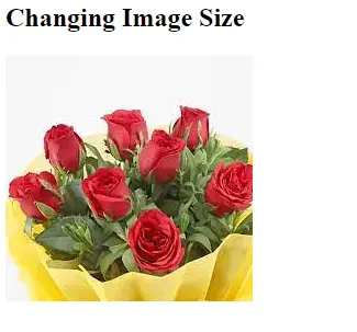
We can resize the above image using CSS with keeping its aspect ratio. Consider the following example:
.images {
            display: block;
            max-width:250px;
            max-height:90px;
}
<h2>Aspect Ratio auto </h2>
<img src="/img/DelftStack/logo.png" class = "images"/>
We use the CSS class selector images in this code segment. This class resizes the image with a size of 250x90px without changing its aspect ratio.
By this method, we can set the aspect ratio according to the needs and requirements of our webpage.
We can also change the image with the same aspect ratio. This is mainly done to make the website responsive to all display sizes.