How to Change the Color of SVG Element in HTML Using CSS
This trivial guide is about using SVG in HTML documents and how we can customize it to change its color using CSS properties. To start with, we will briefly introduce SVG in HTML.
Introduction to SVG
Similar to XHTML, SVG is an XML language that can be used to create vector graphics like the one below. It can be used to make an image by drawing all the necessary lines and shapes, editing pre-existing raster images, or doing both at once.
The image and its elements can be altered entirely by filtering, compositing, or other techniques.
After several competing formats were submitted to the W3C but were not fully ratified, SVG was created in 1999. All popular browsers support SVG.
The slow loading of SVG is a drawback. SVG has advantages, including the availability of a DOM interface and the lack of the need for third-party extensions.
Advantages of Using SVG
- Any text editor can be used to create and edit SVG images.
- SVG images can be scripted, compressed, indexed, and searched.
- Images in SVG can be scaled.
- Any resolution can produce high-quality prints of SVG images.
- SVG images can be zoomed in.
- They maintain all of their quality if SVG graphics are zoomed in or out.
- SVG files are pure XML and are an open standard.
Methods of SVG
SVG serves as a container to hold different graphics. So, it provides various methods or tags to create pictures by yourself on an HTML document. This article will discuss some of the elements and their different options available.
Draw Circle Using SVG
Use the <circle> tag to draw a simple circle in SVG. It has different attributes that are used to set the properties of the circle.
As our first example, we will start with drawing a circle using SVG in HTML. The following HTML code draws a circle in SVG.
<!DOCTYPE html>
<html>
<body>

<h1>First SVG Demo</h1>

<svg width="150" height="150">
   <circle cx="60" cy="60" r="50" stroke="red" stroke-width="5" fill="yellow" />
   Sorry, SVG is not supported for your browser.
</svg>
</body>
</html>
The code is rendered as follows.
- The
<svg>element introduces an SVG image. - The
<svg>element’s width and height attributes specify the dimensions of the SVG image. - A circle can be drawn using the
<circle>element. - The x and y coordinates of the circle’s center are specified by the
cxandcyattributes. - The circle’s center is set to (0,0) if
cxandcyare not set. - The r attribute specifies the circle’s radius.
- The appearance of a shape’s outline is controlled by its
strokeandstroke-widthattributes. We made the circle’s outline have a5 pxred “border”. - The
fillattribute refers to the circle’s interior color. - At the end, closing the
</svg>tag closes the SVG image.
If the browser does not support SVG, the message will be displayed “Sorry, SVG is not supported in your browser”.
Draw Rectangle Using SVG
The <rect> element in SVG is used to draw a rectangle shape. Similar to the <circle> element, it has multiple attributes that can be used to set the properties of the rectangle.
The following code segment draws a rectangle using SVG.
<!DOCTYPE html>
<html>
<body>

<h1>SVG Rectangle</h1>

<svg width="200" height="200">
   <rect width="200" height="100" style="fill:red;stroke-width:5;stroke:black" />
   Sorry, SVG is not supported for your browser.
</svg>
</body>
</html>
- The width and height of the rectangle are determined by the
widthandheightattributes of the elementrect. - The style attribute defines the rectangle’s CSS properties.
- The CSS fill property determines the rectangle’s fill color.
- The CSS stroke-width property determines the width of the rectangle’s border.
- The CSS
strokeproperty specifies the rectangle’s border color.
SVG <image> Tag
Images contained in SVG documents are represented by the <image> SVG element. It can show SVG files or raster image files.
JPEG, PNG, and other SVG files are the only image formats that SVG software needs to support. The behavior of animated GIFs is undefined.
The following are the certain attributes for the <image> tag need to be set.
x: Defines the horizontal position of the image from the origin.y: Defines the vertical position of the image from the origin.width: The size at which the image is rendered. This attribute is necessary, unlike the<img>tag in HTML.height: The image’s rendered height. This attribute is necessary, unlike the<img>tag in HTML.xlinkandhref: Defines the URL of the image file.preserveAspectRatio: Manages the scaling of the image.
The following code snippet displays an SVG file using the image tag in SVG.
<!DOCTYPE html>
<html>
<body>

<svg width="96" height="96">
  <image xlink:href="/img/DelftStack/logo.svg" width="96" height="96" />
</svg>
</body>
</html>
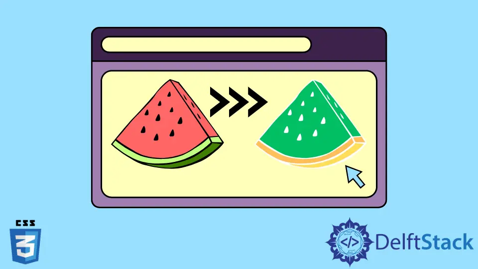
Change the Color of the SVG Image Using CSS
If you need to change the color of your SVG image, we can use the CSS filter property to apply different filters to a photo and change its hue and colors. The filter CSS property gives an element visual effects like blur or color shift.
It is a common practice to use filters to change how borders, backgrounds, and images are rendered.
For example, if we need to change the color of the image in the previous example, then we can use the following filter property.
.filter-green{
        filter: invert(58%) sepia(69%) saturate(1276%) hue-rotate(76deg) brightness(110%) contrast(109%);
    }
<!DOCTYPE html>
<html>
<body>

<svg class="filter-green" width="96" height="96">
  <image xlink:href="/img/DelftStack/logo.svg" width="96" height="96" />
</svg>
</body>
</html>
This will create an overlay effect on the image and change its color. In the above CSS code, we have applied the following filters to the image.
invert: This inverts the color of the image. Starting from 0% to 100%, where 100% will make the image completely inverted.sepia: This adds a vintage effect to the image, eventually changing its color to a metallic side.saturate: This sets the color intensity in the image. A higher value means more intense and sharp colors of the image.hue-rotate: This is to change the hue rotation of the image around the color circle of the image.brightness: This sets the brightness of the image. A value of 0 means wholly dark, and 100% indicates the original brightness of the image. A value greater than 100 will make it more bright.contrast: This sets the contrast of the image. A value of 0 means wholly dark, 100% indicates the original contrast of the image, and a value greater than 100 will make it more contrasting.