Plotly 箱型图

本教程将讨论使用 Plotly 的 box() 函数创建箱型图。
Plotly 箱型图
Plotly 中的箱型图表示变量通过其四分位数的分布。盒子的末端描述了下四分位数和上四分位数,而盒子内的一条线表示中位数或第二个四分位数。
我们可以使用 Plotly 的 box() 函数来创建给定数据的箱型图。我们必须在 box() 函数中提供数据框或值和标签来创建箱型图。
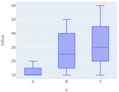
下面的代码创建了一些随机数据的箱型图。
import plotly.express as px

labels = ["A", "B", "C"]
value = [[10, 50, 30], [20, 30, 60], [10, 20, 30], [10, 10, 10]]
fig = px.box(x=labels, y=value, width=500, height=400)
fig.show()
输出:
width 和 height 参数用于设置图形的宽度和高度(以像素为单位)。我们可以使用 color 参数为每个单元格指定默认颜色,并将其值设置为标签。
我们可以使用 orientation 参数和字符串 h 设置盒子的方向,使用字符串 h 表示水平方向,使用 v 表示垂直方向。我们可以使用 x_axis 的 log_x 和 y 轴的 log_y 将轴设置为对数比例,并将其值设置为 true。
我们可以使用 notched 参数将盒子的形状设置为缺口,并将其值设置为 true。我们可以使用 title 参数给图一个标题。
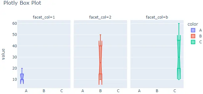
我们可以使用 facet_col 和 facet_row 创建具有单独单元格的子图,并将它们的值设置为整数或字符串列表以设置子图的标题。我们可以使用 facet_col_spacing 设置列间距和 facet_row_spacing 设置两个子图之间的距离作为行间距。
下面的代码更改了上面提到的参数。
import plotly.express as px

labels = ["A", "B", "C"]
value = [[10, 50, 30], [20, 30, 60], [10, 20, 30], [10, 10, 10]]
fig = px.box(
    x=labels,
    y=value,
    width=700,
    height=400,
    color=labels,
    notched=True,
    title="Plotly Box Plot",
    facet_col=[1, 2, "b"],
)
fig.show()
输出:
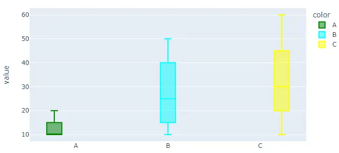
默认情况下,box() 函数为每个单元格赋予不同的颜色,但我们可以使用 color 和 color_discrete_map 参数设置每个单元格的颜色。我们必须在 color 参数中传递每个单元格标签,然后使用 color_discrete_map 参数给每个标签一个颜色,以更改每个单元格的颜色。如果我们没有为标签定义颜色,box() 函数会自动为其赋予随机颜色。
下面的代码设置每个单元格的颜色。
import plotly.express as px

labels = ["A", "B", "C"]
value = [[10, 50, 30], [20, 30, 60], [10, 20, 30], [10, 10, 10]]
fig = px.box(
    x=labels,
    y=value,
    width=700,
    height=400,
    color=labels,
    color_discrete_map={
        "A": "green",
        "B": "cyan",
        "C": "yellow",
    },
)
fig.show()
输出:
我们可以使用 color_discrete_sequence 参数更改默认颜色比例或序列以设置每个单元格的颜色。参数的值应该是有效 CSS 颜色的列表。我们可以使用 Plotly 的内置颜色序列,如 Vivid、Light24 和 Dark2。
下面的代码使用 Dark2 颜色序列更改饼图的颜色。
import plotly.express as px

labels = ["A", "B", "C"]
value = [[10, 50, 30], [20, 30, 60], [10, 20, 30], [10, 10, 10]]
fig = px.box(
    x=labels,
    y=value,
    width=700,
    height=400,
    color=labels,
    color_discrete_sequence=px.colors.qualitative.Dark2,
)
fig.show()
输出:
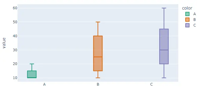
要更改代码中的颜色序列,我们必须将颜色序列的名称从 Dark2 更改为 Vivid。有关 Plotly 颜色序列的更多详细信息,请访问此[链接]。
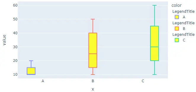
我们可以使用 fig.update_traces() 函数更新 bar() 函数的轨迹。我们可以使用 fillcolor 参数更改框的填充颜色,并将其值设置为黄色等颜色名称。我们可以使用 opacity 参数更改框的不透明度,并将其值从 0 设置为 1。
我们可以使用 legendgrouptitle_text 参数设置图例的标题组,并将其值设置为字符串。
下面的代码使用 fig.update_traces() 函数改变上述的痕迹。
import plotly.express as px

labels = ["A", "B", "C"]
value = [[10, 50, 30], [20, 30, 60], [10, 20, 30], [10, 10, 10]]
fig = px.box(x=labels, y=value, width=700, height=400, color=labels)
fig.update_traces(fillcolor="yellow", opacity=0.8, legendgrouptitle_text="LegendTitle")

fig.show()
输出:
请访问这个链接了解更多关于 box() 函数痕迹的细节。
