在 R 中使用 ggplot 建立直方圖
-
在 R 中使用
geom_histogram使用ggplot建立直方圖 -
使用
fill、colour和size引數修改 R 中的直方圖視覺效果 -
在 R 中使用
facet_wrap構建按類別分組的多個直方圖
本文將演示如何在 R 中使用 ggplot 建立直方圖。
在 R 中使用 geom_histogram 使用 ggplot 建立直方圖
使用 geom_histogram 函式構建一個簡單的直方圖,它只需要一個變數來繪製圖形。在這種情況下,我們使用 diamonds 資料集,即其中的 price 列,來指定到 x 軸的對映。除非使用者明確傳遞,否則 geom_histogram 會自動選擇 bin 大小和比例資料點。
library(ggplot2)

p1 <- ggplot(diamonds, aes(x = price)) +
  geom_histogram()

p1

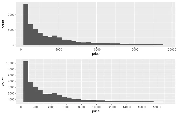
以下示例擴充套件了前面的程式碼片段,以使用 scale_x_continuous 和 scale_y_continuous 函式指定每個軸上的斷點。breaks 引數用於傳遞由 seq 函式生成的值。seq 引數在形成模式時讀起來很直觀 - (from, to, by)。我們還利用 grid.arrange 函式並排顯示兩個圖形以進行視覺比較。
library(ggplot2)
library(gridExtra)

p1 <- ggplot(diamonds, aes(x = price)) +
  geom_histogram()

p2 <- ggplot(diamonds, aes(x = price)) +
  geom_histogram() +
  scale_y_continuous(breaks = seq(1000, 14000, 2000)) +
  scale_x_continuous(breaks = seq(0, 18000, 2000))

grid.arrange(p1, p2, nrow = 2)
使用 fill、colour 和 size 引數修改 R 中的直方圖視覺效果
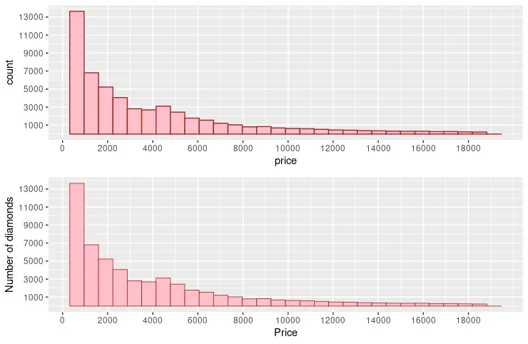
諸如 fill、colour 和 size 等常用引數可用於更改圖形箱的視覺效果。fill 引數指定填充 bin 的顏色;相比之下,colour 用於 bin 筆劃。size 使用數值來表示 bin 筆劃的寬度。另請注意,以下程式碼片段將 name 引數新增到兩個軸。
library(ggplot2)
library(gridExtra)

p3 <- ggplot(diamonds, aes(x = price)) +
  geom_histogram(fill = "pink", colour = "brown") +
  scale_y_continuous(breaks = seq(1000, 14000, 2000)) +
  scale_x_continuous(breaks = seq(0, 18000, 2000))

p4 <- ggplot(diamonds, aes(x = price)) +
  geom_histogram(fill = "pink", colour = "brown", size = .3) +
  scale_y_continuous(breaks = seq(1000, 14000, 2000), name = "Number of diamonds" ) +
  scale_x_continuous(breaks = seq(0, 18000, 2000), name = "Price" )

grid.arrange(p3, p4, nrow = 2)
在 R 中使用 facet_wrap 構建按類別分組的多個直方圖
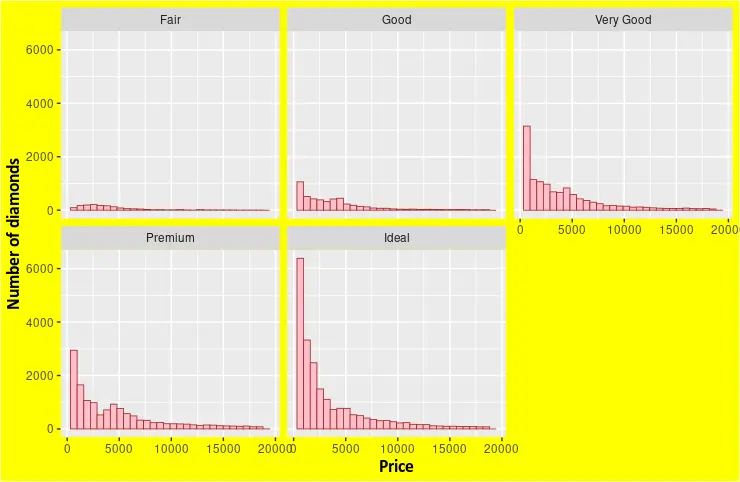
facet_wrap 函式可用於根據變數集繪製多個直方圖。diamonds 資料集提供了足夠的維度來從其中一列中選擇變數。例如,我們選擇 cut 列來顯示每種型別的不同 price 直方圖。theme 函式也可以與 geom_histogram 結合使用來指定圖形元素的自定義格式。
library(ggplot2)

p5 <- ggplot(diamonds, aes(x = price)) +
  geom_histogram(fill = "pink", colour = "brown", size = .3) +
  scale_y_continuous( name = "Number of diamonds" ) +
  scale_x_continuous( name = "Price" ) +
  facet_wrap(~cut) +
  theme(
    axis.title.x = element_text(
      size = rel(1.2), lineheight = .9,
      family = "Calibri", face = "bold", colour = "black"
    ),
    axis.title.y = element_text(
      size = rel(1.2), lineheight = .9,
      family = "Calibri", face = "bold", colour = "black"
    ),
    plot.background = element_rect("yellow"))


p5
Enjoying our tutorials? Subscribe to DelftStack on YouTube to support us in creating more high-quality video guides. Subscribe
作者: Jinku Hu
