R에서 ggplot으로 히스토그램 만들기
-
geom_histogram을 사용하여 R에서ggplot이있는 히스토그램 생성 -
fill,colour및size매개 변수를 사용하여 R에서 히스토그램 시각 자료 수정 -
facet_wrap을 사용하여 R에서 범주별로 그룹화 된 여러 히스토그램 생성
이 기사에서는 R에서ggplot을 사용하여 히스토그램을 만드는 방법을 보여줍니다.
geom_histogram을 사용하여 R에서ggplot이있는 히스토그램 생성
간단한 히스토그램은geom_histogram함수를 사용하여 구성되며 그래프를 그리는 데 하나의 변수 만 필요합니다. 이 경우diamonds데이터 세트, 즉price열을 사용하여 x 축에 대한 매핑을 지정합니다. geom_histogram은 사용자가 명시 적으로 전달하지 않는 한 자동으로 빈 크기를 선택하고 데이터 포인트를 조정합니다.
library(ggplot2)

p1 <- ggplot(diamonds, aes(x = price)) +
  geom_histogram()

p1

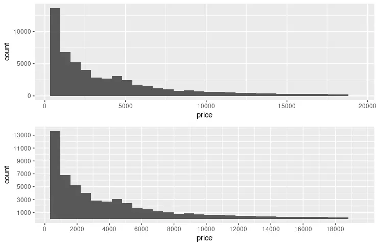
다음 예제는scale_x_continuous및scale_y_continuous함수를 사용하여 각 축에 중단 점을 지정하도록 이전 코드 스 니펫을 확장합니다. breaks매개 변수는seq함수에 의해 생성 된 값을 전달하는 데 사용됩니다. seq매개 변수는(from, to, by)패턴을 형성 할 때 직관적으로 읽을 수 있습니다. 또한grid.arrange기능을 사용하여 시각적 비교를 위해 두 개의 그래프를 나란히 표시합니다.
library(ggplot2)
library(gridExtra)

p1 <- ggplot(diamonds, aes(x = price)) +
  geom_histogram()

p2 <- ggplot(diamonds, aes(x = price)) +
  geom_histogram() +
  scale_y_continuous(breaks = seq(1000, 14000, 2000)) +
  scale_x_continuous(breaks = seq(0, 18000, 2000))

grid.arrange(p1, p2, nrow = 2)
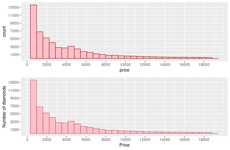
fill,colour및size매개 변수를 사용하여 R에서 히스토그램 시각 자료 수정
fill,colour및size와 같은 공통 매개 변수를 사용하여 그래프 빈의 시각적 표시를 변경할 수 있습니다. fill매개 변수는 빈이 채워지는 색상을 지정합니다. 대조적으로colour은 빈 스트로크에 사용됩니다. size는 빈 스트로크의 너비를 나타내는 숫자 값을 사용합니다. 또한 다음 코드 스 니펫은name매개 변수를 두 축에 추가합니다.
library(ggplot2)
library(gridExtra)

p3 <- ggplot(diamonds, aes(x = price)) +
  geom_histogram(fill = "pink", colour = "brown") +
  scale_y_continuous(breaks = seq(1000, 14000, 2000)) +
  scale_x_continuous(breaks = seq(0, 18000, 2000))

p4 <- ggplot(diamonds, aes(x = price)) +
  geom_histogram(fill = "pink", colour = "brown", size = .3) +
  scale_y_continuous(breaks = seq(1000, 14000, 2000), name = "Number of diamonds" ) +
  scale_x_continuous(breaks = seq(0, 18000, 2000), name = "Price" )

grid.arrange(p3, p4, nrow = 2)
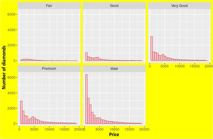
facet_wrap을 사용하여 R에서 범주별로 그룹화 된 여러 히스토그램 생성
facet_wrap함수를 사용하여 변수 집합을 기반으로 여러 히스토그램을 그릴 수 있습니다. diamonds데이터 세트는 열 중 하나에서 변수를 선택하기에 충분한 차원을 제공합니다. 예를 들어,cut열을 선택하여 각 유형에 대해 서로 다른price히스토그램을 표시합니다. theme함수를geom_histogram과 결합하여 그래프 요소에 대한 사용자 정의 형식을 지정할 수도 있습니다.
library(ggplot2)

p5 <- ggplot(diamonds, aes(x = price)) +
  geom_histogram(fill = "pink", colour = "brown", size = .3) +
  scale_y_continuous( name = "Number of diamonds" ) +
  scale_x_continuous( name = "Price" ) +
  facet_wrap(~cut) +
  theme(
    axis.title.x = element_text(
      size = rel(1.2), lineheight = .9,
      family = "Calibri", face = "bold", colour = "black"
    ),
    axis.title.y = element_text(
      size = rel(1.2), lineheight = .9,
      family = "Calibri", face = "bold", colour = "black"
    ),
    plot.background = element_rect("yellow"))


p5

Founder of DelftStack.com. Jinku has worked in the robotics and automotive industries for over 8 years. He sharpened his coding skills when he needed to do the automatic testing, data collection from remote servers and report creation from the endurance test. He is from an electrical/electronics engineering background but has expanded his interest to embedded electronics, embedded programming and front-/back-end programming.
LinkedIn Facebook