Seaborn Set_xticklabels Function

This article will introduce how to control the tick labels on both the axis.
For example, notice the problem with the following graph.
import pandas as pd
import matplotlib.pyplot as plt
import seaborn as sns

df = pd.DataFrame(
    {
        "Date": [
            "01012019",
            "01022019",
            "01032019",
            "01042019",
            "01052019",
            "01062019",
            "01072019",
            "01082019",
        ],
        "Price": [77, 76, 68, 70, 78, 79, 74, 75],
    }
)
df["Date"] = pd.to_datetime(df["Date"], format="%d%m%Y")

plt.figure(figsize=(15, 8))
ax = sns.barplot(x="Date", y="Price", data=df)
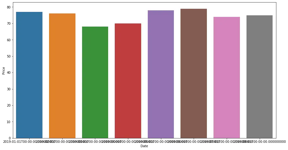
In the above figure, whole dates are plotted on the x-axis. But everything is overlapped and is difficult to read.
We can use the set_xticklabels() function to set custom tick labels for the x-axis. A seaborn plot returns a matplotlib axes instance type object. We can use this function on this object.
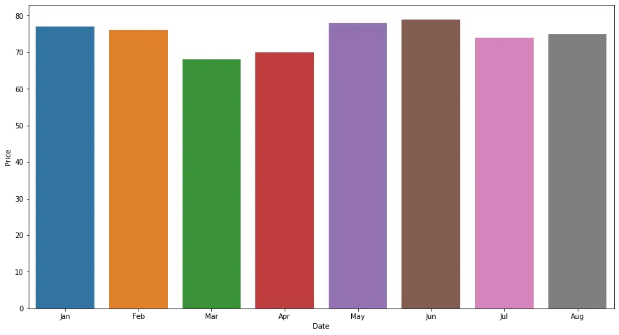
For example, we can pass the labels as the month names as shown below in the problem mentioned above.
import pandas as pd
import matplotlib.pyplot as plt
import seaborn as sns

df = pd.DataFrame(
    {
        "Date": [
            "01012019",
            "01022019",
            "01032019",
            "01042019",
            "01052019",
            "01062019",
            "01072019",
            "01082019",
        ],
        "Price": [77, 76, 68, 70, 78, 79, 74, 75],
    }
)
df["Date"] = pd.to_datetime(df["Date"], format="%d%m%Y")

plt.figure(figsize=(15, 8))
ax = sns.barplot(x="Date", y="Price", data=df)
ax.set_xticklabels(["Jan", "Feb", "Mar", "Apr", "May", "Jun", "Jul", "Aug"])
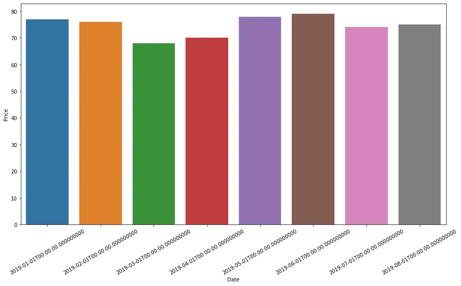
We can also perform minor customizations on the final result. We can use the rotation parameter to rotate the final tick labels by some degree or alter their font size using the size parameter.
If we want to use these parameters on the default tick labels, we can use the get_xticklabels() function. It returns the list of the default tick labels from the plot. We can use this function when we want to customize the default tick labels using rotation or size parameters.
Check the following code to see how to use this function.
import pandas as pd
import matplotlib.pyplot as plt
import seaborn as sns

df = pd.DataFrame(
    {
        "Date": [
            "01012019",
            "01022019",
            "01032019",
            "01042019",
            "01052019",
            "01062019",
            "01072019",
            "01082019",
        ],
        "Price": [77, 76, 68, 70, 78, 79, 74, 75],
    }
)
df["Date"] = pd.to_datetime(df["Date"], format="%d%m%Y")

plt.figure(figsize=(15, 8))
ax = sns.barplot(x="Date", y="Price", data=df)
ax.set_xticklabels(ax.get_xticklabels(), rotation=30, size=10)
Similarly, we can perform the functions on the y-axis using the set_yticklabels(), and the get_yticklabels() functions.

Manav is a IT Professional who has a lot of experience as a core developer in many live projects. He is an avid learner who enjoys learning new things and sharing his findings whenever possible.
LinkedIn