How to Create FacetGrid in Seaborn
The seaborn module is used for visualization and creating beautiful statistical graphs in Python. It is based on and uses the matlplotlib library. At times, we may encounter a situation to display multiple charts at once, which will give better clarity in understanding the dataset. For such situations, we may use the FacetGrid class from the seaborn module.
This tutorial will introduce how to use the FacetGrid class of the seaborn module in Python.
The FacetGrid class is used to visualize the relationship between data distribution with other subsets of data by creating grids for multiple plots. It plots the dataset on the grid by specifying the row and column axis. It is handy when we are working with a complicated dataset.
Different seaborn plots like relplot(),lmplot(), and catplot() use this class by default.
We use the seaborn.FacetGrid() constructor to initiate an object of this class. See the following code.
import pandas as pd
import matplotlib.pyplot as plt
import seaborn as sns

df = pd.DataFrame(
    {
        "Quantity": [5, 6, 7, 8, 5, 6, 7, 8, 5, 6, 7, 8, 5, 6, 7, 8],
        "Price": [9, 10, 15, 16, 13, 14, 15, 18, 11, 12, 14, 15, 16, 17, 18, 19],
        "Day": [1, 1, 1, 1, 1, 1, 1, 1, 2, 2, 2, 2, 2, 2, 2, 2],
        "Product": [
            "A",
            "A",
            "A",
            "A",
            "B",
            "B",
            "B",
            "B",
            "A",
            "A",
            "A",
            "A",
            "B",
            "B",
            "B",
            "B",
        ],
    }
)

g = sns.FacetGrid(df, col="Product", row="Day")
g.map(sns.lineplot, "Price", "Quantity")
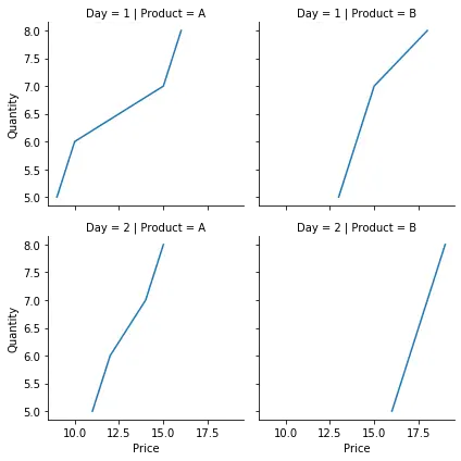
In the above example, we plotted the price for the different products in different quantities over two days. We created a grid using the seaborn.FacetGrid() constructor and initialized it with the value for rows and columns. We specify the desired plot and variables to be plotted using the map() function. We used a relatively simple dataset, and we were able to achieve the desired result. Additionally, we can use a third axis called hue in this class. This plots the data with different categories in the same graph in different colors.
We alter the code in the earlier mentioned example and add the hue parameter. For example,
import pandas as pd
import matplotlib.pyplot as plt
import seaborn as sns

df = pd.DataFrame(
    {
        "Quantity": [5, 6, 7, 8, 5, 6, 7, 8, 5, 6, 7, 8, 5, 6, 7, 8],
        "Price": [9, 10, 15, 16, 13, 14, 15, 18, 11, 12, 14, 15, 16, 17, 18, 19],
        "Day": [1, 1, 1, 1, 1, 1, 1, 1, 2, 2, 2, 2, 2, 2, 2, 2],
        "Product": [
            "A",
            "A",
            "A",
            "A",
            "B",
            "B",
            "B",
            "B",
            "A",
            "A",
            "A",
            "A",
            "B",
            "B",
            "B",
            "B",
        ],
    }
)

g = sns.FacetGrid(df, col="Product", hue="Day")
g.map(sns.lineplot, "Price", "Quantity")
g.add_legend()
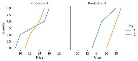
Notice that the total number of plots also reduced by using the hue parameter. The add_legend() function is used to add a legend in the final figure.
We can tweak the final figure using many parameters and functions with this class. For example, the height and aspect parameters can be used to alter the size of the final figure, the set_titles() function can be used to add a title to plot on each axis, set_xlabels() function to alter axis labels and more.

Manav is a IT Professional who has a lot of experience as a core developer in many live projects. He is an avid learner who enjoys learning new things and sharing his findings whenever possible.
LinkedIn