Seaborn 中的 FacetGrid
seaborn 模块用于在 Python 中可视化和创建漂亮的统计图。它基于并使用 matlplotlib 库。有时,我们可能会遇到同时显示多个图表的情况,这样可以更清晰地理解数据集。对于这种情况,我们可以使用 seaborn 模块中的 FacetGrid 类。
本教程将介绍如何在 Python 中使用 seaborn 模块的 FacetGrid 类。
FacetGrid 类用于通过为多个图创建网格来可视化数据分布与其他数据子集之间的关系。它通过指定行轴和列轴在网格上绘制数据集。当我们处理复杂的数据集时,它很方便。
像 relplot()、lmplot() 和 catplot() 等不同的 seaborn 图默认使用这个类。
我们使用 seaborn.FacetGrid() 构造函数来初始化这个类的一个对象。请参考以下代码。
import pandas as pd
import matplotlib.pyplot as plt
import seaborn as sns

df = pd.DataFrame(
    {
        "Quantity": [5, 6, 7, 8, 5, 6, 7, 8, 5, 6, 7, 8, 5, 6, 7, 8],
        "Price": [9, 10, 15, 16, 13, 14, 15, 18, 11, 12, 14, 15, 16, 17, 18, 19],
        "Day": [1, 1, 1, 1, 1, 1, 1, 1, 2, 2, 2, 2, 2, 2, 2, 2],
        "Product": [
            "A",
            "A",
            "A",
            "A",
            "B",
            "B",
            "B",
            "B",
            "A",
            "A",
            "A",
            "A",
            "B",
            "B",
            "B",
            "B",
        ],
    }
)

g = sns.FacetGrid(df, col="Product", row="Day")
g.map(sns.lineplot, "Price", "Quantity")
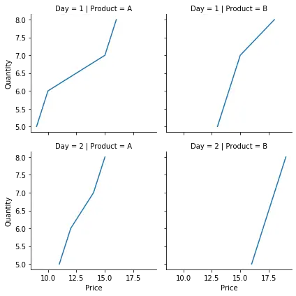
在上面的示例中,我们绘制了两天内不同数量的不同产品的价格。我们使用 seaborn.FacetGrid() 构造函数创建了一个网格,并使用行和列的值对其进行初始化。我们使用 map() 函数指定要绘制的所需图和变量。我们使用了一个相对简单的数据集,我们能够达到预期的结果。此外,我们可以在这个类中使用称为色调的第三个轴。这将在同一图中以不同颜色绘制不同类别的数据。
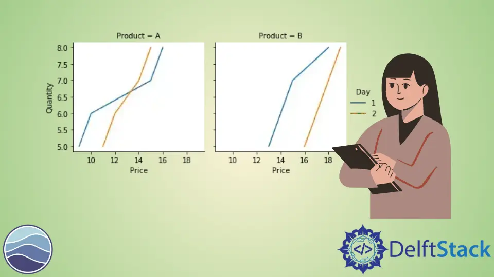
我们更改前面提到的示例中的代码并添加 hue 参数。例如,
import pandas as pd
import matplotlib.pyplot as plt
import seaborn as sns

df = pd.DataFrame(
    {
        "Quantity": [5, 6, 7, 8, 5, 6, 7, 8, 5, 6, 7, 8, 5, 6, 7, 8],
        "Price": [9, 10, 15, 16, 13, 14, 15, 18, 11, 12, 14, 15, 16, 17, 18, 19],
        "Day": [1, 1, 1, 1, 1, 1, 1, 1, 2, 2, 2, 2, 2, 2, 2, 2],
        "Product": [
            "A",
            "A",
            "A",
            "A",
            "B",
            "B",
            "B",
            "B",
            "A",
            "A",
            "A",
            "A",
            "B",
            "B",
            "B",
            "B",
        ],
    }
)

g = sns.FacetGrid(df, col="Product", hue="Day")
g.map(sns.lineplot, "Price", "Quantity")
g.add_legend()
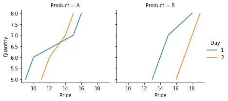
请注意,使用 hue 参数也减少了绘图总数。add_legend() 函数用于在最终图形中添加图例。
我们可以使用此类的许多参数和函数来调整最终图形。例如,height 和 aspect 参数可用于改变最终图形的大小,set_titles() 函数可用于在每个轴上添加标题,set_xlabels() 函数更改轴标签等。

Manav is a IT Professional who has a lot of experience as a core developer in many live projects. He is an avid learner who enjoys learning new things and sharing his findings whenever possible.
LinkedIn