Seaborn 中的 FacetGrid
seaborn 模組用於在 Python 中視覺化和建立漂亮的統計圖。它基於並使用 matlplotlib 庫。有時,我們可能會遇到同時顯示多個圖表的情況,這樣可以更清晰地理解資料集。對於這種情況,我們可以使用 seaborn 模組中的 FacetGrid 類。
本教程將介紹如何在 Python 中使用 seaborn 模組的 FacetGrid 類。
FacetGrid 類用於通過為多個圖建立網格來視覺化資料分佈與其他資料子集之間的關係。它通過指定行軸和列軸在網格上繪製資料集。當我們處理複雜的資料集時,它很方便。
像 relplot()、lmplot() 和 catplot() 等不同的 seaborn 圖預設使用這個類。
我們使用 seaborn.FacetGrid() 建構函式來初始化這個類的一個物件。請參考以下程式碼。
import pandas as pd
import matplotlib.pyplot as plt
import seaborn as sns

df = pd.DataFrame(
    {
        "Quantity": [5, 6, 7, 8, 5, 6, 7, 8, 5, 6, 7, 8, 5, 6, 7, 8],
        "Price": [9, 10, 15, 16, 13, 14, 15, 18, 11, 12, 14, 15, 16, 17, 18, 19],
        "Day": [1, 1, 1, 1, 1, 1, 1, 1, 2, 2, 2, 2, 2, 2, 2, 2],
        "Product": [
            "A",
            "A",
            "A",
            "A",
            "B",
            "B",
            "B",
            "B",
            "A",
            "A",
            "A",
            "A",
            "B",
            "B",
            "B",
            "B",
        ],
    }
)

g = sns.FacetGrid(df, col="Product", row="Day")
g.map(sns.lineplot, "Price", "Quantity")
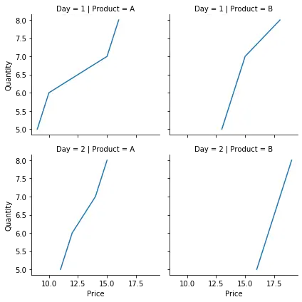
在上面的示例中,我們繪製了兩天內不同數量的不同產品的價格。我們使用 seaborn.FacetGrid() 建構函式建立了一個網格,並使用行和列的值對其進行初始化。我們使用 map() 函式指定要繪製的所需圖和變數。我們使用了一個相對簡單的資料集,我們能夠達到預期的結果。此外,我們可以在這個類中使用稱為色調的第三個軸。這將在同一圖中以不同顏色繪製不同類別的資料。
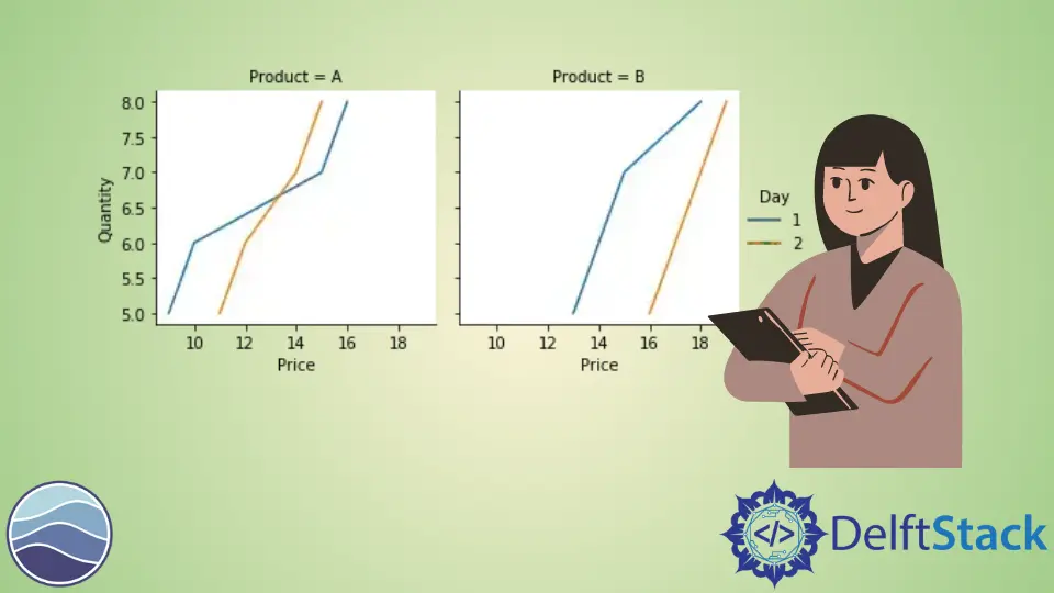
我們更改前面提到的示例中的程式碼並新增 hue 引數。例如,
import pandas as pd
import matplotlib.pyplot as plt
import seaborn as sns

df = pd.DataFrame(
    {
        "Quantity": [5, 6, 7, 8, 5, 6, 7, 8, 5, 6, 7, 8, 5, 6, 7, 8],
        "Price": [9, 10, 15, 16, 13, 14, 15, 18, 11, 12, 14, 15, 16, 17, 18, 19],
        "Day": [1, 1, 1, 1, 1, 1, 1, 1, 2, 2, 2, 2, 2, 2, 2, 2],
        "Product": [
            "A",
            "A",
            "A",
            "A",
            "B",
            "B",
            "B",
            "B",
            "A",
            "A",
            "A",
            "A",
            "B",
            "B",
            "B",
            "B",
        ],
    }
)

g = sns.FacetGrid(df, col="Product", hue="Day")
g.map(sns.lineplot, "Price", "Quantity")
g.add_legend()
請注意,使用 hue 引數也減少了繪圖總數。add_legend() 函式用於在最終圖形中新增圖例。
我們可以使用此類的許多引數和函式來調整最終圖形。例如,height 和 aspect 引數可用於改變最終圖形的大小,set_titles() 函式可用於在每個軸上新增標題,set_xlabels() 函式更改軸標籤等。

Manav is a IT Professional who has a lot of experience as a core developer in many live projects. He is an avid learner who enjoys learning new things and sharing his findings whenever possible.
LinkedIn