How to Create Responsive Carousel Using React
- Responsive Carousel Using React Slick
- Responsive Carousel Using React Hooks
- Responsive Carousel Using React Material-UI
- Conclusion

The React carousel is an effect that allows us to display items in the form of slides. This way, we can easily display multiple items without the need to scroll up and down the page as the items we wish to see are unraveled one after the other.
This awesome design is ideal for E-commerce websites. It is a nice way to display products in one go.
Also, for someone that intends to create a portfolio, the carousel effect is excellent for allowing website visitors to see the services offered without stress.
There are different ways we can utilize this sliding effect in React. We can use the carousel with arrow buttons, so users can manually click forward or backward to see items.
We could make it automatic, where the items are displayed automatically from beginning to the end and then starts again, like a loop.
So moving forward, let us look at different methods to call up this function inside the React framework.
Responsive Carousel Using React Slick
This example utilizes the react-slick dependency to work. After creating a new project folder, we proceed to the project folder inside our terminal and install the library. We will use npm install react-slick --save to install.
We also need to install the React slick-carousel; this will allow us to configure the CSS and fonts of the carousel. We will install this dependency with npm install slick-carousel.
Then we will create two folders: one is for the carousel, and the other is for the CSS aspect. We will create the Components folder; inside it, we will create the Slider.js.
Then we create another folder; we will call this css. And we will create the App.scss file inside it.
Then after that, we proceed to the Slider.js file and input these codes:
Code Snippet (Slider.js):
import React from 'react';
import Slider from "react-slick";
import "slick-carousel/slick/slick.css";
import "slick-carousel/slick/slick-theme.css";


function ImageSlider() {
    let settings = {
        dots: true,
        infinite: true,
        speed: 500,
        slidesToShow: 3,
        slidesToScroll: 1,
        cssEase: "linear"
    }
    return (
        <Slider {...settings}>
            <div className="card-wrapper">
                <div className="card">
                    <div className="card-image">
                        <img src="images/1.jpg" />
                    </div>
                    <ul className="social-icons">
                        <li><a href="#"><i className="fa fa-facebook"></i></a></li>
                        <li><a href="#"><i className="fa fa-instagram"></i></a></li>
                        <li><a href="#"><i className="fa fa-twitter"></i></a></li>
                        <li><a href="#"><i className="fa fa-dribbble"></i></a></li>
                    </ul>
                    <div className="details">
                        <h2>BMW <span className="job-title">M5</span></h2>
                    </div>
                </div>
            </div>
            <div className="card-wrapper">
                <div className="card">
                    <div className="card-image">
                        <img src="images/2.png" />
                    </div>
                    <ul className="social-icons">
                        <li><a href="#"><i className="fa fa-facebook"></i></a></li>
                        <li><a href="#"><i className="fa fa-instagram"></i></a></li>
                        <li><a href="#"><i className="fa fa-twitter"></i></a></li>
                        <li><a href="#"><i className="fa fa-dribbble"></i></a></li>
                    </ul>
                    <div className="details">
                        <h2>Graphic <span className="job-title">Design</span></h2>
                    </div>
                </div>
            </div>
            <div className="card-wrapper">
                <div className="card">
                    <div className="card-image">
                        <img src="images/3.png" />
                    </div>
                    <ul className="social-icons">
                        <li><a href="#"><i className="fa fa-facebook"></i></a></li>
                        <li><a href="#"><i className="fa fa-instagram"></i></a></li>
                        <li><a href="#"><i className="fa fa-twitter"></i></a></li>
                        <li><a href="#"><i className="fa fa-dribbble"></i></a></li>
                    </ul>
                    <div className="details">
                        <h2>Embrace<span className="job-title">Your Darkness</span></h2>
                    </div>
                </div>
            </div>
            <div className="card-wrapper">
                <div className="card">
                    <div className="card-image">
                        <img src="images/4.jpg" />
                    </div>
                    <ul className="social-icons">
                        <li><a href="#"><i className="fa fa-facebook"></i></a></li>
                        <li><a href="#"><i className="fa fa-instagram"></i></a></li>
                        <li><a href="#"><i className="fa fa-twitter"></i></a></li>
                        <li><a href="#"><i className="fa fa-dribbble"></i></a></li>
                    </ul>
                    <div className="details">
                        <h2>ML <span className="job-title">Fashion</span></h2>
                    </div>
                </div>
            </div>
        </Slider>
    )
}

export default ImageSlider
We create components that include the data and the pictures of the items we want to use, and then we wrap all of these inside the <Slider></Slider> tag. This is the carousel library that we installed earlier.
Next, we go into the App.js folder to write these bits of codes:
Code Snippet (App.js):
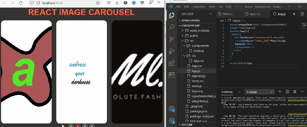
import ImageSlider from "./Components/Slider";
import "./css/App.css"
function App() {
  return (
    <div className="container mt-5 carousel">
      <h1 className="slider_title">React Image Carousel</h1>
      <ImageSlider />
    </div>
  );
}

export default App;
Because the carousel is an effects kind of design for web pages, the CSS aspect is a very vital part of the setup. We will do a lot of CSS to control how each picture moves and how long it takes to transit.
Code Snippet (App.scss):
* {
    margin: 0;
    padding: 0;
  }

  body {
    display: block;
    width: 100%;
    height: 100vh;
    overflow: hidden;
    font-family: "Raleway", sans-serif;
    position: relative;
    background: #333;
  }

  .slider_title {
    font-size: 5vw;
    color: tomato;
    text-transform: uppercase;
    text-align: center;
    margin-bottom: 2vw;
  }

  .card-wrapper {
    position: relative;
    width: 100%;
    padding: 0 10px;
    -webkit-box-sizing: border-box;
            box-sizing: border-box;
  }

  .card-wrapper:active, .card-wrapper:hover, .card-wrapper:focus {
    outline: none;
    border: none;
  }

  .card {
    width: 100%;
    height: 450px;
    border-radius: 16px;
    overflow: hidden;
    cursor: pointer;
    position: relative;
  }

  .card .card-image {
    position: absolute;
    top: 0;
    left: 0;
    width: 100%;
    height: 100%;
    z-index: 2;
    background-color: #000;
    -webkit-transition: .5s;
    transition: .5s;
  }

  .card .card-image img {
    width: 100%;
    height: 100%;
    -o-object-fit: cover;
       object-fit: cover;
  }

  .card:hover img {
    opacity: .4;
    -webkit-transition: .5s;
    transition: .5s;
  }

  .card:hover .card-image {
    -webkit-transform: translateY(-100px);
            transform: translateY(-100px);
    -webkit-transition: all .9s;
    transition: all .9s;
  }

  .social-icons {
    position: absolute;
    top: 50%;
    left: 50%;
    -webkit-transform: translate(-50%, -50%);
            transform: translate(-50%, -50%);
    z-index: 3;
    display: -webkit-box;
    display: -ms-flexbox;
    display: flex;
  }

  .social-icons li {
    list-style: none;
  }

  .social-icons li a {
    position: relative;
    display: block;
    width: 50px;
    height: 50px;
    line-height: 50px;
    text-align: center;
    background: #fff;
    font-size: 23px;
    color: #333;
    font-weight: bold;
    margin: 0 6px;
    -webkit-transition: .4s;
    transition: .4s;
    -webkit-transform: translateY(200px);
            transform: translateY(200px);
    opacity: 0;
  }

  .card:hover .social-icons li a {
    -webkit-transform: translateY(0px);
            transform: translateY(0px);
    opacity: 1;
  }

  .social-icons li a:hover {
    background: #000;
    -webkit-transition: .2s;
    transition: .2s;
  }

  .social-icons li a:hover .fa {
    color: #fff;
  }

  .social-icons li a .fa {
    -webkit-transition: .8s;
    transition: .8s;
  }

  .social-icons li a .fa:hover {
    -webkit-transform: rotateY(360deg);
            transform: rotateY(360deg);
    color: #fff;
  }

  .card:hover li:nth-child(1) a {
    -webkit-transition-delay: .1s;
            transition-delay: .1s;
  }

  .card:hover li:nth-child(2) a {
    -webkit-transition-delay: .2s;
            transition-delay: .2s;
  }

  .card:hover li:nth-child(3) a {
    -webkit-transition-delay: .3s;
            transition-delay: .3s;
  }

  .card:hover li:nth-child(4) a {
    -webkit-transition-delay: .4s;
            transition-delay: .4s;
  }

  .details {
    position: absolute;
    bottom: 400px;
    left: 0;
    background: #fff;
    width: 100%;
    height: 120px;
    z-index: 1;
    padding: 10px;
    -webkit-transition: .6s;
    transition: .6s;
  }

  .details h2 {
    margin: 30px 0;
    padding: 0;
    text-align: center;
  }

  .details h2 .job-title {
    font-size: 16px;
    line-height: 2;
    color: #333;
    font-weight: 300;
    display: block;
  }

  .card:hover .details {
    bottom: 0;
  }

  .carousel .slick-dots {
    bottom: -2.5vw;
  }

  .carousel .slick-dots li button {
    width: 20px;
    height: 20px;
    border: 1px solid #fff;
    border-radius: 20px;
  }

  .carousel .slick-dots li button:before {
    position: absolute;
    top: 50%;
    left: 50%;
    width: 10px;
    height: 10px;
    border-radius: 10px;
    content: "";
    text-align: center;
    opacity: .5;
    color: #000;
    background-color: #fff;
    -webkit-transform: translate(-50%, -50%);
            transform: translate(-50%, -50%);
    -webkit-transition: all .3s ease-in-out;
    transition: all .3s ease-in-out;
  }

  .carousel .slick-dots li.slick-active button, .carousel .slick-dots li:hover button {
    border-color: tomato;
  }

  .carousel .slick-dots li.slick-active button:before, .carousel .slick-dots li:hover button:before {
    background-color: tomato;
    opacity: 1;
  }

  .carousel .slick-prev, .carousel .slick-next {
    width: 50px;
    height: 50px;
    background-color: #fff;
  }

  .carousel .slick-prev:hover, .carousel .slick-prev:focus, .carousel .slick-next:hover, .carousel .slick-next:focus {
    color: #fff;
    outline:
   none;
    background: #fff;
  }

  .carousel .slick-prev:before, .carousel .slick-next:before {
    color: #000;
    font-family: "Raleway", sans-serif;
  }

  .carousel .slick-next {
    right: -55px;
  }

  .carousel .slick-prev {
    left: -55px;
  }
We also set the picture size inside the CSS. We also set how to display the information added to the pictures and the font.
Output:
Responsive Carousel Using React Hooks
In this example, we will be utilizing React’s useState hook, as it helps in switching between values, which happens with the carousel effect.
After creating a new react project, we need to install the react-icons library using npm install react-icons. This dependency will provide us with the left and right arrow icons that we will use to slide between the images.
Then we navigate to the src folder inside the project folders and create a new folder called components. We will create two files inside it, namely: SliderData.js and ImageSlider.
We proceed to the coding aspect, first with the ImageSlider.js:
Code Snippet (ImageSlider.js):
import React, { useState } from 'react';
import { SliderData } from './SliderData';
import { FaArrowAltCircleRight, FaArrowAltCircleLeft } from 'react-icons/fa';

const ImageSlider = ({ slides }) => {
  const [current, setCurrent] = useState(0);
  const length = slides.length;

  const nextSlide = () => {
    setCurrent(current === length - 1 ? 0 : current + 1);
  };

  const prevSlide = () => {
    setCurrent(current === 0 ? length - 1 : current - 1);
  };

  if (!Array.isArray(slides) || slides.length <= 0) {
    return null;
  }

  return (
    <section className='slider'>
      <FaArrowAltCircleLeft className='left-arrow' onClick={prevSlide} />
      <FaArrowAltCircleRight className='right-arrow' onClick={nextSlide} />
      {SliderData.map((slide, index) => {
        return (
          <div
            className={index === current ? 'slide active' : 'slide'}
            key={index}>
            {index === current && (
              <img src={slide.image} alt='travel image' className='image' />
            )}
          </div>
        );
      })}
    </section>
  );
};

export default ImageSlider;
Applying the useState function, we set the nextSlide to increase, i.e., move on to the next item, while the prevSlide does the exact opposite. Then we call the onClick event listener to activate these functions whenever their corresponding arrows are clicked.
Moving forward, we head on to the SliderData.js. This is where we make an array of the images that we want to display with the carousel effect.
Code Snippet (SliderData.js):
export const SliderData = [
    {
        image:
            'https://images.unsplash.com/photo-1546768292-fb12f6c92568?ixid=MXwxMjA3fDB8MHxwaG90by1wYWdlfHx8fGVufDB8fHw%3D&ixlib=rb-1.2.1&auto=format&fit=crop&w=1350&q=80'
    },
    {
        image:
            'https://images.unsplash.com/photo-1501446529957-6226bd447c46?ixlib=rb-1.2.1&ixid=MXwxMjA3fDB8MHxwaG90by1wYWdlfHx8fGVufDB8fHw%3D&auto=format&fit=crop&w=1489&q=80'
    },
    {
        image:
            'https://images.unsplash.com/photo-1483729558449-99ef09a8c325?ixlib=rb-1.2.1&ixid=MXwxMjA3fDB8MHxwaG90by1wYWdlfHx8fGVufDB8fHw%3D&auto=format&fit=crop&w=1350&q=80'
    },
    {
        image:
            'https://images.unsplash.com/photo-1475189778702-5ec9941484ae?ixlib=rb-1.2.1&ixid=MXwxMjA3fDB8MHxwaG90by1wYWdlfHx8fGVufDB8fHw%3D&auto=format&fit=crop&w=1351&q=80'
    },
    {
        image:
            'https://images.unsplash.com/photo-1503177119275-0aa32b3a9368?ixlib=rb-1.2.1&ixid=MXwxMjA3fDB8MHxwaG90by1wYWdlfHx8fGVufDB8fHw%3D&auto=format&fit=crop&w=1350&q=80'
    }
];
Then we head onto the App.js and add a little bit of code:
Code Snippet (App.js):
import './App.css';
import ImageSlider from './components/ImageSlider';
import { SliderData } from './components/SliderData';

function App() {
  return <ImageSlider slides={SliderData} />;
}

export default App;
The CSS mentioned earlier plays a vital role in making sure that the carousel effect works as desired, so we head inside the App.css file and make some adjustments:
Code Snippet (App.css):
.slider {
  position: relative;
  height: 100vh;
  display: flex;
  justify-content: center;
  align-items: center;
}

.image {
  width: 1000px;
  height: 600px;
  border-radius: 10px;
}

.right-arrow {
  position: absolute;
  top: 50%;
  right: 32px;
  font-size: 3rem;
  color: #000;
  z-index: 10;
  cursor: pointer;
  user-select: none;
}

.left-arrow {
  position: absolute;
  top: 50%;
  left: 32px;
  font-size: 3rem;
  color: #000;
  z-index: 10;
  cursor: pointer;
  user-select: none;
}

.slide {
  opacity: 0;
  transition-duration: 1s ease;
}

.slide.active {
  opacity: 1;
  transition-duration: 1s;
  transform: scale(1.08);
}
The carousel effect should excellently work when we put all these codes as instructed.
Output:

Responsive Carousel Using React Material-UI
React Material-UI is a feature library that we will deploy to set up the navigation arrows for react carousel, then we will use the react state hooks to finish up the job.
After creating a new project, we then install the material-UI with npm install @material-ui/core and npm install @material-ui/icons.
Now we head into src and create 3 folders, Components, Helpers, and Images. We will create Carousel.js and Carousel.css inside the Components folder.
We will create CarouselData.js inside the Helpers folder and put the images inside the Images folder. We start with the Carousel.js folder and input these codes:
Code Snippet (Carousel.js):
import React, { useState } from "react";
import "./Carousel.css";
import { images } from "../Helpers/CarouselData";
import ArrowBackIosIcon from "@material-ui/icons/ArrowBackIos";
import ArrowForwardIosIcon from "@material-ui/icons/ArrowForwardIos";

function Carousel() {
  const [currImg, setCurrImg] = useState(0);

  return (
    <div className="carousel">
      <div
        className="carouselInner"
        style={{ backgroundImage: `url(${images[currImg].img})` }}
      >
        <div
          className="left"
          onClick={() => {
            currImg > 0 && setCurrImg(currImg - 1);
          }}
        >
          <ArrowBackIosIcon style={{ fontSize: 30 }} />
        </div>
        <div className="center">
          <h1>{images[currImg].title}</h1>
          <p>{images[currImg].subtitle}</p>
        </div>
        <div
          className="right"
          onClick={() => {
            currImg < images.length - 1 && setCurrImg(currImg + 1);
          }}
        >
          <ArrowForwardIosIcon style={{ fontSize: 30 }} />
        </div>
      </div>
    </div>
  );
}

export default Carousel;
This is where we set all the navigation operations using the useState to define what happens when we click either of the arrows, which triggers the onClick event listener.
Then we set the corresponding CSS using the Carousel.css:
Code Snippet (Carousel.css):
.carousel {
    width: 60%;
    height: 700px;
    background-color: black;
}

.carouselInner {
    height: 100%;
    width: 100%;
    background-position: center;
    background-repeat: no-repeat;
    background-size: cover;
    display: flex;
}

.carouselInner .left {
    flex: 5%;
    height: 100%;
    background-color: rgb(0, 0, 0, 0.6);
    display: grid;
    place-items: center;
    color: white;
    cursor: pointer;
}

.carouselInner .center {
    flex: 80%;
    height: 100%;
    display: grid;
    place-items: center;
    font-family: Arial, Helvetica, sans-serif;
    text-align: justify;
    text-align-last: center;
}

h1 {
    font-size: 5rem;
}

p {
    font-size: 2rem;
}

h1, p {
    background-color: rgb(255, 255, 255, 0.8);
    padding: 20px;
    border-radius: 9px;
}

.carouselInner .right {
    flex: 5%;
    height: 100%;
    background-color: rgb(0, 0, 0, 0.6);
    display: grid;
    place-items: center;
    color: white;
    cursor: pointer;
}
In the Helpers folder, we have the CarouselData.js file. As the name implies, the file houses the images and other information we want to display on the webpage.
Code Snippet (CarouselData.js):
import City from "../Images/city.jpg";
import Salvador from "../Images/salvador.jpg";
import Ubc from "../Images/ubc.jpg";

export const images = [
  { title: "San Diego",
  subtitle: "This is San Diego",
  img: City,
  },
  {
    title: "Salvador, Brazil",
    subtitle: "The Best City in the World",
    img: Salvador,
  },
  {
    title: "UBC (Vancouver)",
    subtitle: "The University of British Columbia",
    img: Ubc,
  },
];
Lastly, we do a bit of coding in App.js. This file makes sure our project is rendered well.
Code Snippet (App.js):
import "./App.css";
import Carousel from "./Components/Carousel";
import React from "react";
function App() {
  return (
    <div className="App">
      <Carousel />
    </div>
  );
}

export default App;
Output:

Conclusion
The carousel effect beautifies web pages no matter the intention it is being used for. And the React framework provides a very flexible platform to explore numerous ways to get the slide effects up and running on our web apps.

Fisayo is a tech expert and enthusiast who loves to solve problems, seek new challenges and aim to spread the knowledge of what she has learned across the globe.
LinkedIn