How to Use Event Handlers and Other Attributes on Material UI Buttons
- Buttons in Material UI in React
- Handling Events of Buttons in Material UI in React
-
API for Custom
<Button>Component in React
Libraries like Material UI are beneficial for designing the user interface of React applications without spending too much time. The library contains many custom components explicitly created for React.
These components are customizable, so you can adjust them to fit the style and color palette of your React application. Material UI is based on Material Design, a collection of design principles and guidelines by Google.
Custom Material UI components provide an easy way to style your application. It doesn’t get in the form of default features of React framework, such as state, event handlers, and such.
You can use event handlers, such as onClick(), just as you use them for common HTML elements.
Buttons in Material UI in React
It’s hard to imagine any user interface without buttons. It’s the fundamental way to listen for users’ input and respond to their actions.
Material UI has a <Button> component, which accepts attributes like variant, color, href, and many more. You can set the value of these props to customize the look and behavior of the button.
There are three different buttons in Material UI and three respective values for the variant attribute: text, contained, and outlined.
You can see what each of these types looks like on live codesandbox.
To learn more about buttons in Material UI (and React in general), read the official documentation.
Handling Events of Buttons in Material UI in React
Similar to the regular <button> element in HTML, the Button component from the Material UI package also accepts event handler attributes and functions.
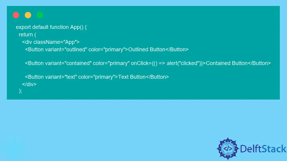
The most commonly used event handler for buttons is onClick. Let’s look at an example:
export default function App() {
  return (
    <div className="App">
      <Button variant="outlined" color="primary">Outlined Button</Button>

      <Button variant="contained" color="primary" onClick={() => alert("clicked")}>Contained Button</Button>

      <Button variant="text" color="primary">Text Button</Button>
    </div>
  );
In this example, if we click the second button, it will show a popup with the text clicked.
You can try it out yourself on codesandbox.
API for Custom <Button> Component in React
If you look at the API page for <Button> custom component, it doesn’t list onClick or other native event handlers as good props.
To keep the documentation short, all the natively available attributes and event handlers are absent from the official API documentation of the <Button> component.
That is because the library creators assume you know that all the native event handlers and attributes of a <button> HTML element are available for the custom <Button> component.

Irakli is a writer who loves computers and helping people solve their technical problems. He lives in Georgia and enjoys spending time with animals.
LinkedIn