How to Create and Visualize a Correlation Matrix in R
-
the
cor()Function in R - Prepare the Data to Create a Correlation Matrix in R
- Visualize a Correlation Matrix in R
- References
This article will first see how to prepare data to create a correlation matrix. We will then create a correlation matrix and visualize it.
Our sample code will use the dplyr, ggplot2 and GGally packages. These packages need to be installed if they are not available.
Example Code:
# Install required packages.

# Uncomment and run the concerned line.
# install.packages("dplyr")
# install.packages("ggplot2")
# install.packages("GGally")
the cor() Function in R
Base R provides the cor() function to compute the correlation coefficient between two numeric vectors or the correlation matrix for the numeric columns of a data frame or matrix.
The function’s documentation provides details about using its arguments, x, y, use and method.
The x argument takes the data. The use argument is required if there is any missing data.
The method is pearson by default.
Prepare the Data to Create a Correlation Matrix in R
The correlation coefficient can only be computed for numeric data. The data must not just look like numbers; it must be in numeric format.
There are two-factor columns in the following sample data frame comprised of numbers and a character column.
The cor() function cannot be used even on the columns with numbers because those numbers are not stored as numeric values.
Example Code:
# Vectors, data frame.
f1 = as.factor(c(7,7,3,11,7,5,5))
str(f1)
f2 = as.factor(c(6,6,6,12,6,4,2))
str(f2)
s = letters[4:10]

fr = data.frame(s,f1,f2)

# The data frame shows numbers.
fr

# But the numbers are not stored in numeric format.
str(fr)

# Correlation matrix cannot be computed.
cor(fr[2:3])
Output:
> # The data frame shows numbers.
> fr
  s f1 f2
1 d  7  6
2 e  7  6
3 f  3  6
4 g 11 12
5 h  7  6
6 i  5  4
7 j  5  2
> # But the numbers are not stored in numeric format.
> str(fr)
'data.frame':	7 obs. of  3 variables:
 $ s : chr  "d" "e" "f" "g" ...
 $ f1: Factor w/ 4 levels "3","5","7","11": 3 3 1 4 3 2 2
 $ f2: Factor w/ 4 levels "2","4","6","12": 3 3 3 4 3 2 1
> # Correlation matrix cannot be computed.
> cor(fr[2:3])
Error in cor(fr[2:3]) : 'x' must be numeric
Suppose the data is numeric but got stored as factors. We can convert the concerned columns to numeric.
This involves two steps to get the correct numbers rather than the factor levels. First, we convert to the character and then to numeric.
In the example code, we will use the mutate(), across() and all_of() functions and the pipe operator, %>%, from the dplyr package. The actual conversion is done using a custom function.
Example Code:
library(dplyr)

# This custom function does the actual conversion.
con_fn = function(k){
  return(as.numeric(as.character(k)))
}

# We will convert specific columns to numeric.
fr2 = fr %>% mutate(across(all_of(c("f1","f2")), con_fn))

# The columns are now numeric.
str(fr2)

# Compute the correlation matrix.
cor(fr2[2:3]) # No error now.
Output:
> # The columns are now numeric.
> str(fr2)
'data.frame':	7 obs. of  3 variables:
 $ s : chr  "d" "e" "f" "g" ...
 $ f1: num  7 7 3 11 7 5 5
 $ f2: num  6 6 6 12 6 4 2
> # Compute the correlation matrix.
> cor(fr2[2:3]) # No error now.
          f1        f2
f1 1.0000000 0.7833495
f2 0.7833495 1.0000000
We have successfully created a correlation matrix for the two numeric variables.
Visualize a Correlation Matrix in R
Before creating the visualization, we will add a few more columns. The last column is type int, which is also numeric.
Example Code:
# Reproducible vectors.
set.seed(555)
n1 = round(rnorm(7)+2,1)
set.seed(222)
n2 = sample(22:42, 7, replace=TRUE)

# Join the columns to the data frame.
fr3 = cbind(fr2, n1, n2)

# Check the structure.
str(fr3)

# Compute the correlation matrix.
cor(fr3[2:5])
Output:
> # Check the structure.
> str(fr3)
'data.frame':	7 obs. of  5 variables:
 $ s : chr  "d" "e" "f" "g" ...
 $ f1: num  7 7 3 11 7 5 5
 $ f2: num  6 6 6 12 6 4 2
 $ n1: num  1.7 2.5 2.4 3.9 0.2 2.9 1.8
 $ n2: int  36 39 41 30 31 30 39
> # Compute the correlation matrix.
> cor(fr3[2:5])
           f1         f2         n1         n2
f1  1.0000000  0.7833495  0.3124483 -0.5809116
f2  0.7833495  1.0000000  0.4938292 -0.4142586
n1  0.3124483  0.4938292  1.0000000 -0.1132145
n2 -0.5809116 -0.4142586 -0.1132145  1.0000000
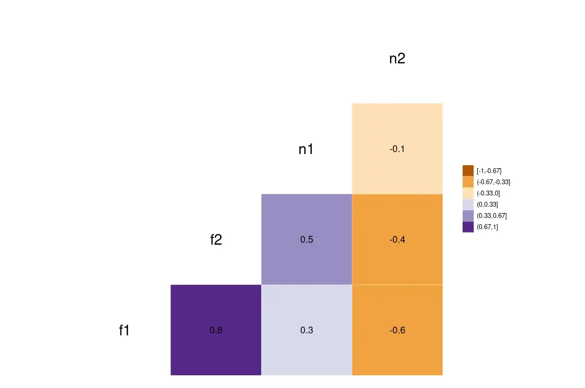
We will use the ggcorr() function from the GGally package to visualize the correlation matrix. This package depends on the ggplot2 package.
It is important to note that this function does two things. It computes the correlation matrix and then plots it.
By default, the ggcorr() function uses pairwise observations (if there are missing values) and computes the pearson correlation coefficient. It also uses ColorBrewer palettes.
-
Although the color can be graded continuously, we will use 6 discrete values. The argument
nbreaks=6achieves this result.The function divides the range -1 to 1 into 6 equal intervals.
- A divergent color palette is required because values of the correlation coefficients can range from negative to positive.
- We will use a color-blind friendly palette. This palette can provide up to 11 distinct color values.
- The argument
label=TRUEplots the correlation values on the color tiles.
Example Code:
# Load the GGally library.
# This loads ggplot2 also.
library(GGally)

# Visualize the correlation matrix.
ggcorr(fr3[2:5], nbreaks=6, palette="PuOr", label=TRUE, label_size=5, size=8, legend.size=10)
A plot of the correlation matrix. The darker shades represent a higher correlation.
The correlation ranges from -1 (represented by orange) to 1 (represented by purple).
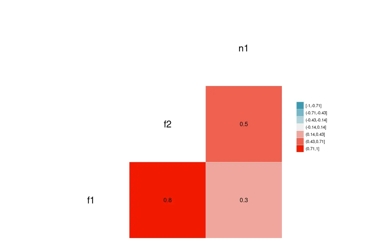
Suppose we have a correlation matrix and want to plot it. We can use the ggcorr() function by specifying data=NULL and supplying a correlation matrix using cor_matrix.
Example Code:
# Just three columns, for illustration.
fr4 = cor(fr3[2:4])
fr4

# Only visualize with given correlation matrix.
ggcorr(data = NULL, cor_matrix= fr4, nbreaks=7, label=TRUE, label_size=5, size=8, legend.size=10)
The plot of a given correlation matrix.
References
- For the
dplyrfunctions, refer to the package documentation. - The CRAN page of the
GGallypackage links to its manual.

Jesse is passionate about data analysis and visualization. He uses the R statistical programming language for all aspects of his work.