SciPy signal.butter
SciPy, a compact library of Python, issues some significant levels of algorithms considering optimization, statistics, and many other parameters. The signal package under this library focuses on common functions related to signal processing.
Butterworth filter is a special kind of digital filter and is one of the most common ones used in motion analysis and audio circuits. Also, the documentation of the functions under the signal package includes the butter that ensures Matlab style IIR filter design.
Designing filters manually is a comprehensive task, and monitoring the responses after applying them is tough.
So, the Python library updates with more intuitive functions (for both digital and analog signals) to mimic the manual cases. The scipy.signal.butter is such an addition.
The following section will cover an example of a Butterworth band-pass filter with scipy.signal.butter. This refers to having a cutoff (lowcut, highcut) frequency; thus, the filter will only accept a ranged response.
So the peak values are discarded, and a comparative flattened signal frequency is achieved with the best compromise in attenuation and phase difference.
Use scipy.signal.butter in Python
Specifically, the butter function takes overall 2 compulsory parameters. Firstly, it takes the order, which implies having the strength of the filter.
The higher the order, the best level of output is expected. Next, the array-like object has the passband and stopband frequency.
The Nyquist rate has a significant contribution to determining the sampling rate. Other than that, there would be the problem of aliasing and thus the risk of losing important frequency having data.
This concept is portrayed in the coding example in terms of some expressions.
Technically, the task is to take a noisy signal. Filter the expected ranged frequency via the butter function.
And thus, we get “no ripple” flat responses necessary for our specific case. Let’s jump to the code block for a better understanding.
Code Snippet:
from scipy.signal import butter, lfilter
import numpy as np
import matplotlib.pyplot as plt
Initially, the imports are performed. We have used Google Colab for the coding editor.
The following link will redirect you to the main code base.
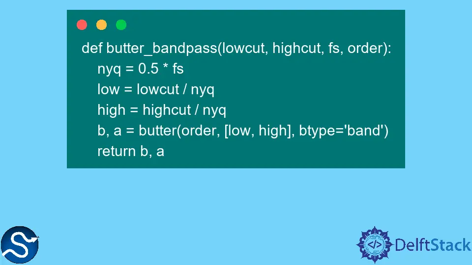
Next, we will have two user-defined functions. The first one will calculate the cutoff frequencies and then, through the butter function, will return the filter coefficient (b, a).
And the following function will have the input signal (the signal that requires to be filtered) and will return the filtered signal (y). Let’s view the classes.
def butter_bandpass(lowcut, highcut, fs, order):
    nyq = 0.5 * fs
    low = lowcut / nyq
    high = highcut / nyq
    b, a = butter(order, [low, high], btype="band")
    return b, a
def butter_bandpass_filter(x, lowcut, highcut, fs, order):
    b, a = butter_bandpass(lowcut, highcut, fs, order)
    y = lfilter(b, a, x)
    return y
In the next stage, we will generate a random noisy signal with a frequency, period, and most other parameters required to develop signals. We will call the butter_bandpass() and butter_bandpass_filter() functions for filtering the noisy signal.
def filtering():

    fs = 5000.0
    lowcut = 500.0
    highcut = 1000.0
    T = 0.05
    nsamples = int(T * fs)
    t = np.linspace(0, T, nsamples, endpoint=False)
    sig = np.sin(2 * np.pi * 2 * t)
    noise = 5 * np.random.randn(nsamples)
    x = sig + noise
    order = 5

    plt.figure(figsize=(10, 12))

    plt.subplot(3, 1, 1)
    plt.plot(t, x, "m", label="Noisy signal")
    plt.legend(loc="upper left")
    plt.grid(True)
    plt.axis("tight")

    y = butter_bandpass_filter(x, lowcut, highcut, fs, order)
    plt.subplot(3, 1, 2)
    plt.plot(t, y, "orange", label="Filtered signal")
    plt.xlabel("time (seconds)")
    plt.grid(True)
    plt.axis("tight")
    plt.legend(loc="upper left")

    plt.subplot(3, 1, 3)
    plt.plot(t, x, label="Noisy signal")
    plt.plot(t, y, label="Filtered signal")

    plt.show()


filtering()
And the output projects:
-
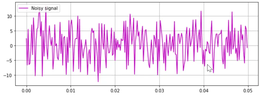
Noisy signal (input signal) plot
-
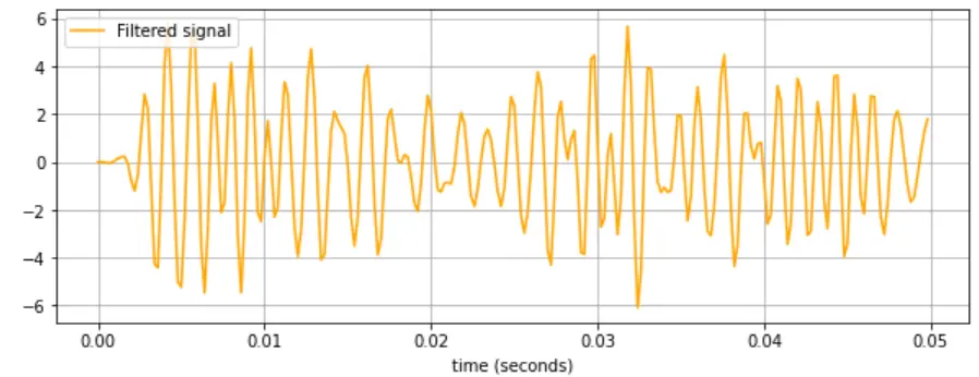
Filtered signal (after applying Butterworth filter)
-
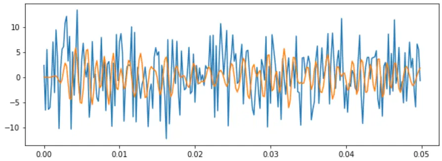
Preview of noisy signal and filtered signal together
As in the last code fence, you will see how we used matplotlib to show the results. In the first plot (magenta), we have the generated noisy signal, and from the y-axis values, you will notice that the signal peaks reach over 10 and -10.
In the second plot (orange), you will see the filtered signal has a limit from 6 to -6 on the vertical axis. The measurements are based on the gain and the overall frequency range.
The final plot (blue and orange) depicts how successively the Butterworth filter worked on the input signal. This plot is the merged version of the prior two plots.