How to Get Browser Width in JavaScript
- Using the Window Object
- Using the Document Element
- Using Resize Events
-
Use
inner.widthandinner.height - Conclusion
- FAQ

When developing web applications, understanding the browser width is crucial for creating responsive designs that enhance user experience. JavaScript provides several methods to retrieve the width of the browser window, allowing developers to adapt their layouts dynamically. Whether you’re building a mobile-friendly site or a complex web application, knowing how to get the browser width is an essential skill in your toolkit.
In this article, we will explore various methods to obtain the browser width using JavaScript. We’ll delve into practical examples, ensuring you have a clear understanding of how to implement these techniques in your projects. By the end, you’ll be equipped with the knowledge to effectively manage your website’s layout based on the user’s browser width.
Using the Window Object
One of the simplest methods to get the browser width is by utilizing the window object. This object provides properties and methods to interact with the browser window, including the innerWidth property, which returns the width of the viewport in pixels.
Here’s how you can use it:
let browserWidth = window.innerWidth;
console.log(browserWidth);
When you run this code, it captures the current width of the browser window and logs it to the console. The innerWidth property gives you the width of the viewport, which is the area where content is displayed, excluding toolbars and scrollbars. This is particularly useful for responsive design, as it allows you to adjust styles or layout based on the size of the user’s screen.
Output:
1024
In this example, if the browser width is 1024 pixels, that value will be printed to the console. You can use this value to conditionally apply CSS classes or adjust JavaScript functionality, ensuring that your application behaves correctly across various devices.
Using the Document Element
Another effective way to get the browser width is by accessing the document.documentElement property. This approach can be particularly useful when you need to consider the entire document’s width, including any potential scrollbars.
Here’s the code snippet to achieve this:
let browserWidth = document.documentElement.clientWidth;
console.log(browserWidth);
In this example, document.documentElement.clientWidth retrieves the width of the visible area of the browser, which is often the same as window.innerWidth. However, it can provide different results in some scenarios, especially when scrollbars are present. The method is reliable for ensuring that you are getting the correct width without including the scrollbar width, which can be crucial for layout adjustments.
Output:
1024
When you run this code, it will similarly log the browser width to the console. This method is particularly beneficial when working with CSS and JavaScript together, as it allows for precise control over layout elements, ensuring they fit well within the viewport dimensions.
Using Resize Events
To make your web application responsive, you might want to listen for changes in the browser width as the user resizes the window. JavaScript provides the resize event, which you can use to trigger a function whenever the window is resized.
Here’s how you can implement this:
window.addEventListener('resize', function() {
    let browserWidth = window.innerWidth;
    console.log(browserWidth);
});
In this code, we set up an event listener for the resize event on the window object. Each time the user resizes the browser, the function will execute and log the new width to the console. This is particularly useful for applications that need to adjust their layout or styles dynamically as the user changes the size of the browser window.
Output:
800
If the browser is resized to 800 pixels, that value will be printed. By using this technique, you can ensure that your web application responds fluidly to user interactions, providing a seamless experience regardless of the device or screen size.
Use inner.width and inner.height
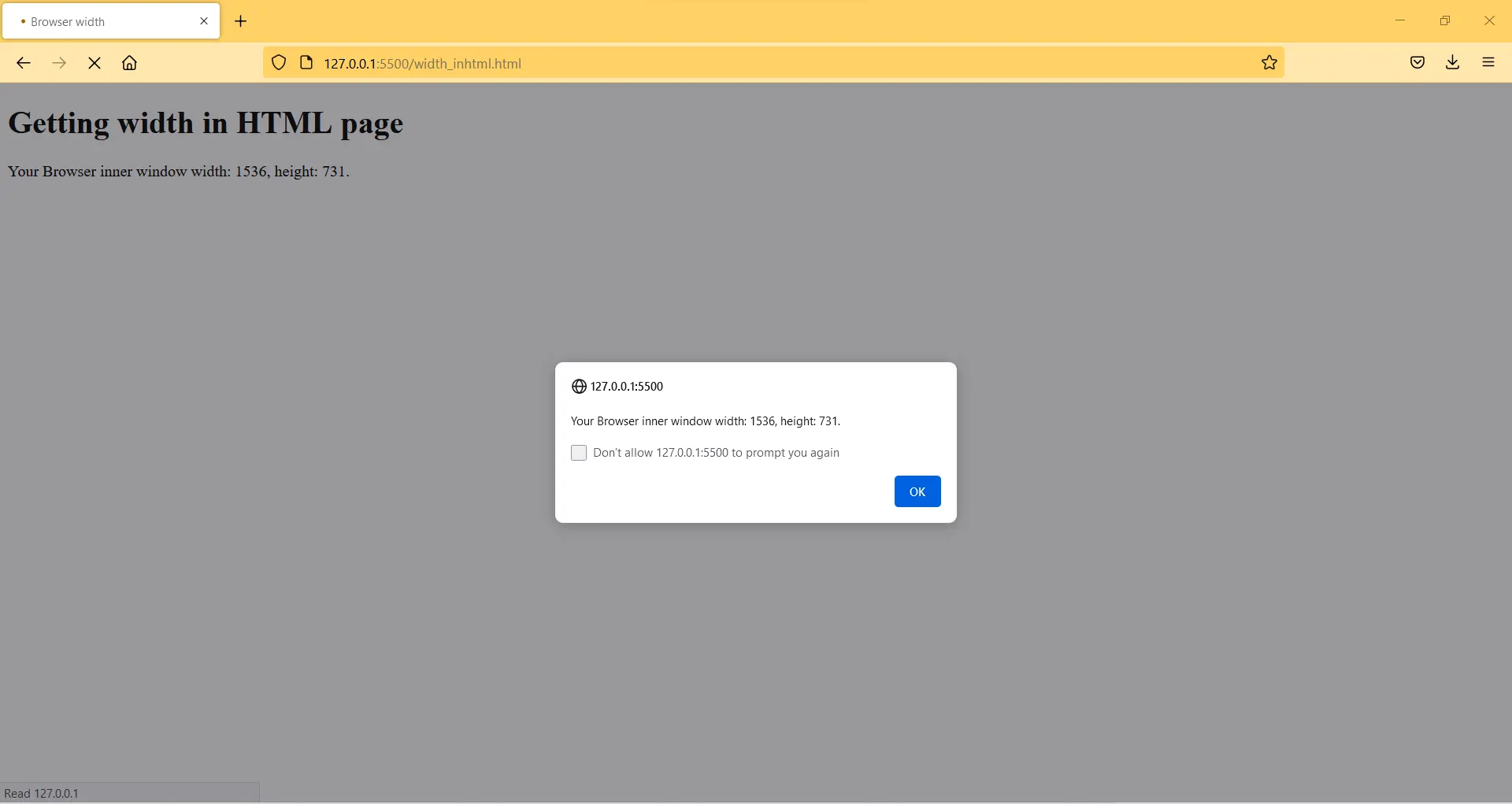
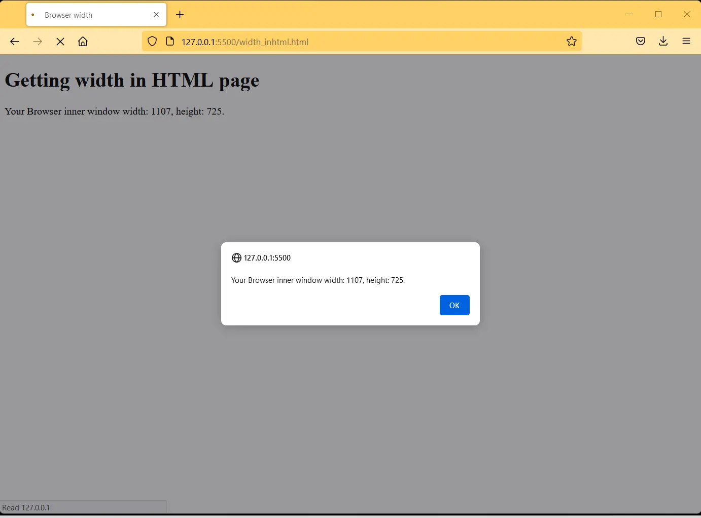
We will create an HTML page in which we will do scripting inside the body of the code.
In the scripting section, we will write a code that will display the inner width of the browser in the output.
When we run the HTML code, a page opens in the browser. We used the alert method in the scripting to display a message on the page.
<!DOCTYPE html>
<html lang="en">
<head>
    <meta charset="UTF-8">
    <meta http-equiv="X-UA-Compatible" content="IE=edge">
    <meta name="viewport" content="width=device-width, initial-scale=1.0">
    <title>Browser width</title>
    <h1>Getting width in HTML page</h1>
</head>
<body>
    <p id="demo"></p>
    <script>
        var w = window.innerWidth
        || document.documentElement.clientWidth
        || document.body.clientWidth;
        var h = window.innerHeight
        || document.documentElement.clientHeight
        || document.body.clientHeight;
        var x = document.getElementById("demo");
        x.innerHTML = "Your Browser inner window width: " + w + ", height: " + h + ".";
        alert("Your Browser inner window width: " + w + ", height: " + h + ".");
        </script>
</body>
</html>
The display message will show the inner width and height of the browser. The width and height are default in this case.
But when we change the width of the browser. The display message will show different widths and heights of the browser.
Output:
Your Browser inner window width: 362, height: 450.
The inner.width gives us the inner width of the browser. The inner.height gives us the inner height of the browser.
Conclusion
Understanding how to get the browser width in JavaScript is a fundamental aspect of web development. By utilizing the window object, the document element, and resize events, you can create responsive designs that adapt to various screen sizes. These techniques empower you to enhance user experience and ensure your web applications are functional across all devices.
As you implement these methods in your projects, remember that responsiveness is key to modern web design. By mastering how to retrieve and utilize browser width, you’ll be well on your way to creating engaging and user-friendly web applications.
FAQ
-
How can I get the browser width on page load?
You can use thewindow.innerWidthproperty inside a script that runs when the page loads. -
Is there a difference between
innerWidthandclientWidth?
Yes,innerWidthincludes the width of the scrollbar, whileclientWidthdoes not. -
Can I get the browser width in a specific element?
Yes, you can useelement.clientWidthto get the width of a specific HTML element. -
How do I handle browser width changes in real-time?
You can use theresizeevent listener to detect changes in browser width and respond accordingly. -
What is the best practice for responsive design?
Use media queries in CSS along with JavaScript to adjust layouts based on the browser width.

My name is Abid Ullah, and I am a software engineer. I love writing articles on programming, and my favorite topics are Python, PHP, JavaScript, and Linux. I tend to provide solutions to people in programming problems through my articles. I believe that I can bring a lot to you with my skills, experience, and qualification in technical writing.
LinkedIn