How to Place HTML Div Side by Side
This post will look at many methods for showing two div elements side by side in an HTML document.
Use the float property
Using the float CSS property, text and inline elements can wrap around an element positioned on its container’s left or right side. The element is nevertheless included in the flow of the page, even if it is not part of the regular flow.
Syntax:
float: $value;
This value can be anything like left, right, none, inline-start, inline-end, etc.
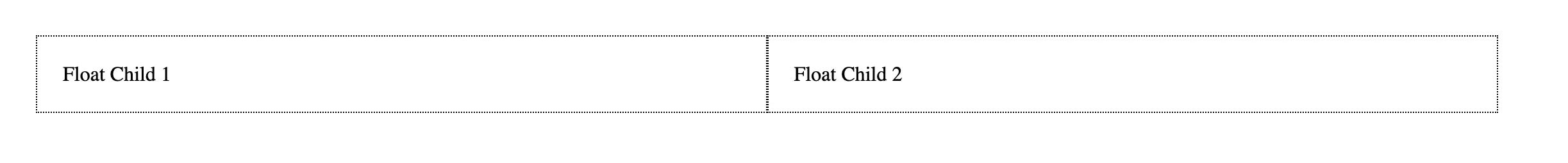
To further understand the previous concept, consider the following example.
<div class="float-parent">
  <div class="float-child">Float Child 1</div>
  <div class="float-child">Float Child 2</div>
</div>
.float-parent {
    padding: 20px;
}

.float-child {
    width: 45%;
    float: left;
    padding: 20px;
    border: 1px dotted black;
}
In the preceding example, we are floating each div to put them side by side using the float attribute. They will display side by side if there is the adequate room because they are both floating to the left.
We have two .float-child divs, each with a width of 45%, so they fit.
Run the above line of code in any browser compatible with HTML. It will display the following outcome.
Use the flexbox property
Without requiring float or positioning, the Flexible Box Layout module makes it simpler to develop flexible, responsive layout structures. Flexbox is mobile-friendly and responsive, making it handy for designing small-scale layouts.
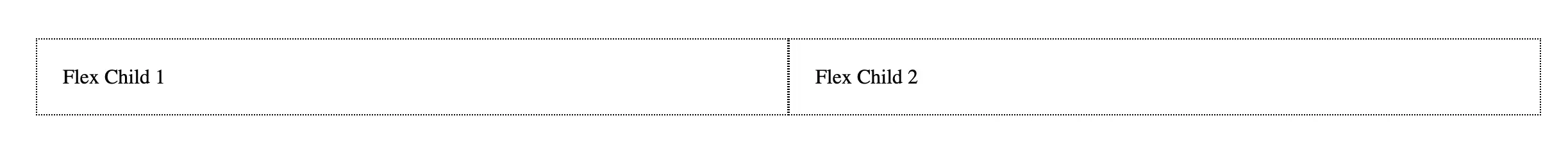
To further understand the previous concept, consider the following example.
<div class="flex-parent">
  <div class="flex-child">Flex Child 1</div>
  <div class="flex-child">Flex Child 2</div>
</div>
.flex-parent {
    display: flex;
    padding: 20px;
}

.flex-child {
    flex: 1;
    padding: 20px;
    border: 1px dotted black;
}
In the preceding example, we’ve set display: flex; on the parent div container using the class .flex-parent element of flexbox. This activates flexbox.
Then we are setting flex: 1; in each .flex-child div element. This figure functions as a ratio between the widths of each child flex element in the parent flex element.
They will share the available space equally because they are identical. We have two child div components; therefore, each div will take up 50% of the space.
Run the above line of code in any browser compatible with HTML. It will display the following outcome.
Use css grid
CSS Grid layout excels in dividing a page into major regions and specifying the connection between components of an HTML primitive-based control.
One important change with grid is that you first choose what the grid template will look like. Referring to the number of columns and/or rows you desire in your layout.
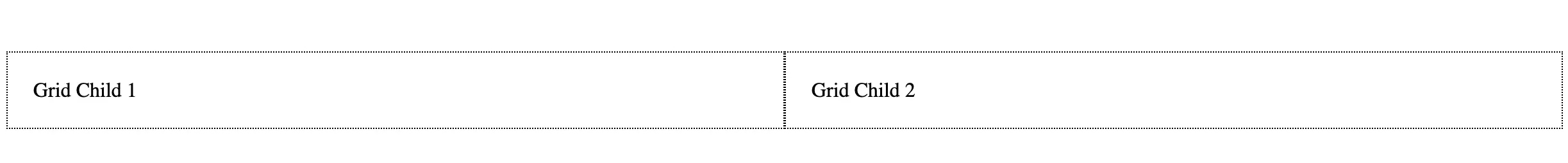
To further understand the previous concept, consider the following example.
<div class="grid-parent">
    <div class="grid-child">
        Grid Child 1
    </div>
    <div class="grid-child">
        Grid Child 2
    </div>
</div>
.grid-parent {
    display: grid;
    grid-template-columns: 1fr 1fr;
}

.grid-child {
    flex: 1;
    padding: 20px;
    border: 1px dotted black;
}
In this instance, we want two columns with equal widths. So, we use the display: grid; property to enable grid in the parent div element via class .grid-container element.
The grid-template-columns parameter is then used to add the number of columns we desire in our layout.
We set it to 1fr 1fr because we want two columns of the same width. This instructs the browser to generate a two-column layout with a 1 fr = fractional unit spacing between each column.
The flex: 1 rule we used in the flexbox approach is analogous to the fr unit, which is a ratio of one column to another. Each column will use the same amount of space if the columns are set to 1fr 1fr.
Run the above line of code in any browser compatible with HTML. It will display the following outcome.

Shraddha is a JavaScript nerd that utilises it for everything from experimenting to assisting individuals and businesses with day-to-day operations and business growth. She is a writer, chef, and computer programmer. As a senior MEAN/MERN stack developer and project manager with more than 4 years of experience in this sector, she now handles multiple projects. She has been producing technical writing for at least a year and a half. She enjoys coming up with fresh, innovative ideas.
LinkedIn