HTML Three Column Layout
Websites frequently use multiple columns to display content. Column layout can be designed in numerous ways per the designer’s requirements.
We can build responsive and appealing column layouts with a combination of HTML and CSS. In this article, we will focus on designing a 3-column layout.
Create a Three Column Layout in HTML
Generally, HTML columns are defined using the <div> tag . In between the <div> tag, we define the class with the row keyword.
While defining three column layout, it should create three <div> elements and three column classes between them.
Let’s look at the following example.
<!DOCTYPE html>
<html>
    <head>
        <title>html 3 column layout</title>
        <link rel="stylesheet" href="style1.css">
    </head>

    <body>
        <h1>
            Column three layout
        </h1>
        <div class="row">
              <div class="column" style="background-color:#404040;">Content of the column</div>
              <div class="column" style="background-color:#a0a0a0;">Content of the column</div>
              <div class="column" Style="background-color:#dcdcdc;">Content of the column</div>
        </div>
    </body>
</html>
Considering the above HTML code, we declared the row class inside the first <div> element inside it. Three columns are defined as classes that can divide the entire browser area.
Using the style element, we can add background colors for the three columns.
The content of the columns is absolutely up to the designer’s thoughts. With the help of the above code, we can design a simple 3-column layout.
It is highly recommended to add some CSS properties to get a proper 3-column layout. We can use the CSS code below for that purpose.
Add CSS Properties to the HTML Column Layout
We can create a basic column layout using HTML properties, but with the help of CSS properties, it would be extra interactive. They help to style the columns.
*{
    box-sizing: border-box;
}

.row{
   display:grid;
   grid-template-columns: 33.33% 33.33% 33.33%;
   justify-content: center;
   text-align: center;
   font-size: 25px;
   height: 300px;
}
The 3-column layout can be made as a grid. The above CSS code denotes how to use the display property to display the grid layout.
We have the grid-template-columns property to divide the whole area of the browser space into the same three columns.
CSS property height defined the height of the column. The justify-content property is used to justify the content in each column.
Additionally, we added text-align and font-size.
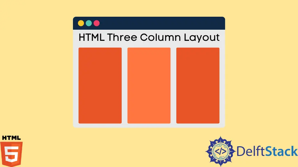
As a result of the HTML and CSS codes above, we can get a 3-column layout like the following.
Web layout must fit with distinctive types of screens. We will create a responsive HTML 3-column layout to assist with a few HTML elements.
Let’s check the way how to design a responsive column layout.
Create a Responsive Three Column Layout in HTML
There are several ways to make the column layout responsive. We can add a viewport element to adjust the layout to different screens.
<meta name="viewport" content="width=device-width, initial-scale=1">
The <meta> tag is used to add the viewport element that will set the viewport of the web page. Setting the web page’s viewport will instruct the browser to manage the page’s size and scale.
Using the above HTML code, we can make the column layout suit all the different types of screen sizes. We should add the above code inside the head element of the HTML code as the following code.
<!DOCTYPE html>
<html>
    <head>
        <title>html 3 column layout</title>
        <link rel="stylesheet" href="style1.css">
        <meta name="viewport" content="width=device-width, initial-scale=1">
        <style>
            *{
                box-sizing: border-box;
            }
            .row{

                display:grid;
                grid-template-columns: 33.33% 33.33% 33.33%;
                justify-content: center;
                text-align: center;
                font-size: 25px;
                height: 300px;
            }
        </style>
    </head>

    <body>
        <h1>
            Column three layout
        </h1>
        <div class="row">
              <div class="column" style="background-color:#404040;">Content of the column</div>
              <div class="column" style="background-color:#a0a0a0;">Content of the column</div>
              <div class="column" Style="background-color:#dcdcdc;">Content of the column</div>
        </div>
    </body>
</html>
Conclusion
The HTML 3-column layout can be created by simply defining the <div> element with the row and column classes and adding some CSS style properties. This article discussed creating a basic 3-column layout using HTML and adding a few CSS properties to style them.

Nimesha is a Full-stack Software Engineer for more than five years, he loves technology, as technology has the power to solve our many problems within just a minute. He have been contributing to various projects over the last 5+ years and working with almost all the so-called 03 tiers(DB, M-Tier, and Client). Recently, he has started working with DevOps technologies such as Azure administration, Kubernetes, Terraform automation, and Bash scripting as well.