CSS Transition With Multiple Properties
The language used to style a web page is called CSS, which stands for Cascading Style Sheets. CSS explains how HTML components should appear on a screen, paper, or other media.
A lot of work is saved via CSS. It can manage the design of several web pages simultaneously.
In CSS files, external stylesheets are kept.
the transition Property of CSS
CSS transitions are the quickest (and cleanest) way to animate your components. Learn how CSS transitions function in this tutorial and how to use them to create animations.
When a CSS property switches from one value to another over time, a transition takes place. Four CSS properties: transition-property, transition-duration, transition-timing-function, and transition-delay are combined to form the transition property.
Example code:
.selector {
transition-property: property;
transition-duration: duration;
transition-timing-function: timing-function;
transition-delay: delay}
You can also use all four abovementioned properties in just one statement, as shown in the following code example.
.selector {
transition: property duration timing-function delay;
}
How to Trigger Transition in CSS
CSS transitions may be triggered immediately by using pseudo-classes like hover (which activates when the mouse is over an element), focus (which activates when a user clicks into an input element or tabs into an element), or active (activates when the user clicks on the element).
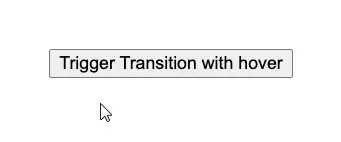
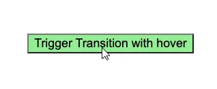
Trigger transition With hover
The transition property can be triggered by hover, as shown in the below example.
<!DOCTYPE html>
<html>
    <head>
        <style>
        body {
            display: flex;
            min-height: 50vh;
            justify-content: center;
            align-items: center;
        }
        .button {
            font-size: 3em;
            font-family: inherit;
            border: none;
            background-color: #33ae74;
            padding: 0.5em 0.75em;
            transition: background-color 0.5s ease-out;
        }
        .button:hover {
            background-color: lightgreen;
        }
        </style>
    </head>
    <body>
        <button class="button">Trigger Transition with hover</button>
    </body>
</html>
Output:
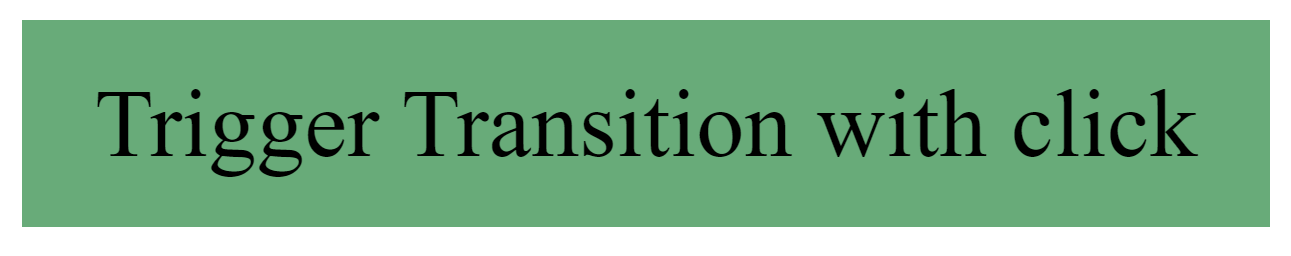
Trigger transition With Click
You can activate a transition with a click, as shown in the below example. Just a single click activates the transition color.
Example code:
<!DOCTYPE html>
<html>
   <head>
      <style>
      body {
      display: flex;
      min-height: 50vh;
      justify-content: center;
      align-items: center;
      }
      .button {
      font-size: 3em;
      font-family: inherit;
      border: none;
      background-color: #33ae74;
      padding: 0.5em 0.75em;
      transition: background-color 0.5s ease-out;
      }
      .button.is-active {
      background-color: lightblue;
      }
      </style>
  </head>
      <body>
          <button class="button">Trigger Transition with click</button>
      </body>
</html>
const button = document.querySelector('.button');
button.addEventListener('click', _ => button.classList.toggle('is-active'));
Output:
Conclusion
There are a total of four transition properties of CSS. You can use the transition properties of CSS separately and use all four properties in just one statement mentioned in the article above.

Zeeshan is a detail oriented software engineer that helps companies and individuals make their lives and easier with software solutions.
LinkedIn