여러 속성이 있는 CSS 전환

웹 페이지의 스타일을 지정하는 데 사용되는 언어를 CSS라고 하며 Cascading Style Sheets를 의미합니다. CSS는 HTML 구성 요소가 화면, 종이 또는 기타 미디어에 어떻게 나타나야 하는지 설명합니다.
많은 작업이 CSS를 통해 저장됩니다. 그것은 동시에 여러 웹 페이지의 디자인을 관리할 수 있습니다.
CSS 파일에서는 외부 스타일시트가 유지됩니다.
CSS의 전환 속성
CSS 전환은 구성 요소에 애니메이션을 적용하는 가장 빠르고 깔끔한 방법입니다. 이 자습서에서 CSS 전환이 작동하는 방식과 전환을 사용하여 애니메이션을 만드는 방법을 알아보세요.
CSS 속성이 시간이 지남에 따라 한 값에서 다른 값으로 전환되면 전환이 발생합니다. 4개의 CSS 속성: transition-property, transition-duration, transition-timing-function 및 transition-delay가 결합되어 transition 속성을 형성합니다.
예제 코드:
.selector {
transition-property: property;
transition-duration: duration;
transition-timing-function: timing-function;
transition-delay: delay}
다음 코드 예제와 같이 하나의 명령문에서 위에서 언급한 네 가지 속성을 모두 사용할 수도 있습니다.
.selector {
transition: property duration timing-function delay;
}
CSS에서 전환을 트리거하는 방법
CSS 전환은 hover(마우스가 요소 위에 있을 때 활성화됨), focus(사용자가 입력 요소를 클릭하거나 요소로 탭할 때 활성화됨) 또는 와 같은 의사 클래스를 사용하여 즉시 트리거될 수 있습니다. 활성(사용자가 요소를 클릭하면 활성화됨).
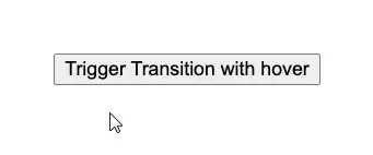
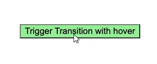
호버로 전환 트리거
transition 속성은 아래 예제와 같이 hover에 의해 트리거될 수 있습니다.
<!DOCTYPE html>
<html>
    <head>
        <style>
        body {
            display: flex;
            min-height: 50vh;
            justify-content: center;
            align-items: center;
        }
        .button {
            font-size: 3em;
            font-family: inherit;
            border: none;
            background-color: #33ae74;
            padding: 0.5em 0.75em;
            transition: background-color 0.5s ease-out;
        }
        .button:hover {
            background-color: lightgreen;
        }
        </style>
    </head>
    <body>
        <button class="button">Trigger Transition with hover</button>
    </body>
</html>
출력:
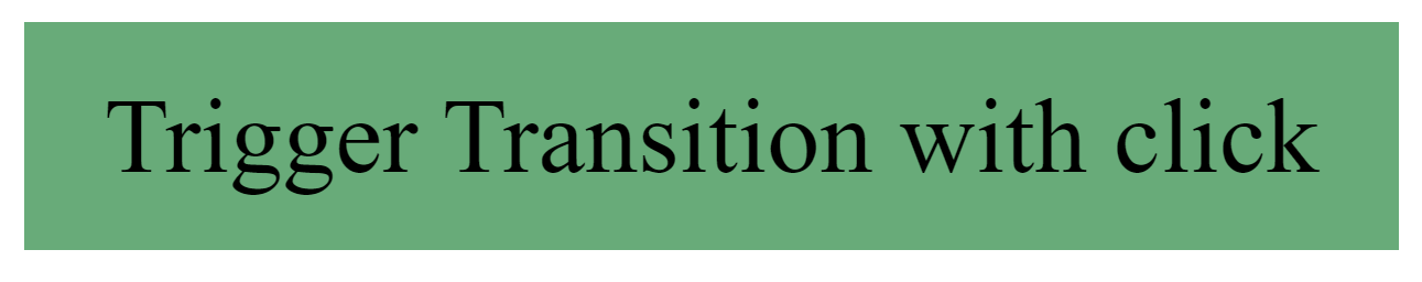
클릭으로 전환 트리거
아래 예와 같이 클릭 한 번으로 전환을 활성화할 수 있습니다. 단 한 번의 클릭으로 전환 색상이 활성화됩니다.
예제 코드:
<!DOCTYPE html>
<html>
   <head>
      <style>
      body {
      display: flex;
      min-height: 50vh;
      justify-content: center;
      align-items: center;
      }
      .button {
      font-size: 3em;
      font-family: inherit;
      border: none;
      background-color: #33ae74;
      padding: 0.5em 0.75em;
      transition: background-color 0.5s ease-out;
      }
      .button.is-active {
      background-color: lightblue;
      }
      </style>
  </head>
      <body>
          <button class="button">Trigger Transition with click</button>
      </body>
</html>
const button = document.querySelector('.button');
button.addEventListener('click', _ => button.classList.toggle('is-active'));
출력:
결론
CSS에는 총 4개의 transition 속성이 있습니다. CSS의 transition 속성을 개별적으로 사용할 수 있으며 위 문서에서 언급한 하나의 명령문에서 네 가지 속성을 모두 사용할 수 있습니다.

Zeeshan is a detail oriented software engineer that helps companies and individuals make their lives and easier with software solutions.
LinkedIn