How to Implement Flex Layout in Angular
- Problems with CSS-Based Flexbox
- The Flex Layout in Angular
- Steps to Implement Flex Layout in Angular
This tutorial will discuss and demonstrate how to use the Angular flex layout.
Angular flex layout is an Angular component that implements a flexbox-based responsive layout system. It lets us build layouts that respond well on mobile devices and desktop screens.
Flexbox is a layout mode that arranges items in the container according to available space and the order specified in the source code, which means it will automatically adjust depending on the size of the screen.
This is different from other layout modes such as grid or absolute positioning, where items have explicitly set positions.
Problems with CSS-Based Flexbox
CSS-based flexbox is an easy and intuitive way to create layouts, but some problems arise when using this method. One of the major problems is the lack of support for older browsers like IE 9, IE 10, Safari 5, and Opera 12.
Another problem with CSS-based flexbox is that it doesn’t work well with responsive design. This is because it’s hard to make a layout look good on different screen sizes without adding extra code or images.
The quantity of CSS generated for flexbox CSS is enormous (>250k), and we must alter the child flexbox stylings if we change the layout direction. Customized media query breakpoints are also not supported.
The preceding issues were addressed by using an angular flex layout. Angular flex layout is a TypeScript-only UI layout engine that specifies layout settings via HTML markup (Layout API).
The Flex Layout in Angular
The Angular flex layout is a new layout engine for Angular introduced in version 4.0. Flex layouts are a child of the CSS Flexible Box Layout Module (or simply “flexbox”).
Flex layouts allow for a more natural and intuitive way to specify how to layout content inside a container. This can be done by defining the central axis, which determines how flex items are distributed in the container and then specifying one or more secondary axes that define their size and position relative to other items.
The main advantages of using an Angular flex layout are:
- it is easier to use than other options;
- it allows you to create responsive designs quickly;
- it’s not limited to just two dimensions like floats or inline-block;
- it has more options than CSS Grid.
To create responsive layouts using standard CSS flexbox or CSS grid, we must write complicated CSS code using media queries. It’s also challenging to comprehend.
However, we can use flexbox attributes to declare flexbox layout parameters directly within the HTML template with the new Angular flexbox layout.
Steps to Implement Flex Layout in Angular
Angular flex layout enables developers to create responsive UI layouts. It is designed to be used in the browser and supports mobile and desktop environments.
The tutorial will walk you through the following steps:
-
Create a new project using the Angular CLI.
-
Add Bootstrap CSS framework.
-
Add a flex layout module to your project.
-
Add a container component.
-
Create two components (a header and a footer component).
-
Implement flex-direction property on the container component.
Let’s discuss an Angular flex layout example using the steps mentioned above.
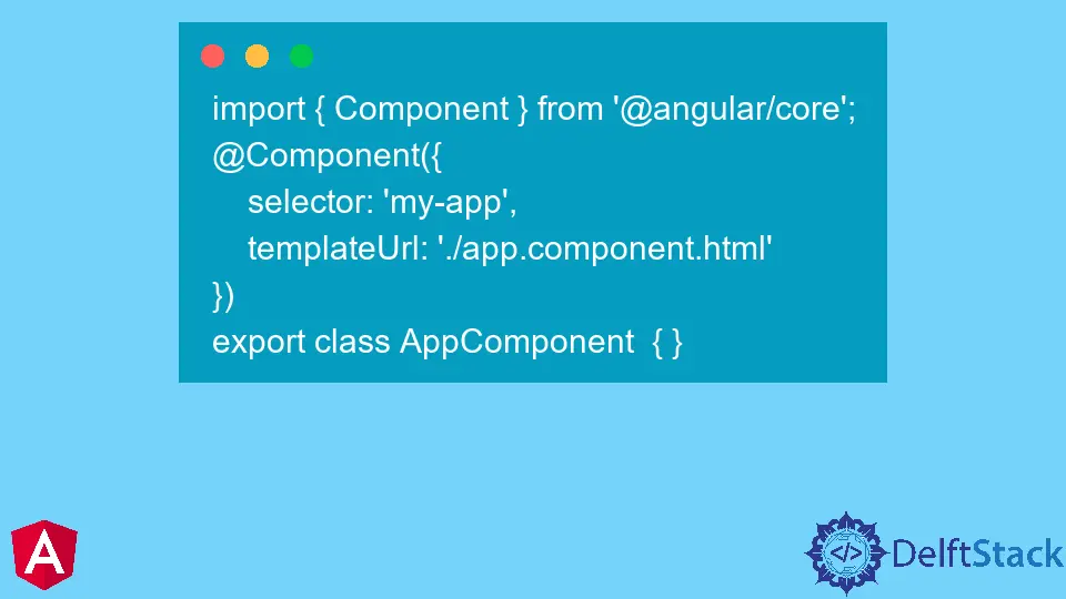
TypeScript code:
import { Component } from '@angular/core';
@Component({
    selector: 'my-app',
    templateUrl: './app.component.html'
})
export class AppComponent  { }
HTML code:
<div fxLayout="column" fxLayoutAlign="center">
<mat-card fxFlex="100">
<div fxLayout="column">
    <div fxFlex="60" class="action-blurb">Home</div>
    <div fxFlex="90" class="action-blurb" fxFlexOffset="20">Contact US</div>
</div>
</mat-card>
</div>
Click here to check the live demonstration of the code above.

Muhammad Adil is a seasoned programmer and writer who has experience in various fields. He has been programming for over 5 years and have always loved the thrill of solving complex problems. He has skilled in PHP, Python, C++, Java, JavaScript, Ruby on Rails, AngularJS, ReactJS, HTML5 and CSS3. He enjoys putting his experience and knowledge into words.
Facebook