Matplotlib 密度圖
Suraj Joshi
2024年2月15日
Matplotlib
Matplotlib Plot
-
使用
scipy.stats模組中的gaussian_kde()方法生成密度圖 -
使用
seaborn包中的kdeplot()方法生成密度圖 -
使用
distplot()方法從seaborn包中生成密度圖 -
在
pandas.DataFrame.plot()方法中設定kind='density'來生成密度圖

為了使用 Python 生成密度圖,我們首先使用 scipy.stats 模組中的 gaussian_kde() 方法從給定資料中估計密度函式。然後我們繪製密度函式,生成密度圖。另外,我們也可以使用 seaborn 包中的 kdeplot() 或者在 pandas.DataFrame.plot() 方法中設定 kind='density'來生成密度圖。
使用 scipy.stats 模組中的 gaussian_kde() 方法生成密度圖
import numpy as np
import matplotlib.pyplot as plt
from scipy.stats import kde

data = [2, 3, 3, 4, 2, 1, 5, 6, 4, 3, 3, 3, 6, 4, 5, 4, 3, 2]
density = kde.gaussian_kde(data)
x = np.linspace(-2, 10, 300)
y = density(x)

plt.plot(x, y)
plt.title("Density Plot of the data")
plt.show()
輸出:
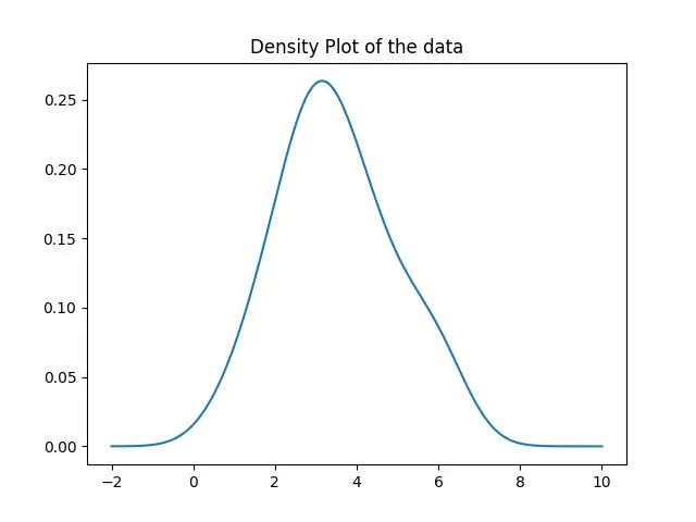
在這裡,我們首先使用 gaussian_kde() 方法估計給定資料的密度函式。然後,我們用 plot() 方法繪製出從 -2 到 10 的值的函式。
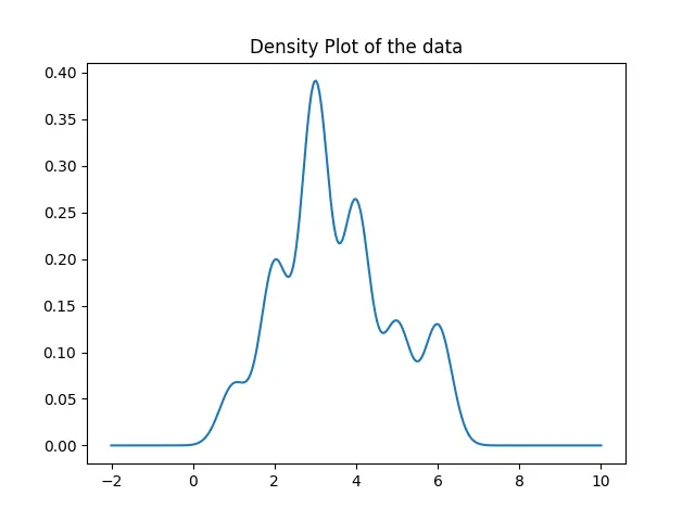
生成的密度圖足夠是不精確的,這是由 gaussian_kde 函式自動設定頻寬而導致的。為了設定頻寬,我們可以使用 gaussian_kde 類的 covariance_factor 函式。然後我們呼叫 _compute_covariance 方法,使所有的因子都能正確計算,從而生成精確的圖。
import numpy as np
import matplotlib.pyplot as plt
from scipy.stats import kde

data = [2, 3, 3, 4, 2, 1, 5, 6, 4, 3, 3, 3, 6, 4, 5, 4, 3, 2]
prob_density = kde.gaussian_kde(data)
prob_density.covariance_factor = lambda: 0.25
prob_density._compute_covariance()

x = np.linspace(-2, 10, 300)
y = prob_density(x)

plt.plot(x, y)
plt.title("Density Plot of the data")
plt.show()
輸出:
使用 seaborn 包中的 kdeplot() 方法生成密度圖
import matplotlib.pyplot as plt
import seaborn as sns

data = [2, 3, 3, 4, 2, 1, 5, 6, 4, 3, 3, 3, 6, 4, 5, 4, 3, 2]
sns.kdeplot(data, bw=0.25)
plt.show()
輸出:
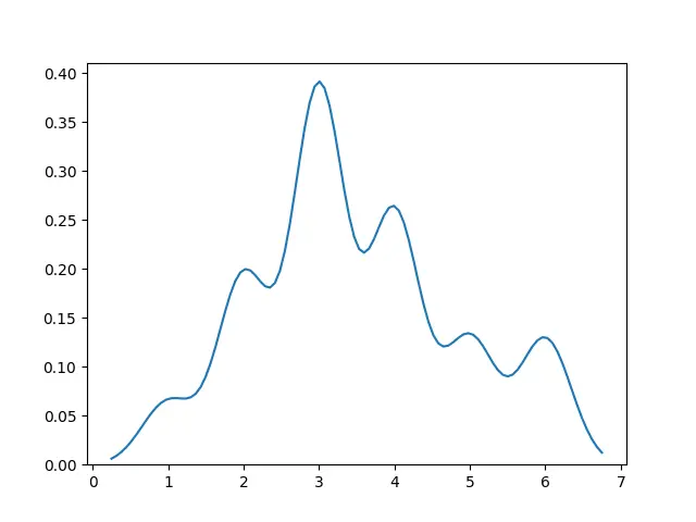
這樣,我們只需將資料傳入 kdeplot() 方法就可以生成密度圖。
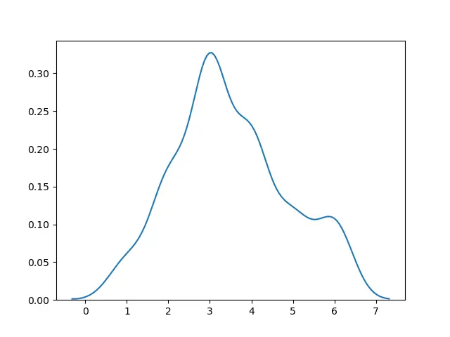
使用 distplot() 方法從 seaborn 包中生成密度圖
我們也可以使用 seaborn 包中的 distplot() 方法,並設定 hist=False 來生成密度圖。
import matplotlib.pyplot as plt
import seaborn as sns

data = [2, 3, 3, 4, 2, 1, 5, 6, 4, 3, 3, 3, 6, 4, 5, 4, 3, 2]
sns.distplot(data, hist=False)
plt.show()
輸出:
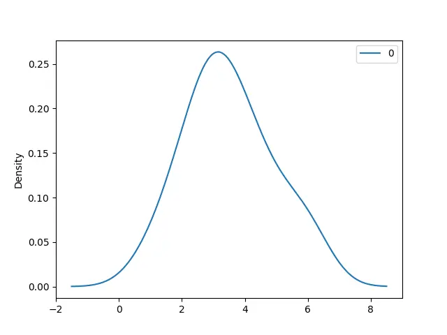
在 pandas.DataFrame.plot() 方法中設定 kind='density'來生成密度圖
import pandas as pd
import matplotlib.pyplot as plt

data = [2, 3, 3, 4, 2, 1, 5, 6, 4, 3, 3, 3, 6, 4, 5, 4, 3, 2]
df = pd.DataFrame(data)
df.plot(kind="density")
plt.show()
輸出:
Enjoying our tutorials? Subscribe to DelftStack on YouTube to support us in creating more high-quality video guides. Subscribe
作者: Suraj Joshi

Suraj Joshi is a backend software engineer at Matrice.ai.
LinkedIn