TUTORIAL · Tkinter
Tkinter Tutorial - Combobox
Tutorial of Python Tkinter combobox
On this page
A ttk.Combobox is a Tkinter field with a drop-down list of choices. Set its values option to populate the list, call current(index) to select by position, and use get() to read the displayed text. A populated list does not select its first item automatically. The short Python example below illustrates the index and text relationship without creating a window; actual widget snippets in this guide are shown inline because the supplied execution environment has no graphical display. For selection callbacks, bind the exact virtual-event name <<ComboboxSelected>> so your handler responds when a user picks an item. (<<ComboboxSelected>>)
Python Tkinter ttk.Combobox Example
This small example shows how an explicit selection maps to its position and displayed text. It runs without opening a Tk window.
months = ["January", "February", "March", "April"]
selected_index = 1
selected_text = months[selected_index]
print(selected_index, selected_text)
1 February
For a widget, import ttk with from tkinter import ttk, create it with ttk.Combobox(parent, values=months), and set the initial choice with combo.current(1). The current() method with no argument returns the selected item’s index; get() returns its displayed text. In the default normal state, a user can type a value that is not in the list: get() then returns that text and current() returns -1 when it does not match a listed item.
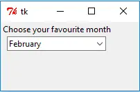
Set Fonts for the Combobox and Its List
The font option styles the Combobox field. Its drop-down list is a separate Tk listbox, so configure that list with the *TCombobox*Listbox.font option pattern. For example, create a font tuple such as ("Courier", 16, "bold") for the field, then set the root window option with app.option_add("*TCombobox*Listbox.font", ("Courier", 14)) before opening the list. Use separate tuples when the field and list need different sizes or weights. Font family availability depends on the operating system, which may substitute an installed font.
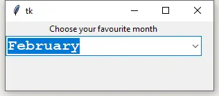
Setting only the Combobox’s font can leave the list text in its system default font. Configure the listbox option before the drop-down first opens so both parts of the control use the intended styling.
Bind a Callback to a Combobox Selection
Tkinter names the selection virtual event <<ComboboxSelected>>. Bind that exact name with combo.bind("<<ComboboxSelected>>", show_selection) to run a function after a user chooses an item from the list. Define the callback to accept Tkinter’s event object, for example def show_selection(event): print("Selected:", event.widget.get()). When the user chooses March, the callback prints Selected: March. The event is generated for a user selection from the list; setting a value in code with current() does not represent a user selecting an item.
The callback reads the widget that emitted the event through event.widget, so it can also be reused for more than one Combobox if needed. Keep the callback focused on the response to a selection, such as updating a related label or recalculating a form value.
Update Combobox Values Before the List Opens
Use the postcommand option when choices should be refreshed each time the user opens the drop-down. Tkinter calls the assigned function immediately before displaying the list, allowing it to replace combo["values"]. For example, a refresh_months() function can assign ["July", "August", "September", "October"]; pass it to the constructor as postcommand=refresh_months.
postcommand runs before the list is shown, not when the window is created. The initial list can contain January through April, then its first opening updates the available choices to July through October. The displayed text does not automatically become a selection just because the choices changed. Keep the callback quick because it runs as part of opening the drop-down.
Make the Combobox Read-Only or Disabled
A Combobox uses state="normal" by default, which lets the user type in its field and choose a listed item. Set state="readonly" to prevent typing while still allowing a choice from the list. Set state="disabled" when the control should be unavailable; Tkinter renders it as inactive and prevents interaction. For instance, create controls with ttk.Combobox(app, values=months, state="normal"), state="readonly", or state="disabled" to compare these modes in a window.
Use readonly when a value must come from the offered choices but the user should still be able to change it. Use disabled when the value is temporarily unavailable or the control is informational. A disabled Combobox cannot be opened or edited; changing its state back to normal or readonly restores interaction. For more Tkinter widgets that can accompany a form, see the Tkinter Entry tutorial and Tkinter Button tutorial.