HOWTO · React Native
React ネイティブ境界半径
この記事では、reacts native での境界半径の使用について説明します。
この記事では、react native で borderRadius を使用する方法を説明します。 まず、React Native の borderRadius prop の例を見て理解します。
また、react native で borderRadius を利用して、指定されたボックスの角を丸める方法も学びます。
React ネイティブ境界半径
React Native は、すべての角を丸める borderRadius prop を提供します。 borderRadius プロップは、1 から 100 までの数値のみを受け入れます。 100 以上を入力すると、結果は 100 の値と同じになるはずです。
コード例:
import React from 'react';
import {StyleSheet, View} from 'react-native';

const App = () => {
  return (<View style = {styles.container}><View style = {
    styles.middle
  } />
    </View>);
};
const styles = StyleSheet.create({
  container: {
    flex: 1,
    justifyContent: 'center',
    backgroundColor: '#fff',
    padding: 20,
    margin: 10,
  },
  middle: {
    flex: 0.3,
    backgroundColor: '#01CDE8',
    borderWidth: 5,
    borderRadius: 10,
  },
});
export default App;
丸みを帯びた境界線が隠れている場合は、overflow: 'hidden' も試してください。 borderRadius プロップは、4つの角すべてから伸びる曲線を作成するために使用されます。
ただし、特定の交点に特定の曲率を追加するには、borderTopRightRadius、borderTopLeftRadius、topStartRadius の境界線、TopEndRadius などの他の固有のプロパティが必要です。
ただし、borderTopLeftRadius と borderTopStartRadius、borderTopRightRadius と borderTopEndRadius など、一部のプロパティの動作は一貫しています。 結果として、両方の小道具は同じです。
出力:
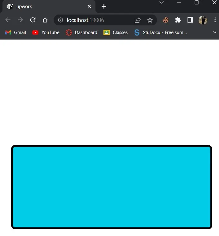
borderRadius プロップがすべての角を丸くすることは誰もが知っていますが、特定の角を丸めたい場合は、次の手順を参照してください。
TopStartRadius- 左上隅に境界線を作成します。TopEndRadius- 右上隅に境界線を作成します。BottomStartRadius- 左下隅を作成します。BottomEndRadius- 右下隅の境界線を作成します。
以下の例で説明しましょう。
import React from 'react';
import {StyleSheet, View} from 'react-native';

const App = () => {
  return (<View style = {styles.container}><View style = {
    styles.middle
  } />
    </View>);
};
const styles = StyleSheet.create({
  container: {
    flex: 1,
    justifyContent: 'center',
    backgroundColor: '#fff',
    padding: 20,
    margin: 10,
  },
  middle: {
    flex: 0.3,
    backgroundColor: '#01CDE8',
    borderWidth: 5,
    backfaceVisibility: 'hidden',
    borderTopStartRadius: 1,
    borderTopEndRadius: 20,
    borderBottomStartRadius: 20,
    borderBottomEndRadius: 1,
  },
});
export default App;
出力:
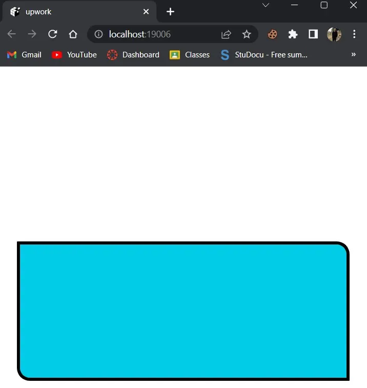
個人用または定期的な監視アプリケーション用の基本的なダッシュボードまたはプロファイル ページを作成してみましょう。 この例では、borderRadius を使用して、プロフィール写真、カード、ボタン、入力フィールド、およびアイコンをデザインします。
コード例:
import {Image, StyleSheet} from 'react-native';

export default function App() {
  return (
    <Image
  style = {styles.profile} source = {
    {
      uri:
          'https://cdn.britannica.com/43/172743-138-545C299D/overview-Barack-Obama.jpg?w=800&h=450&c=crop',
    }
  } />
  );
}

const styles = StyleSheet.create({
  profile: {
    marginTop: 20,
    height: 100,
    width: 100,
    backgroundColor: "wheat",
    borderRadius: 50,
  },
});
画像コンポーネントに円形の borderRadius が追加されました。 次の出力が得られるはずです。
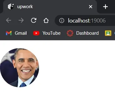
プロフィール写真のサムネイルを装飾するために広く使用されていることに注意してください。