R のキャレットパッケージを使用して混同行列を視覚化する
-
R で
confusionMatrix関数を使用して混同行列を作成する -
fourfoldplot関数を使用して、R の混同行列を視覚化する -
autoplot関数を使用して、R の混同行列を視覚化する
この記事では、R の caret パッケージを使用して混同行列を視覚化する複数の方法を示します。
R で confusionMatrix 関数を使用して混同行列を作成する
confusionMatrix 関数は caret パッケージの一部であり、因子またはテーブルのデータ型から混同行列を作成できます。sample 関数と rep 関数を使用して 2つのランダム因子を作成することに注意してください。confusionMatrix は、最初の引数として予測されたクラスの因数を取り、2 番目の引数として真の結果として使用されるクラスの因数を取ります。
library(caret)

confusionMatrix(
  factor(sample(rep(letters[1:4], 200), 50)),
  factor(sample(rep(letters[1:4], 200), 50)))
Confusion Matrix and Statistics

          Reference
Prediction a b c d
         a 2 5 6 2
         b 3 2 4 2
         c 3 5 2 2
         d 5 1 2 4

Overall Statistics

               Accuracy : 0.2
                 95% CI : (0.1003, 0.3372)
    No Information Rate : 0.28
    P-Value [Acc > NIR] : 0.9260

                  Kappa : -0.0672

 Mcnemar's Test P-Value : 0.7795

Statistics by Class:

                     Class: a Class: b Class: c Class: d
Sensitivity            0.1538   0.1538   0.1429   0.4000
Specificity            0.6486   0.7568   0.7222   0.8000
Pos Pred Value         0.1333   0.1818   0.1667   0.3333
Neg Pred Value         0.6857   0.7179   0.6842   0.8421
Prevalence             0.2600   0.2600   0.2800   0.2000
Detection Rate         0.0400   0.0400   0.0400   0.0800
Detection Prevalence   0.3000   0.2200   0.2400   0.2400
Balanced Accuracy      0.4012   0.4553   0.4325   0.6000
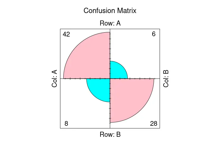
fourfoldplot 関数を使用して、R の混同行列を視覚化する
confusionMatrix 関数はテキストデータを出力しますが、fourfoldplot 関数を使用してそれらの一部を視覚化できます。fourfoldplot は、k 分割表で 2 x2 の 4つ折りグラフを作成します。分割表は、配列形式で渡すか、k が 1 に等しい場合は 2x2 行列として渡す必要があります。次の例は、ハードコードされたテーブルデータでの fourfoldplot の使用法を示していることに注意してください。
ctable <- as.table(matrix(c(42, 6, 8, 28), nrow = 2, byrow = TRUE))
fourfoldplot(ctable, color = c("cyan", "pink"),
             conf.level = 0, margin = 1, main = "Confusion Matrix")
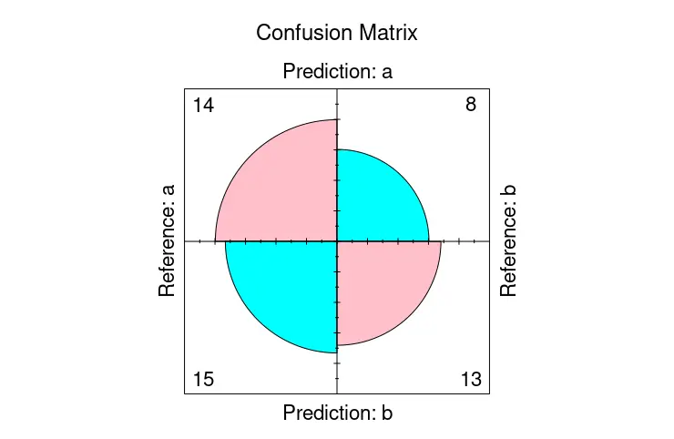
一方、confusionMatrix をオブジェクトとして格納し、そこから table メンバーを fourfoldplot に渡して、混同行列を視覚化することができます。
library(caret)

cmat <- confusionMatrix(
  factor(sample(rep(letters[1:2], 200), 50)),
  factor(sample(rep(letters[1:2], 200), 50)))

fourfoldplot(cmat$table, color = c("cyan", "pink"),
             conf.level = 0, margin = 1, main = "Confusion Matrix")
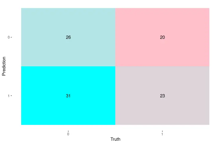
autoplot 関数を使用して、R の混同行列を視覚化する
または、ggplot2 パッケージの autoplot 関数を使用して、混同行列を表示することもできます。この場合、autoplot 関数の最初の引数として直接渡すことができる conf_mat クラスのオブジェクトを生成する conf_mat 関数を使用して行列を作成します。後者は、オブジェクトに対応するグラフを描画することを自動的に決定します。
library(yardstick)
library(ggplot2)

set.seed(123)
truth_predicted <- data.frame(
  obs = sample(0:1,100, replace = T),
  pred = sample(0:1,100, replace = T)
)
truth_predicted$obs <- as.factor(truth_predicted$obs)
truth_predicted$pred <- as.factor(truth_predicted$pred)

cm <- conf_mat(truth_predicted, obs, pred)

autoplot(cm, type = "heatmap") +
  scale_fill_gradient(low = "pink", high = "cyan")
チュートリアルを楽しんでいますか? <a href="https://www.youtube.com/@delftstack/?sub_confirmation=1" style="color: #a94442; font-weight: bold; text-decoration: underline;">DelftStackをチャンネル登録</a> して、高品質な動画ガイドをさらに制作するためのサポートをお願いします。 Subscribe
著者: 胡金庫
