How to Create Seaborn Bar and Stacked Bar Plots

A bar plot is used to represent the observed values in rectangular bars. The seaborn module in Python uses the seaborn.barplot() function to create bar plots.
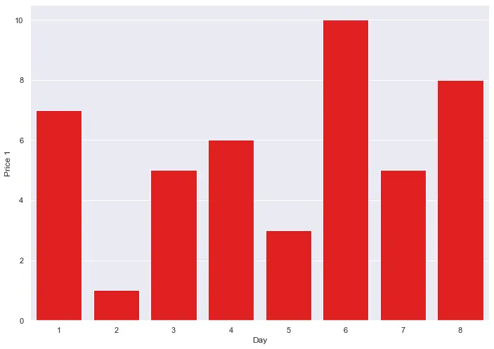
See the code below to create a simple bar graph for the price of a product over different days.
import pandas as pd
import matplotlib.pyplot as plt
import seaborn as sns

df = pd.DataFrame(
    {"Price 1": [7, 1, 5, 6, 3, 10, 5, 8], "Day": [1, 2, 3, 4, 5, 6, 7, 8]}
)

s1 = sns.barplot(x="Day", y="Price 1", data=df, color="red")

In this tutorial, we will learn how to create stacked bar plots in Seaborn.
When we talk about stacked bar plots, what we mean is that we have two or more sets of observations represented on the same graph. This gives the overall graph a stacked look, with one set of observations placed over the second set.
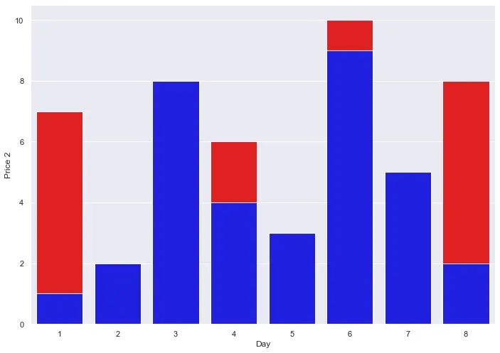
We do not have a function that can create such stacked bar plots directly, but we can use the traditional seaborn.barplot() method to plot two individual bar graphs and place them both on top of each other.
We implement this logic in the following code.
import pandas as pd
import matplotlib.pyplot as plt
import seaborn as sns

df = pd.DataFrame(
    {
        "Price 1": [7, 1, 5, 6, 3, 10, 5, 8],
        "Price 2": [1, 2, 8, 4, 3, 9, 5, 2],
        "Day": [1, 2, 3, 4, 5, 6, 7, 8],
    }
)

s1 = sns.barplot(x="Day", y="Price 1", data=df, color="red")

s2 = sns.barplot(x="Day", y="Price 2", data=df, color="blue")

In the above graph, we have plotted the price of two commodities over different days on a bar graph.
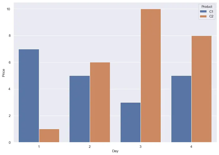
If we want, we can represent a set of observations for categorical values on the same bar plot. The final result will not be that of a stacked look, but it will represent the observations on the same graph on multiple bars.
See the following code.
import pandas as pd
import matplotlib.pyplot as plt
import seaborn as sns

df = pd.DataFrame(
    {
        "Price": [7, 1, 5, 6, 3, 10, 5, 8],
        "Product": ["C1", "C2", "C1", "C2", "C1", "C2", "C1", "C2"],
        "Day": [1, 1, 2, 2, 3, 3, 4, 4],
    }
)

s = sns.barplot(x="Day", y="Price", data=df, hue="Product")

We were able to plot the price for 2 products on 4 different days on the same graph. We give the x and y-axis the desired value for the bar plot and use the hue parameter to group the observations for different categories, such that it creates different bars on the same graph. In this way, the final output is a lot cleaner, and everything is done using one function only.
Manav is a IT Professional who has a lot of experience as a core developer in many live projects. He is an avid learner who enjoys learning new things and sharing his findings whenever possible.
LinkedIn