How to Create Seaborn Swarmplot

A scatter plot is one of the most basic and useful graphs used. The seaborn module in Python can take such graphs a step further and use them to represent categorical values.
A swarm plot is a type of scatter plot that is used for representing categorical values. It is very similar to the strip plot, but it avoids the overlapping of points. We can use the seaborn.swarmplot() to create such graphs.
It is not advisable to use this type of graph when the sample size is large.
We will use the swarmplot() function to create such a graph for categorical values in the following code.
import pandas as pd
import matplotlib.pyplot as plt
import seaborn as sns
df = pd.DataFrame(
{
"Quantity": [5, 6, 7, 8, 5, 6, 7, 8, 5, 6, 7, 8, 5, 6, 7, 8],
"Price": [9, 10, 15, 16, 13, 14, 15, 18, 11, 12, 14, 15, 16, 17, 18, 19],
"Day": [1, 1, 1, 1, 1, 1, 1, 1, 2, 2, 2, 2, 2, 2, 2, 2],
"Product": [
"A",
"A",
"A",
"A",
"B",
"B",
"B",
"B",
"A",
"A",
"A",
"A",
"B",
"B",
"B",
"B",
],
}
)
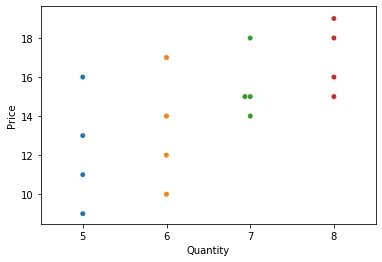
sns.swarmplot(data=df, y="Price", x="Quantity")
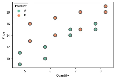
In the above example, we can add the hue parameter to the swarmplot() function and separate the categories for the two different products. We can split the two products using the dodge argument and setting it to True.
Additionally, we can use some other arguments also with the swarmplot() function. The size and color of the points can be changed using the size and color arguments. We can alter the color combination used for different categories using the palette parameter. The linewidth argument adds a border to the points of the specified width. The order of the categories plotted can be controlled using the order parameter.
We will try to make use of the above arguments in the following example.
import pandas as pd
import matplotlib.pyplot as plt
import seaborn as sns

df = pd.DataFrame(
    {
        "Quantity": [5, 6, 7, 8, 5, 6, 7, 8, 5, 6, 7, 8, 5, 6, 7, 8],
        "Price": [9, 10, 15, 16, 13, 14, 15, 18, 11, 12, 14, 15, 16, 17, 18, 19],
        "Day": [1, 1, 1, 1, 1, 1, 1, 1, 2, 2, 2, 2, 2, 2, 2, 2],
        "Product": [
            "A",
            "A",
            "A",
            "A",
            "B",
            "B",
            "B",
            "B",
            "A",
            "A",
            "A",
            "A",
            "B",
            "B",
            "B",
            "B",
        ],
    }
)

sns.swarmplot(
    data=df,
    y="Price",
    x="Quantity",
    hue="Product",
    dodge=True,
    linewidth=2.5,
    palette="Set2",
    size=10,
)
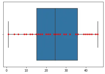
The swarmplot() can also be used as a good compliment over a box or violin plot. It gives a good idea of the distribution of the data.
We can add a box plot over the swarm plot using the following code.
import random
import numpy as np
import seaborn as sns

n = random.sample(range(0, 50), 30)
arr = np.array(n)
sns.boxplot(n)
sns.swarmplot(n, color="red")
The catplot() function can also create such a swarm plot. For this, we need to specify the value for the kind parameter in the catplot() function as swarm.

Manav is a IT Professional who has a lot of experience as a core developer in many live projects. He is an avid learner who enjoys learning new things and sharing his findings whenever possible.
LinkedIn