How to Create Pairplot in Python Seaborn
In Python, we use the seaborn module for creating different types of graphs and plots to visualize a dataset. Different functions create different types of plots. Sometimes a single plot may not be enough to visualize a dataset, and we may need to plot multiple graphs simultaneously. The pairplot() function can help with this.
This tutorial will introduce how to use the pairplot() function of the seaborn module in Python.
It is based on the PairGrid class in seaborn and returns an object of its type. It also plots all the numeric columns of the data on both the axis, displaying a matrix of different plots. It produces a final figure with a uniform graph on the diagonal and a different plot on the upper and lower triangles.
If we want, we can specify the required variables to be plotted using the x_vars, y_vars, or the vars argument within the pairplot() function.
For example,
import pandas as pd
import matplotlib.pyplot as plt
import seaborn as sns


df = pd.DataFrame(
    {
        "Quantity": [5, 6, 7, 8, 5, 6, 7, 8, 5, 6, 7, 8, 5, 6, 7, 8],
        "Price": [9, 10, 15, 16, 13, 14, 15, 18, 11, 12, 14, 15, 16, 17, 18, 19],
        "Day": [1, 1, 1, 1, 1, 1, 1, 1, 2, 2, 2, 2, 2, 2, 2, 2],
        "Product": [
            "A",
            "A",
            "A",
            "A",
            "B",
            "B",
            "B",
            "B",
            "A",
            "A",
            "A",
            "A",
            "B",
            "B",
            "B",
            "B",
        ],
    }
)
sns.pairplot(df)
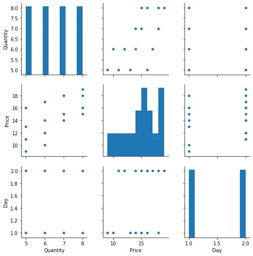
In the above code, we create a simple example of the pairplot() function. Notice the different graphs plotted on the diagonal.
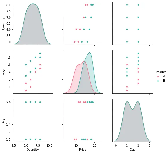
We can tweak the final result using a few methods and parameters. The hue parameter can be used to plot the different categories in different colors. The palette argument can define the colors used for this. A common legend is added for all graphs. We can add this in the above example to distinguish the two products.
import pandas as pd
import matplotlib.pyplot as plt
import seaborn as sns

df = pd.DataFrame(
    {
        "Quantity": [5, 6, 7, 8, 5, 6, 7, 8, 5, 6, 7, 8, 5, 6, 7, 8],
        "Price": [9, 10, 15, 16, 13, 14, 15, 18, 11, 12, 14, 15, 16, 17, 18, 19],
        "Day": [1, 1, 1, 1, 1, 1, 1, 1, 2, 2, 2, 2, 2, 2, 2, 2],
        "Product": [
            "A",
            "A",
            "A",
            "A",
            "B",
            "B",
            "B",
            "B",
            "A",
            "A",
            "A",
            "A",
            "B",
            "B",
            "B",
            "B",
        ],
    }
)
sns.pairplot(df, hue="Product", palette="husl")
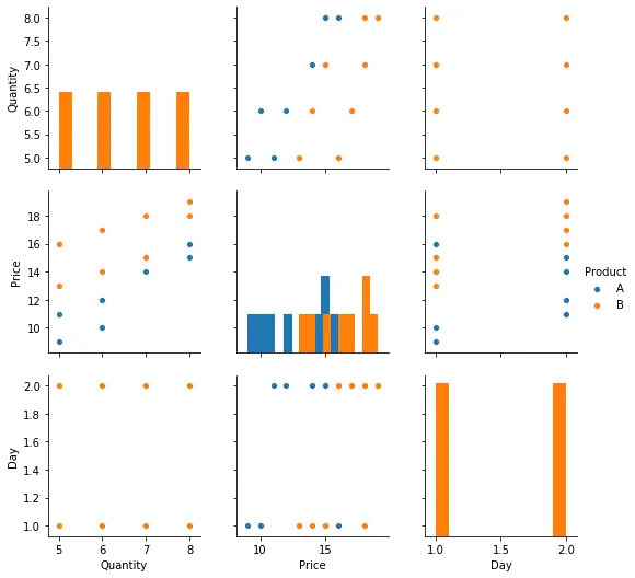
We can also control the kind of graphs to be plotted on the upper-lower or triangles and the diagonal. The diag_kind parameter is used to specify the plots for the diagonal and the kind parameter for the remaining. Their value can be reg, scatter, kde, hist, or some other plot.
For example,
import pandas as pd
import matplotlib.pyplot as plt
import seaborn as sns


df = pd.DataFrame(
    {
        "Quantity": [5, 6, 7, 8, 5, 6, 7, 8, 5, 6, 7, 8, 5, 6, 7, 8],
        "Price": [9, 10, 15, 16, 13, 14, 15, 18, 11, 12, 14, 15, 16, 17, 18, 19],
        "Day": [1, 1, 1, 1, 1, 1, 1, 1, 2, 2, 2, 2, 2, 2, 2, 2],
        "Product": [
            "A",
            "A",
            "A",
            "A",
            "B",
            "B",
            "B",
            "B",
            "A",
            "A",
            "A",
            "A",
            "B",
            "B",
            "B",
            "B",
        ],
    }
)
sns.pairplot(df, hue="Product", diag_kind="hist", kind="scatter")
To customize the individual plots on the diagonal and otherwise, we use the plot_kws and diag_kws parameters. We pass the required customizations as dictionary key-value pairs. We can alter the height of the individual plots also using the height parameter.
Additionally, remember that it returns an object of the PairGrid class to customize the final figure using methods from that class.

Manav is a IT Professional who has a lot of experience as a core developer in many live projects. He is an avid learner who enjoys learning new things and sharing his findings whenever possible.
LinkedIn