How to Use MUI Icons in React
-
Use Icons From the
Material UILibrary -
How to Use the
Material DesignIcons in React -
Use the MUI Icons With the
IconButtonComponent in React -
Use the MUI Icons With the
ButtonComponent in React
React is a library for building UI (user interfaces). It gives you the freedom to create elements with custom visuals and functionality.
Typically, React applications are written in JSX, a templating language similar to HTML. React developers can also use CSS to style the components.
However, sometimes styling a simple component can take a very long time. That’s why React component libraries like Material UI are useful.
This particular library includes ready-made components that can be imported and used without styling them manually. React developers can save time using components from the Material UI library.
Use Icons From the Material UI Library
Regardless of what type of application you’re building, you’re going to need buttons. MUI gives you a lot of possibilities for customization of functionality and the visuals of the buttons.
The UI library includes more than a dozen hundred different icons in different varieties. Surely, you can find an icon for almost every purpose and use it with a button.
How to Use the Material Design Icons in React
To use one out of more than 2000 Material Design icons in React, first, choose one from this catalog. You can choose between one of the five types of icons: filled, outlined, rounded, two-tone, and sharp.
The good news is that all icons are free, unlike other similar icon libraries.
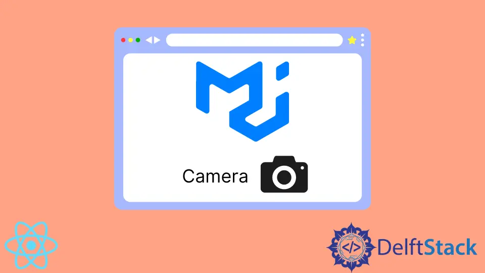
Let’s take a look at one example. Here we have imported a camera icon.
import CameraAltIcon from "@mui/icons-material/CameraAlt";
export default function App() {
  return (
    <div className="App">
      <h1>
        Camera <CameraAltIcon></CameraAltIcon>
      </h1>
    </div>
  );
}
In this example, we display an icon in our header text. React developers can customize the size and color of each one of the Material Design icons.
We can use the fontSize and color props. Let’s take a look at the example.
export default function App() {
  return (
    <div className="App">
      <h1>
        Camera <CameraAltIcon color="primary" fontSize="large"></CameraAltIcon>
      </h1>
    </div>
  );
}
You can see how the icon looks on the codesandbox. You can change the value of the props.
You can check out the Icon API page on the official documentation website to learn more about customization possibilities.
However, icons are much more useful when used inside buttons. Fortunately, Material UI components have support for that as well.
Use the MUI Icons With the IconButton Component in React
Custom IconButton component from the @mui/material package allows us to turn any of the Material Design icons into buttons. You have to wrap the icon with an IconButton component like this example.
import CameraAltIcon from "@mui/icons-material/CameraAlt";
import { IconButton, Button } from "@mui/material";
export default function App() {
  return (
    <div className="App">
      <h1>
        Camera <CameraAltIcon color="primary" fontSize="large"></CameraAltIcon>
        <br/>
        <IconButton>
          <CameraAltIcon/>
        </IconButton>
      </h1>
    </div>
  );
}
Here we turned the <CameraAltIcon> into a button. Note that we aren’t using color, fontSize, and other props for the icon in this case, but we can.
You can check how the icon button looks on the live codesandbox demo. You can also set the size, color, disabled, and other props on the <IconButton> component itself.
To learn more, check out the official API documentation.
Use the MUI Icons With the Button Component in React
The basic Button component is useful for displaying icons with the accompanying text. In addition to common attributes, such as color and size, the API of the <Button> component also includes startIcon and endIcon props.
These allow React developers to put certain icons at the buttons’ start or end, respectively. Look at the actual code below.
<Button startIcon={<CameraAltIcon />} variant="outlined">
          Take a Picture
</Button>
In this case, the button will have a text between the opening and closing tags of the Button component, and the specified icon will appear right before the text. See the live demo on codesandbox.
Material UI gives you a lot of freedom for customizing the buttons. It would be nearly impossible for a single or small team of developers to do all this work themselves.
For more information about this component’s API, check out official docs.

Irakli is a writer who loves computers and helping people solve their technical problems. He lives in Georgia and enjoys spending time with animals.
LinkedIn