How to Plot Candlestick Charts in Plotly
Data Science is a computer science branch that uses algorithms, processes, systems, mathematics, and scientific procedures to extract insights and knowledge from structured, unstructured, and noisy data and uses those learnings to solve business problems and craft learning-based solutions.
Python and R are two programming languages famous in the data science community because of the support and capabilities these languages offer.
Since data visualization is a key component of data science, Python offers a library, Plotly, that helps us create interactive charts and maps.
It supports various types of plots such as scatter plots, line charts, bar charts, pie charts, bubble charts, error bars, histograms, 2D histograms, heatmaps, candlesticks, Mapbox choropleth maps, clustergrams, etc.
This article talks about one of the plots that Plotly supports, namely, candlesticks.
Candlesticks in Python
A candlesticks chart is a type of financial chart that describes high, low, open, and close values for a given x coordinate. The box in a candlestick represents the spread between the open and the close values.
The lines extending the ends of the boxes represent the spread between the low and high values.
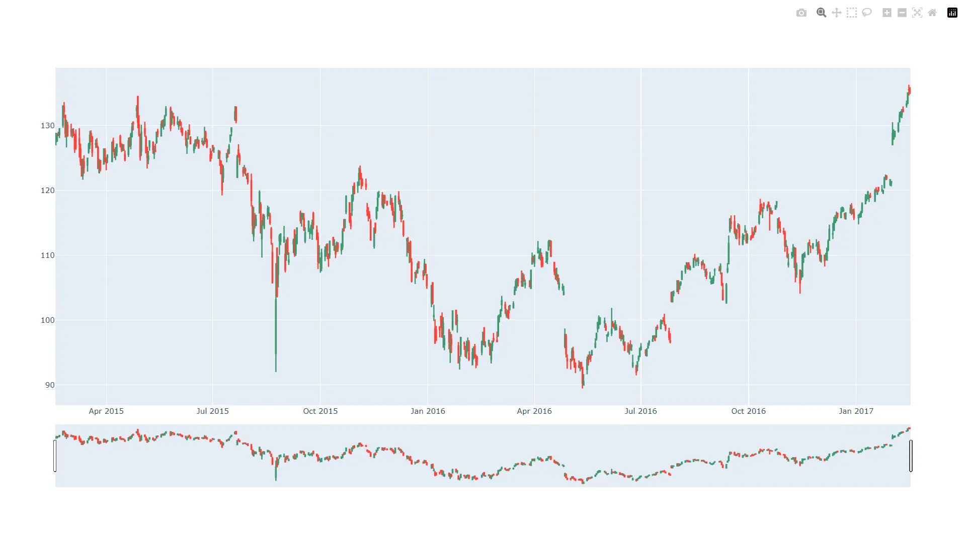
We can create candlestick charts using Plotly. Refer to the following Python code for a simple example.
import pandas as pd
from datetime import datetime
import plotly.graph_objects as go

dataFrame = pd.read_csv(
    "https://raw.githubusercontent.com/plotly/datasets/master/finance-charts-apple.csv"
)

figure = go.Figure(
    data=[
        go.Candlestick(
            x=dataFrame["Date"],
            open=dataFrame["AAPL.Open"],
            high=dataFrame["AAPL.High"],
            low=dataFrame["AAPL.Low"],
            close=dataFrame["AAPL.Close"],
        )
    ]
)
figure.show()
Output:
The data in the file looks as follows. Following are the first ten lines of the CSV file.
Date,AAPL.Open,AAPL.High,AAPL.Low,AAPL.Close,AAPL.Volume,AAPL.Adjusted,dn,mavg,up,direction
2015-02-17,127.489998,128.880005,126.919998,127.830002,63152400,122.905254,106.7410523,117.9276669,129.1142814,Increasing
2015-02-18,127.629997,128.779999,127.449997,128.720001,44891700,123.760965,107.842423,118.9403335,130.0382439,Increasing
2015-02-19,128.479996,129.029999,128.330002,128.449997,37362400,123.501363,108.8942449,119.8891668,130.8840887,Decreasing
2015-02-20,128.619995,129.5,128.050003,129.5,48948400,124.510914,109.7854494,120.7635001,131.7415509,Increasing
2015-02-23,130.020004,133,129.660004,133,70974100,127.876074,110.3725162,121.7201668,133.0678174,Increasing
2015-02-24,132.940002,133.600006,131.169998,132.169998,69228100,127.078049,111.0948689,122.6648335,134.2347981,Decreasing
2015-02-25,131.559998,131.600006,128.149994,128.789993,74711700,123.828261,113.2119183,123.6296667,134.0474151,Decreasing
2015-02-26,128.789993,130.869995,126.610001,130.419998,91287500,125.395469,114.1652991,124.2823333,134.3993674,Increasing
2015-02-27,130,130.570007,128.240005,128.460007,62014800,123.510987,114.9668484,124.8426669,134.7184854,Decreasing
...
Next, using the Figure class, we create an instance where we set the data property to a Candlestick class’s object. For the Candlestick class’s instance, we set the x values to the Date column, open to the AAPL.Open column, high to the AAPL.High column, low to AAPL.Low column, and close to AAPL.Close column of the CSV file.
Next, we show the candlestick chart using the show() method available on the Figure instance.
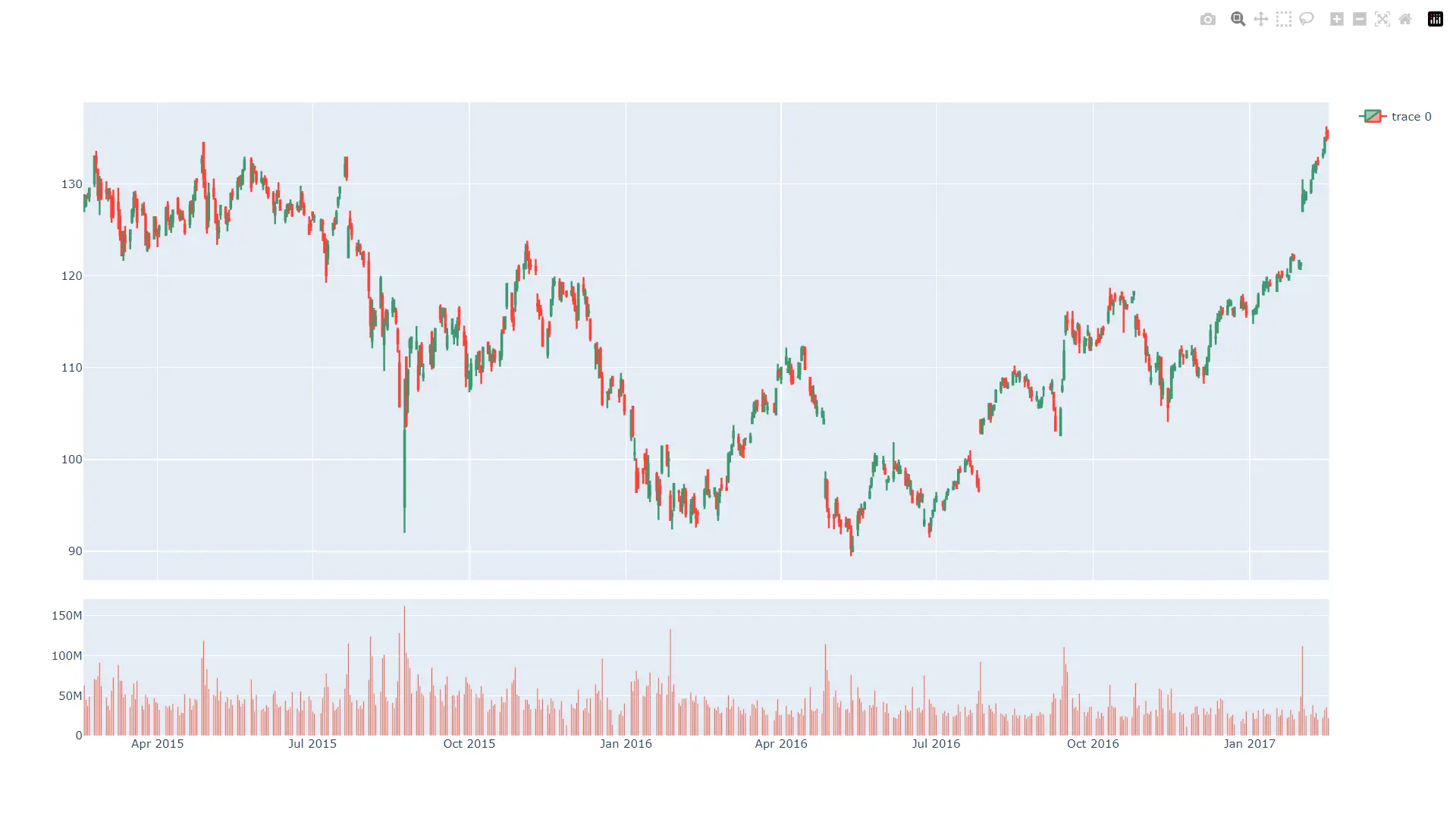
Show a Volume Plot Along With the Candlestick Plot
To show a volume plot along with the candlestick plot, we can add a smaller subplot to the candlestick plot. This plot will reside below the candlestick plot and contain details about the stock volume sold daily.
To make a grid structure, we will use the make_subplots() method and specify 2 rows and 1 columns. Next, we will create a candlestick plot, as discussed above and a bar plot to represent volume.
Lastly, we will add both plots to the grid or subplots we just created and show both plots. Note that figure.update(layout_xaxis_rangeslider_visible = False) statement disable the rangeslider offered by the candlestick plot.
Refer to the following Python code for the same.
import pandas as pd
import plotly.graph_objects as go
from plotly.subplots import make_subplots

dataFrame = pd.read_csv(
    "https://raw.githubusercontent.com/plotly/datasets/master/finance-charts-apple.csv"
)

figure = make_subplots(
    rows=2, cols=1, shared_xaxes=True, vertical_spacing=0.05, row_width=[0.2, 0.7]
)
appleStockPlot = go.Candlestick(
    x=dataFrame["Date"],
    open=dataFrame["AAPL.Open"],
    high=dataFrame["AAPL.High"],
    low=dataFrame["AAPL.Low"],
    close=dataFrame["AAPL.Close"],
)
volume = go.Bar(x=dataFrame["Date"], y=dataFrame["AAPL.Volume"], showlegend=False)
figure.add_trace(appleStockPlot, row=1, col=1)
figure.add_trace(volume, row=2, col=1)
figure.update(layout_xaxis_rangeslider_visible=False)
figure.show()
Output:

Vaibhav is an artificial intelligence and cloud computing stan. He likes to build end-to-end full-stack web and mobile applications. Besides computer science and technology, he loves playing cricket and badminton, going on bike rides, and doodling.