How to Plot Bubble Chart in Plotly
This tutorial will discuss creating a bubble chart using the scatter() function of Plotly.
Plotly Bubble Chart in Python
A scatter plot, also known as a bubble chart, shows data points as circles or bubbles on a graph. We can use the scatter() function of plotly.express to create a bubble or scatter plot.
To create the scatter or bubble chart, we must pass the x and y-axis values inside the scatter() function. If only one axis value is given, the function will use the indices of the values as the second axis values.
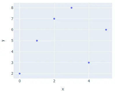
For example, let’s create a bubble chart using some random data. See the code below.
import plotly.express as px

values = [2, 5, 7, 8, 3, 6]
fig = px.scatter(y=values, width=500, height=400)
fig.show()
Output:
The width and height argument is used to set the width and height of the above figure in pixels. We can also create a bubble chart using a data frame.
In the case of a data frame, we can use the data_frame argument to pass the data inside the scatter() function. We can give random color to each bubble using the color argument.
The scatter() function will use a color sequence to set the color of each bubble. We can set the size of each bubble using the size argument and set its value to a list of integers. We can set the hover title for each bubble using the hover_name argument and setting its value to a list of strings.
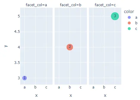
We can also add text inside each bubble using the text argument and setting its value to a list of strings. We can split each bubble on a different plot using the facet_col argument, putting each bubble on a different plot.
We can set the plot’s orientation using the orientation argument and set its value to h for horizontal orientation and v for vertical orientation. For example, let’s change the properties mentioned above. See the code below.
import plotly.express as px

values = [3, 4, 5]
labels = ["a", "b", "c"]
fig = px.scatter(
    y=values,
    x=labels,
    width=500,
    height=400,
    color=labels,
    size=[5, 10, 15],
    hover_name=["B1", "B2", "B3"],
    text=["1", "2", "3"],
    facet_col=labels,
)
fig.show()
Output:
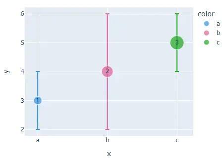
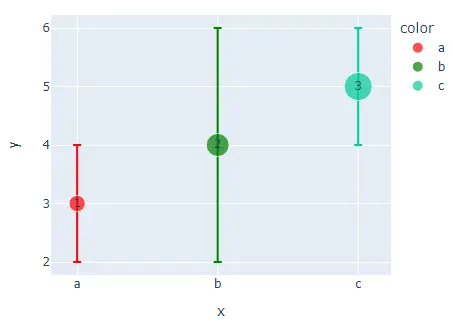
We can also add error bars on each bubble using the error_x for the x-axis error and error_y for the y-axis error.
We can change the default color sequence using the color_discrete_sequence and setting its value to a Plotly supported color sequence like Dark24 and Light24 using plotly.express.color.qualitative attribute. For example, let’s change the color sequence of the above bubble chart.
See the code below.
import plotly.express as px

values = [3, 4, 5]
labels = ["a", "b", "c"]
fig = px.scatter(
    y=values,
    x=labels,
    width=500,
    height=400,
    color=labels,
    size=[5, 10, 15],
    hover_name=["B1", "B2", "B3"],
    text=["1", "2", "3"],
    error_y=[1, 2, 1],
    color_discrete_sequence=px.colors.qualitative.Dark24,
)
fig.show()
Output:
To change the color sequence, we need to change the color sequence name in the above code, like from Dark24 to Light24. If we want to give each bubble our color instead of a color sequence, we can use the color_discrete_map argument to override the color sequence.
Check this link for more details about the Plotly colors. For example, let’s change the color of the first two bubbles present in the above plot.
See the code below.
import plotly.express as px

values = [3, 4, 5]
labels = ["a", "b", "c"]
fig = px.scatter(
    y=values,
    x=labels,
    width=500,
    height=400,
    color=labels,
    size=[5, 10, 15],
    hover_name=["B1", "B2", "B3"],
    text=["1", "2", "3"],
    error_y=[1, 2, 1],
    color_discrete_map={"a": "red", "b": "green"},
)
fig.show()
Output:
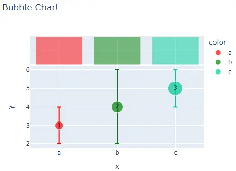
We only changed the first two colors, and the rest of the colors will be from the default color sequence. We can set the opacity of the bubbles using the opacity argument and set its value from 0 to 1.
We can also change the axis to log scale using the log_x and log_y arguments and setting its value to true. We can set the title of the figure using the title argument.
We can use the marginal_x and marginal_y to draw a distribution graph above the bubble graph to show the distribution of points. For example, let’s change the properties mentioned above.
See the code below.
import plotly.express as px

values = [3, 4, 5]
labels = ["a", "b", "c"]
fig = px.scatter(
    y=values,
    x=labels,
    width=500,
    height=400,
    color=labels,
    size=[5, 10, 15],
    hover_name=["B1", "B2", "B3"],
    text=["1", "2", "3"],
    error_y=[1, 2, 1],
    color_discrete_map={"a": "red", "b": "green"},
    title="Bubble Chart",
    opacity=0.7,
    marginal_x="histogram",
)
fig.show()
Output:
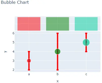
We can also change many other properties of the bubble chart using the scatter() function traces using the fig.update_traces() function. We can hide the legends using the showlegend argument and setting its value to false.
We can change the color of the error bars, which is by default the same as the bubble color using the error_y_color argument. We can change the error bar line width using the error_y_thickness argument.
For example, let’s change the traces mentioned above. See the code below.
import plotly.express as px

values = [3, 4, 5]
labels = ["a", "b", "c"]
fig = px.scatter(
    y=values,
    x=labels,
    width=500,
    height=400,
    color=labels,
    size=[5, 10, 15],
    hover_name=["B1", "B2", "B3"],
    text=["1", "2", "3"],
    error_y=[1, 2, 1],
    color_discrete_map={"a": "red", "b": "green"},
    title="Bubble Chart",
    opacity=0.7,
    marginal_x="histogram",
)
fig.update_traces(showlegend=False, error_y_color="red", error_y_thickness=5)
fig.show()
Output:
Check this link for more details about the scatter() function traces.
