How to Create Stackplot in Matplotlib
Matplotlib is a library for Python that provides a wide range of plotting features. One of the most useful features of matplotlib is the stackplot function.
It allows you to create a stacked area plot, where the values of each data series are stacked on top of each other. It is particularly useful for visualizing data that has multiple sub-categories.
For example, you could use it to visualize data broken down by gender, age group, or location.
It is also a great way to visualize cumulative data. For example, you could use stackplot to visualize the total number of books sold by an author throughout their career.
If you’re exploring a way to visualize data with multiple dimensions, Matplotlib’s stackplot function is a great option.
Stackplot in Python
A stackplot is a plot showing different data pieces on top of each other. The most common use for a stackplot is to show how different parts of a data set contribute to a total.
For example, you might have data that shows the total number of hours of sunlight each day, and you also have data that shows the number of hours of sunlight that each part of the day contributes.
It would let you see how the total number of hours of sunlight changes over time and how each part of the day contributes to that total.
The data sets are stacked on top of each other. The first data is set at the bottom of the stack and the last at the top.
Use Matplotlib’s Stackplot Function
Matplotlib’s stackplot function allows you to create a stacked area plot. This can be useful for visualizing data that has both positive and negative values.
To use this, you must have your data as a list of lists.
Each sub-list should contain the data for one data set. The function will then stack the data sets on top of each other.
You can also specify the colors of each data set by passing a list of colors to the stackplot function. The default color scheme is blue for the first data set, orange for the second data set, and green for the third data set.
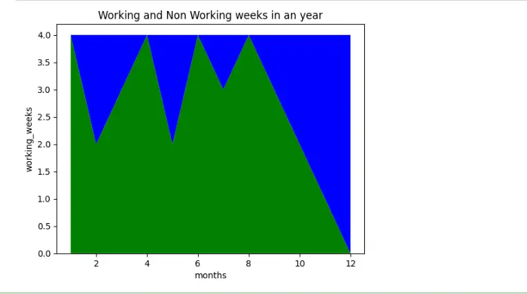
Code:
# import matplotlib
import matplotlib.pyplot as plt

# months
months = [1, 2, 3, 4, 5, 6, 7, 8, 9, 10, 11, 12]

# working weeks each month
working_weeks = [4, 2, 3, 4, 2, 4, 3, 4, 3, 2, 1, 0]

# non-working weeks each month
non_working_weeks = [0, 2, 1, 0, 2, 0, 1, 0, 1, 2, 3, 4]

# Stackplot with the above data
plt.stackplot(months, working_weeks, non_working_weeks, colors=["g", "b"])

# months
plt.xlabel("months")

# working weeks
plt.ylabel("working_weeks")

# set the title of the Graph
plt.title("Working and Non Working weeks in an year")

# show the graph
plt.show()
Output:
Benefits of Matplotlib Stackplot
Matplotlib stackplot is one of Python’s most popular data visualization libraries. It allows you to easily create beautiful charts and graphs and is highly customizable.
One of the great things about stackplot is that it is very easy to use. You can create a basic chart with just a few lines of code.
And if you need more control, you can always tweak the code to get the desired results.
Another benefit is that it is very versatile. You can utilize it to make a variety of different types of charts and graphs.
Whether you want to visualize data for a presentation or a research paper, it can help you get the job done.
So if you’re looking for a data visualization library that is easy to use and highly customizable, it is a great option.
Conclusion
This blog concludes that the stackplot is a great way to visualize multiple data sets on the same plot. It is especially helpful when you compare each data set’s relative sizes.
This also explains that about the use of stackplot. For this purpose, pass in the data you want to plot and specify the stack keyword.
Stackplot will then automatically stack the data from bottom to top.
You can also specify a color for each data stack, which can be useful for distinguishing different data sets.

Zeeshan is a detail oriented software engineer that helps companies and individuals make their lives and easier with software solutions.
LinkedIn