How to Plot Frequency Distribution Curves of Your Data in MATLAB
-
Use the
sshist()Function to Calculate Density-Estimation and Obtain the Frequency Curve of Our Data in MATLAB -
Use the
histfit()Function to Obtain the Frequency Curve of Our Data in MATLAB
We will look at different ways to plot your data frequency distribution curves in MATLAB. We will use different example codes and related outputs to clear your concepts and give you a complete insight using MATLAB.
Note that MATLAB allows a user to perform statistical operations using different functions like histfit(), hist() and sshist().
A frequency distribution is a list/table/graph that shows how frequently certain possibilities occur in our dataset. We can use MATLAB to plot the curves of the frequency distribution of our data.
We can manually add the data or import it from an excel sheet. Using different functions, we can easily obtain the required curves.
Use the sshist() Function to Calculate Density-Estimation and Obtain the Frequency Curve of Our Data in MATLAB
To plot a frequency distribution graphical curve in MATLAB, we first need to calculate the optimal number of bins-for-histogram.
For our kernel-density estimate computations, we will suppose that our frequency distribution has a standard length of bins for the histogram in MATLAB.
Still, this approach almost probably is not realistic. The first approach calculates the optimal bin width to produce the cleanest curve while retaining the core PDF as much as feasible.
The function sshist is not included in the standard list of functions in MATLAB, but we can obtain the function’s source code and use it to run our code to calculate the density estimation of the bins. See example,
Our_data = randn(1,1e4);

optN = sshist(Our_data);

figure(1)
[M,C] = hist(Our_data);
[Nop,Cop] = hist(Our_data,optN);
[f,xi] = ksdensity(Our_data,Cop);

dNom = mode(diff(Center));
dNom = mode(diff(Cop));

plot(Center,N/dNom,'.-',Cop,Nop/dNom,'.-',xi,f*length(Our_data),'.-')
legend('Default','Optimum','ksdensity')
title('Frequency Distribution')
Output:
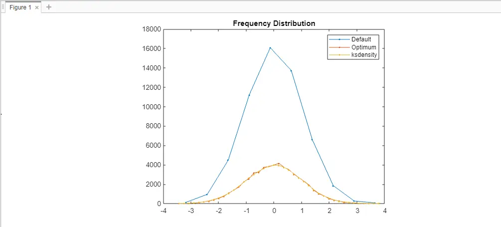
As discussed above, optimal-bin is to be calculated first. The reason behind this calculation is to give the structure to our frequency distribution histogram.
When we use the ksdensity function, it returns a flat curve. So, it depends on the nature of our work and the type of output graph we want according to our data.
Note that we used an extra m-file to execute this code successfully. The function sshist() is not predefined in MATLAB.
That is why we need to copy the source code of this function, create an m-file, and paste the copied code here.
Then execute the code to get the frequency distribution graph. The link to the source code of m-file is sshist().
Use the histfit() Function to Obtain the Frequency Curve of Our Data in MATLAB
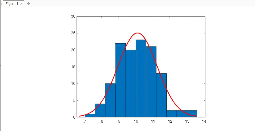
To construct a frequency distribution histogram with normal-distribution fitting using histfit(), let us take the size of our data samples as 100 with variance as 1 and mean like 10.
rng default;
freq_dist_data = normrnd(10,1,120,1);
histfit(freq_dist_data)
Output:
Note that the histfit function in MATLAB works similarly to the fitdist function to fit our frequency distribution to our dataset and to return all the values used in fitting.
fitting_values = fitdist(freq_dist_data,'Normal')
Output:
fitting_values =

  NormalDistribution

  Normal distribution
       mu = 10.0894   [9.88181, 10.297]
    sigma =  1.1484   [1.01919, 1.31541]

Mehak is an electrical engineer, a technical content writer, a team collaborator and a digital marketing enthusiast. She loves sketching and playing table tennis. Nature is what attracts her the most.
LinkedIn