How to Apply Multiple Transforms in CSS
-
Apply Multiple Transforms by Specifying Multiple
transformValues in CSS -
Apply Multiple Transforms by Specifying Multiple
transformin CSS -
Apply Multiple Transforms by Specifying Multiple
transform-originin CSS - Apply Multiple Transforms Using Nested Classes in CSS
- Conclusion
CSS transform is a powerful yet underused way of adding animation effects to elements. However, when multiple transforms are applied at once, it can get tricky to get the desired result; for example, we want elements to transform in sync when elements overlap.
This article will explore how multiple transforms can be applied in CSS.
Apply Multiple Transforms by Specifying Multiple transform Values in CSS
There are many ways to use multiple CSS transforms. We will discuss them in the following sections.
One way to apply multiple CSS transforms is to use the shorthand transform property. This property can take multiple values, separated by spaces.
For example:
transform: rotate(45deg) scale(2);
This line would rotate an element 45 degrees and then double its size.
Another example is if you wanted to rotate an element by 30 degrees and then translate it by 50px, you would utilize the following code:
transform: rotate(30deg) translate(50px);
This line can be a valuable technique for creating complex animations and interactions.
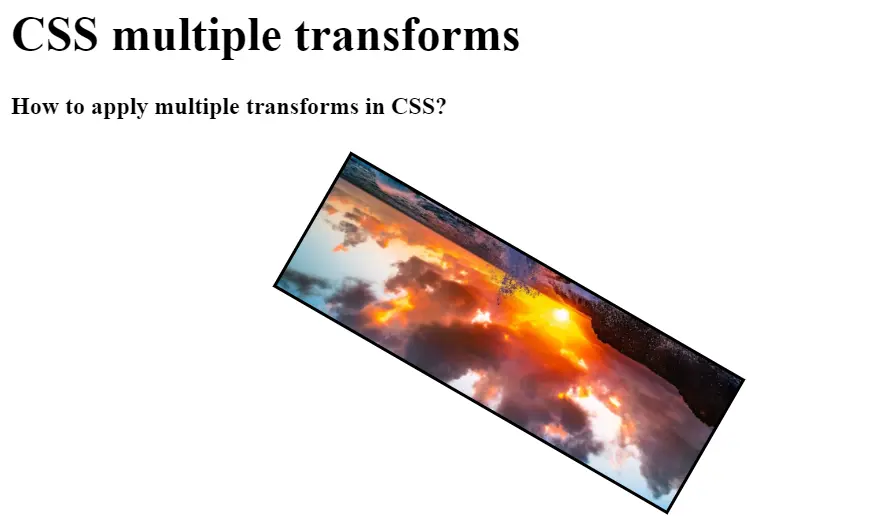
Let’s now look at some examples of multiple transforms. You can use the following code for the transformation of an image.
Example Code:
<!DOCTYPE html>
<html>
    <head>
        <title>Title of the document</title>
        <style>
            body {
                margin: 10px;
            }
            .box {
                background: url("/img/DelftStack/logo.png")
                    no-repeat;
                background-size: cover;
                height: 100px;
                width: 600px;
                border: 2px solid #000000;
                transform: rotate(110deg) translate(45px, -160px);
            }
            h1 {
                color: #000000;
            }
        </style>
    </head>
    <body>
        <h1>
            CSS Multiple transforms
        </h1>
        <strong>
            How to apply multiple transforms in CSS?
        </strong>
        <div class="box"></div>
    </body>
</html>
In the above code, we used the CSS function transform: rotate(110deg) translate(45px, -160px) for the transformation of the image. This CSS code will rotate the image up to 110 degrees.
So by using the above code, you can apply it to transform any image.
Apply Multiple Transforms by Specifying Multiple transform in CSS
Another way to use multiple transforms is to specify each transform individually.
For example:
transform: rotate(45deg);

transform: scale(2);
Apply Multiple Transforms by Specifying Multiple transform-origin in CSS
You can also utilize the transform-origin property to change the point of origin for the transformation. For example:
transform-origin: 50% 50%;

transform-origin: bottom right;
This one would change the point of origin to the element’s center or the bottom right corner of the component.
Apply Multiple Transforms Using Nested Classes in CSS
There is another way of applying CSS transformation. The following is a CSS code, but we will make two nested classes, outer-transform and inner-transform, to apply multiple CSS transforms.
This code will also give our desired output.
Example Code:
<!DOCTYPE html>
<html>
    <head>
        <title>Title of the document</title>
        <style>
            h1 {
                color: #000000;
            }
            .outer-transform {
                transform: translate(150px, 180px);
            }
            .inner-transform {
                background: url("/img/DelftStack/logo.png")
                    no-repeat;
                background-size: cover;
                height: 100px;
                width: 600px;
                border: 2px solid #000000;
                transform: rotate(-150deg);
            }
        </style>
    </head>
    <body>
        <h1>
            CSS multiple transforms
        </h1>
        <strong>
            How to apply multiple transforms in CSS?
        </strong>
        <div class="outer-transform">
            <div class="inner-transform"></div>
        </div>
    </body>
</html>
Output:
Conclusion
We are glad to inform you that you can apply several transforms to an element in CSS. You can have a div that is rotated and translated simultaneously and even an element rotated and translated in different directions.
Transforms are a powerful tool for creating visual effects on HTML elements. CSS supports multiple transforms, allowing a greater range of effects.
When used together, transforms can create some truly stunning visuals.

Zeeshan is a detail oriented software engineer that helps companies and individuals make their lives and easier with software solutions.
LinkedIn