How to Create a Search Box in AngularJS
- Create a Search Box With Icon Using Angular Material in AngularJS
- Create a Search Box With Icon Using Font-Awesome in AngularJS
- Conclusion

The major reason for implementing placeholders inside input bars is that users will know what they are expected to fill into the input field. In the case of a search field, we could instead design a search icon in place of a placeholder.
The search design has a more mature look and feels with such an idea. Also, the search icon can replace the usual search icon by making the search icon clickable.
Let us look at methods to implement the search box with icons inside the Angular framework.
Create a Search Box With Icon Using Angular Material in AngularJS
The Angular Material provides us with easy-to-use components and icons for our webpage. We will implement it in this example.
Using the terminal inside VS Code, we start by creating a new Angular project, navigate to the project folder, and install the material module with ng add @angular/material.
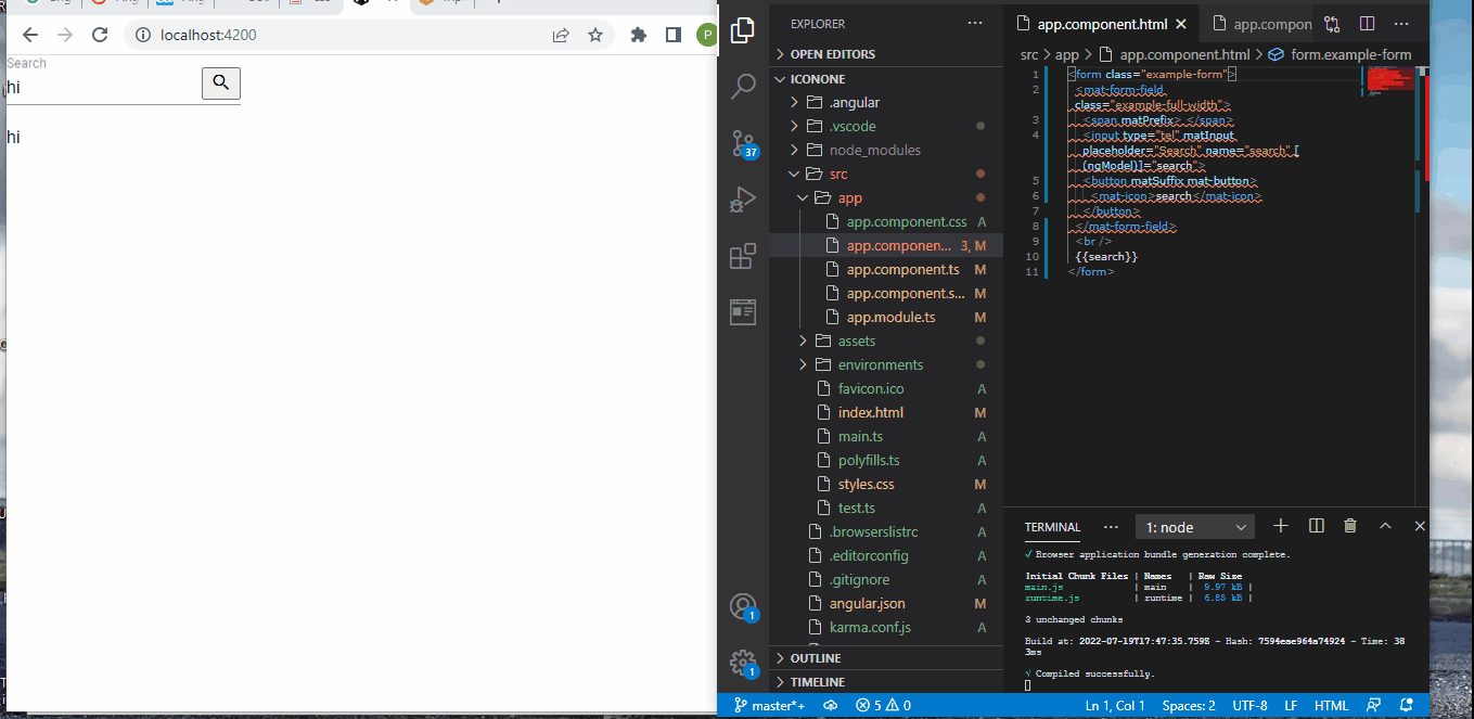
Then we navigate to the app.component.html to write these codes:
Code Snippet- app.component.html:
<form class="example-form">
  <mat-form-field class="example-full-width">
    <span matPrefix> </span>
    <input type="tel" matInput placeholder="Search" name="search" [(ngModel)]="search">
    <button matSuffix mat-button>
      <mat-icon>search</mat-icon>
    </button>
  </mat-form-field>
  <br />
  {{search}}
</form>
The matSuffix places the search icon after the input field, and we use the mat-icon to create the search icon.
Then we import the modules that will make the search icon work. The app.module.ts file should look like the below:
Code Snippet- app.module.ts:
import { NgModule } from '@angular/core';
import { BrowserModule } from '@angular/platform-browser';

import { AppComponent } from './app.component';
import { BrowserAnimationsModule } from '@angular/platform-browser/animations';
import { MatFormFieldModule } from '@angular/material/form-field';
import { MatIconModule } from '@angular/material/icon';
import { MatInputModule } from '@angular/material/input';
import { FormsModule } from '@angular/forms';

@NgModule({
  declarations: [
    AppComponent
  ],
  imports: [
    BrowserModule,
    BrowserAnimationsModule,
    MatFormFieldModule,
    MatIconModule,
    MatInputModule,
    FormsModule
  ],
  providers: [],
  bootstrap: [AppComponent]
})
export class AppModule { }
Output:
Create a Search Box With Icon Using Font-Awesome in AngularJS
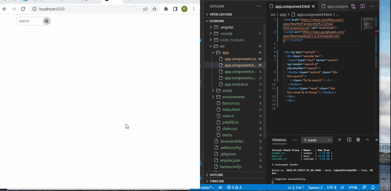
The Font-Awesome is the number one place to get all kinds of icons, so we must import the Font-Awesome CSS link for the search icon.
We visit cdnjs.com/libraries/angular.js and copy the CSS URL into the top part of the app.component.html file of the project app. Then we add the CSS class for the search from fontawesome.com.
Then we add the rest of the codes like this:
Code Snippet- app.component.html:
<link href="https://cdnjs.cloudflare.com/ajax/libs/font-awesome/4.2.0/css/font-awesome.css" rel="stylesheet"/>
<script src="https://ajax.googleapis.com/ajax/libs/angularjs/1.2.23/angular.min.js"></script>

<div ng-app="sample" >
  <div class="sample ten">
    <input type="text" name="search" ng-model="search.$" placeholder="search">
    <button type="submit" class="btn btn-search">
      <i class="fa fa-search"></i>
    </button>
    <button type="reset" class="btn btn-reset fa fa-times"></button>
  </div>
  <br>
</div>
Then we add the CSS styling like below:
Code Snippet- css:
* {
  box-sizing: border-box;
}

html,
body {
  font-size: 12px;
}

input {
  border: 1px solid #ccc;
  font-size: 12px;
  height: 30px;
  padding: 4px 8px;
  position: absolute;
  width: 50%;
}
input:focus {
  outline: none;
}

button {
  text-align: center;
}
button:focus {
  outline: none;
}
button.btn-search, button.btn-reset {
  background: #568683;
  border: none;
  height: 30px;
  font-size: 12px;
  padding: 4px;
  position: absolute;
  width: 30px;
}

.sample {
  float: left;
  height: 50px;
  margin: 0 8%;
  position: relative;
  width: 34%;
}
.sample.ten input {
  border-radius: 15px;
  transition: all .6s ease-in-out .3s;
  width: 120px;
}
.sample.ten input:focus {
  transition-delay: 0;
  width: 200px;
}
.sample.ten input:focus ~ button {
  transform: rotateZ(360deg);
}
.sample.ten input:focus ~ button.btn-search {
  background: #568683;
  color: #fff;
  left: 172px;
  transition-delay: 0;
}
.sample.ten input:focus ~ button.btn-reset {
  left: 202px;
  transition-delay: .3s;
}
.sample.ten button {
  transition: all .6s ease-in-out;
}
.sample.ten button.btn-search {
  background: #ccc;
  border-radius: 50%;
  height: 26px;
  left: 92px;
  top: 2px;
  transition-delay: .3s;
  width: 26px;
}
.sample.ten button.btn-reset {
  background: #fff;
  border: 1px solid #ccc;
  border-radius: 50%;
  font-size: 10px;
  height: 20px;
  left: 92px;
  line-height: 20px;
  padding: 0;
  top: 5px;
  width: 20px;
  z-index: -1;
}
Output:
Conclusion
Creating a search box with an icon is a very subtle way to let visitors know what that input field is for and it can equally serve as a submit button, giving your webpage space for other contents.

Fisayo is a tech expert and enthusiast who loves to solve problems, seek new challenges and aim to spread the knowledge of what she has learned across the globe.
LinkedIn