Confirmation Dialog in Angular
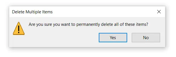
Confirmation dialogs are used to confirm actions that the user is about to take. They also show an error message if the user has invalid input data.
This article teaches you how to use Angular Material to create a confirmation popup in Angular. We’ll create a new common component, which will be accessible from other components.
Install and Use the Angular Material Component to Create a Confirmation Dialog in Angular
Web-based applications have typically used the built-in JavaScript functionality to display alerts and dialogues. The vanilla JavaScript dialog boxes, on the other hand, are contemporary, which means that everything on the screen will stop until the user replies, and they can’t be modified visually.
But now, things have been changed; with some help from the Material components, we can quickly design a dynamic confirmation popup in Angular.
First, you need to install the Angular Material with the help of the following code.
npm install --save @angular/material @angular/cdk @angular/animations
Now, it’s time to import the following important dependencies after installing Angular Material. For more information about Angular Material, click here.
import { NgModule } from '@angular/core';
import {MatDialogModule } from '@angular/material/dialog' ;'@material/button';

@NgModule({
  imports: [
    MatDialogModule
  ],
  exports: [
   MatDialogModule
  ]
})
export class CustomMaterialModule { }
Using the following command, create a new component with the name confirm-dialog.
ng generate component confirm-dialog
The dialogue component will be created in a folder and added to the app.module.ts declarations array.
It’s worth noting that the MatDialog module creates components at runtime. As a result, Angular will want some further info from us.
The component class should be included in the entry components array in our NgModule specification for any component loaded into a dialogue.
import { NgModule } from '@angular/core';
import { BrowserModule } from '@angular/platform-browser';
import { CustomMaterialModule } from './custom-material/custom-material.module';
import { ConfirmDialogComponent } from './confirm-dialog/confirm-dialog.component';
import { AppComponent } from './app.component';
import { BrowserAnimationsModule } from '@angular/platform-browser/animations';


@NgModule({
  imports: [
    BrowserModule,

    CustomMaterialModule,
    BrowserAnimationsModule,
  ],
  declarations: [AppComponent, ConfirmDialogComponent],
  entryComponents: [ConfirmDialogComponent],
  bootstrap: [AppComponent]
})
export class AppModule { }
After completing the preceding steps, it’s time to add some code to the component directly.
<h1 mat-dialog-title>
{{title}}
</h1>

<div mat-dialog-content>
<p>{{message}}</p>
</div>

<div mat-dialog-actions>
  <button mat-button (click)="onDelete()">Cancel</button>
  <button mat-raised-button (click)="onCommand()">Save</button>
  </div>
import { MatDialogRef, MAT_DIALOG_DATA } from '@angular/material/dialog';
import { Component, OnInit, Inject } from '@angular/core';

@Component({
  selector: 'app-confirm-dialog',
  templateUrl: './confirm-dialog.component.html',
  styleUrls: ['./confirm-dialog.component.css']
})
export class ConfirmDialogComponent implements OnInit {
  title: string;
  message: string;
  constructor(public dialogRef: MatDialogRef<ConfirmDialogComponent>,
    @Inject(MAT_DIALOG_DATA) public data: ConfirmDialogModel) {
    this.title = data.title;
    this.message = data.message;
  }
  ngOnInit() {
  }
  onCommand(): void {
    this.dialogRef.close(true);
  }
  onDelete(): void {
    this.dialogRef.close(false);
  }
}

export class ConfirmDialogModel {
  constructor(public title: string, public message: string) {
  }
}
The constructor method does two things: it connects to the window and injects the message shown on it. Both are given by the component that initiates the popup.
Let’s jump into the final step. Ultimately, we can use the code below to display our custom confirmation dialogue.
Because we utilize the MatDialog component internally, we include the MatDialog dependency in the constructor and display the confirm dialogue when the button is clicked. We can receive the outcome and change the view using data-binding by listening to the dialog’s afterClosed() event.
To initiate the dialogue, add a button to the view and a label to display the response.
<button mat-raised-button (click)="confirmDialog()">Confirm</button>
import { Component } from '@angular/core';
import { ConfirmDialogModel, ConfirmDialogComponent } from './confirm-dialog/confirm-dialog.component';
import { MatDialog } from '@angular/material/dialog';

@Component({
  selector: 'my-app',
  templateUrl: './app.component.html'
})
export class AppComponent {
  result: string = '';

  constructor(public dialog: MatDialog) {
  }

  confirmDialog(): void {
    const message = `Do you want to save this file?`;

    const dialogData = new ConfirmDialogModel("File Saving Message", message);

    const dialogRef = this.dialog.open(ConfirmDialogComponent, {
      maxWidth: "600px",
      data: dialogData
    });

    dialogRef.afterClosed().subscribe(dialogResult => {
      this.result = dialogResult;
    });
  }
}

Muhammad Adil is a seasoned programmer and writer who has experience in various fields. He has been programming for over 5 years and have always loved the thrill of solving complex problems. He has skilled in PHP, Python, C++, Java, JavaScript, Ruby on Rails, AngularJS, ReactJS, HTML5 and CSS3. He enjoys putting his experience and knowledge into words.
Facebook