在 Matplotlib Python 中绘制 NumPy 线性拟合图
Suraj Joshi
2022年1月22日
Matplotlib

本教程介绍了如何使用 numpy.polyfit() 方法对给定数据进行曲线拟合,并使用 Matplotlib 包显示曲线。
import numpy as np
import matplotlib.pyplot as plt

x = [1, 2, 3, 1.5, 4, 2.5, 6, 4, 3, 5.5, 5, 2]
y = [3, 4, 8, 4.5, 10, 5, 15, 9, 5, 16, 13, 3]

plt.scatter(x, y)
plt.title("Scatter Plot of the data")
plt.xlabel("X")
plt.ylabel("Y")
plt.show()
输出:
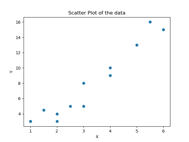
它显示的是需要进行曲线拟合的数据的散点图。我们可以看到,X 和 Y 的数值之间并不存在完美的线性关系,但我们将尝试从数据中做出最佳的线性近似。
绘制数据的线性拟合图
import numpy as np
import matplotlib.pyplot as plt

x = [1, 2, 3, 1.5, 4, 2.5, 6, 4, 3, 5.5, 5, 2]
y = [3, 4, 8, 4.5, 10, 5, 15, 9, 5, 16, 13, 3]

plt.scatter(x, y, color="red")
plt.title("Scatter Plot of the data")
plt.xlabel("X")
plt.ylabel("Y")

linear_model = np.polyfit(x, y, 1)
linear_model_fn = np.poly1d(linear_model)
x_s = np.arange(0, 7)
plt.plot(x_s, linear_model_fn(x_s), color="green")

plt.show()
输出:
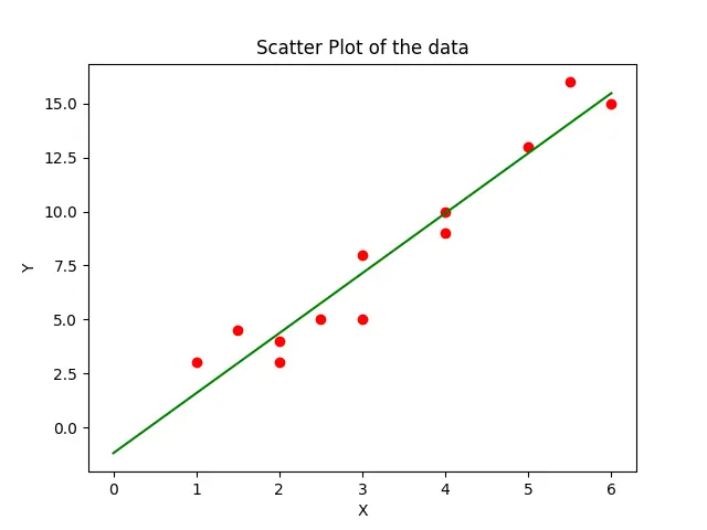
在这里,我们尝试用 y=m*x+c 形式的方程来近似给定数据。polyfit() 方法将从数据中估计 m 和 c 参数,poly1d() 方法将从这些系数中做出一个方程。然后我们用绿色颜色的直线代表的 plot() 方法将方程绘制在图中。
在这个例子中,我们对数据拟合了一个线性方程,因为我们在 polyfit() 方法中把 1 作为第三个参数。我们也可以尝试用其他参数值来拟合数据的高阶曲线。
import numpy as np
import matplotlib.pyplot as plt

x = [1, 2, 3, 1.5, 4, 2.5, 6, 4, 3, 5.5, 5, 2]
y = [3, 4, 8, 4.5, 10, 5, 15, 9, 5, 16, 13, 3]

plt.scatter(x, y, color="red")
plt.title("Scatter Plot of the data")
plt.xlabel("X")
plt.ylabel("Y")

linear_model = np.polyfit(x, y, 2)
linear_model_fn = np.poly1d(linear_model)
x_s = np.arange(0, 7)
plt.plot(x_s, linear_model_fn(x_s), color="green")

plt.show()
输出:
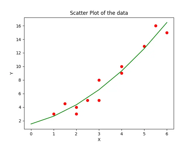
这样,我们只要将 polyfit() 方法的第三个参数设置为 2,就可以对数据生成二次曲线拟合。
Enjoying our tutorials? Subscribe to DelftStack on YouTube to support us in creating more high-quality video guides. Subscribe
作者: Suraj Joshi

Suraj Joshi is a backend software engineer at Matrice.ai.
LinkedIn