R 中的 scale_x_discrete 函式
-
使用
scale_x_discrete反轉 R 圖中x軸上的元素順序 -
在 R 中使用
scale_x_discrete的x軸上顯示元素的子集 -
使用
scale_x_discrete重新命名 R 中x軸上的元素標籤 -
使用
scale_x_discrete修改 R 中的x軸名稱

本文將介紹 R 中的 scale_x_discrete 函式。
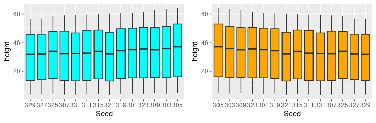
使用 scale_x_discrete 反轉 R 圖中 x 軸上的元素順序
scale_x_discrete 用於設定離散 x 軸比例美學的值。在本文中,我們使用 ggplot 和 geom_boxplot 函式構建多個箱線圖來演示 scale_x_discrete 中不同引數的效果。通常情況下,軸上元素的順序需要顛倒,實現這一點最簡單的方法是將 scale_x_discrete 引數的 limits 引數設定為 rev(levels(dataset_name$X_axis_items))。請注意,資料集名稱首先出現,然後是 $ 符號,然後我們指定需要反轉的 x 軸資料。
library(ggplot2)
library(gridExtra)

p1 <- ggplot(Loblolly, aes(x = Seed, y = height)) +
  geom_boxplot(fill = "cyan")

p2 <- ggplot(Loblolly, aes(x = Seed, y = height)) +
  geom_boxplot(fill = "orange") +
  scale_x_discrete(limits = rev(levels(Loblolly$Seed)))

grid.arrange(p1, p2, ncol = 2, nrow =2)
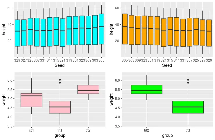
在 R 中使用 scale_x_discrete 的 x 軸上顯示元素的子集
scale_x_discrete 函式的另一個有用功能是從 x 軸消除一些元素並僅繪製其中的少數元素。在這種情況下,我們使用 PlantGrowth 資料集,其中列出了三類組。因此,我們可以輸出只有 trt2 和 trt1 組的箱線圖,如下面的程式碼片段所示。
library(ggplot2)
library(gridExtra)

p1 <- ggplot(Loblolly, aes(x = Seed, y = height)) +
  geom_boxplot(fill = "cyan")

p2 <- ggplot(Loblolly, aes(x = Seed, y = height)) +
  geom_boxplot(fill = "orange") +
  scale_x_discrete(limits = rev(levels(Loblolly$Seed)))

p3 <- ggplot(PlantGrowth, aes(x = group, y = weight)) +
  geom_boxplot(fill = "pink")

p4 <- ggplot(PlantGrowth, aes(x = group, y = weight)) +
  geom_boxplot(fill = "green") +
  scale_x_discrete(limits = c("trt2", "trt1"))

grid.arrange(p1, p2, p3, p4, ncol = 2, nrow =2)
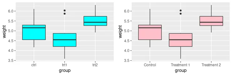
使用 scale_x_discrete 重新命名 R 中 x 軸上的元素標籤
scale_x_discrete 函式還可用於沿 x 軸重新命名元素標籤。新標籤值可以與分配給 scale_x_discrete 函式中的 labels 引數的向量一起提供。
library(ggplot2)
library(gridExtra)

p1 <- ggplot(PlantGrowth, aes(x = group, y = weight)) +
  geom_boxplot(fill = "cyan")

p2 <- ggplot(PlantGrowth, aes(x = group, y = weight)) +
  geom_boxplot(fill = "pink") +
  scale_x_discrete(
    labels = c("Control", "Treatment 1", "Treatment 2")
  )

grid.arrange(p1, p2, ncol = 2, nrow =2)
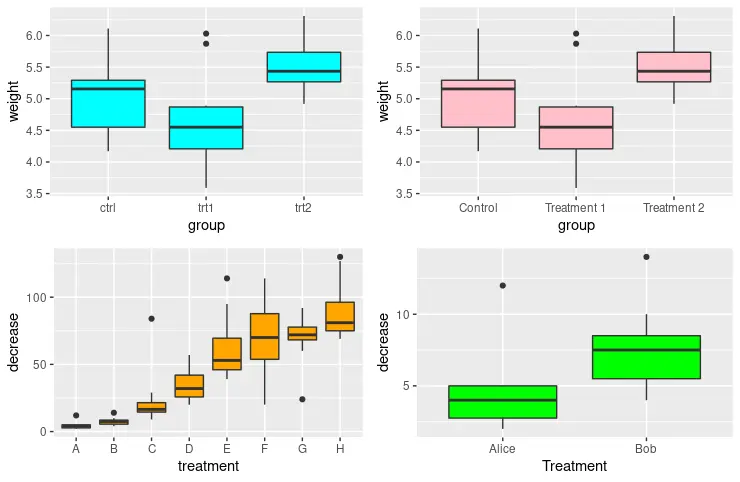
使用 scale_x_discrete 修改 R 中的 x 軸名稱
請注意,前面的每個方法都可以組合以輸出所需的圖形結構。例如,以下示例程式碼繪製 p4 以僅顯示元素的子集,並使用提供的值重新命名這些標籤。此外,我們利用 scale_x_discrete 使用 name 引數沿 x 軸修改名稱。
library(ggplot2)
library(gridExtra)

p1 <- ggplot(PlantGrowth, aes(x = group, y = weight)) +
  geom_boxplot(fill = "cyan")

p2 <- ggplot(PlantGrowth, aes(x = group, y = weight)) +
  geom_boxplot(fill = "pink") +
  scale_x_discrete(
    labels = c("Control", "Treatment 1", "Treatment 2")
  )

p3 <- ggplot(OrchardSprays, aes(x = treatment, y = decrease)) +
  geom_boxplot(fill = "orange")

p4 <- ggplot(OrchardSprays, aes(x = treatment, y = decrease)) +
  geom_boxplot(fill = "green") +
  scale_x_discrete(
    limits = c("A", "B"),
    labels = c("Alice", "Bob"),
    name = "Treatment"
  )

grid.arrange(p1, p2, p3, p4, ncol = 2, nrow =2)
Enjoying our tutorials? Subscribe to DelftStack on YouTube to support us in creating more high-quality video guides. Subscribe
作者: Jinku Hu
