How to Create Multiple Seaborn Plots
-
Use the
seaborn.FacetGrid()to Plot Multiple Seaborn Graphs -
Use the
seaborn.PairGrid()to Plot Multiple Seaborn Graphs -
Use the
seaborn.pairplot()to Plot Multiple Seaborn Graphs in Python

In this tutorial, we will discuss how to plot multiple graphs in the seaborn module.
Use the seaborn.FacetGrid() to Plot Multiple Seaborn Graphs
The FacetGrid() class is used to visualize the relationship between data distribution with other subsets of data and can be used to create grids for multiple plots.
The following code shows how to use this function.
import pandas as pd
import matplotlib.pyplot as plt
import seaborn as sns

df = pd.DataFrame(
    {
        "Price": [7, 1, 5, 6, 3, 10, 5, 8],
        "Product": [1, 1, 1, 1, 2, 2, 2, 2],
        "Day": [1, 2, 3, 4, 5, 6, 7, 8],
    }
)

g = sns.FacetGrid(df, col="Product")
g.map(sns.lineplot, "Day", "Price")
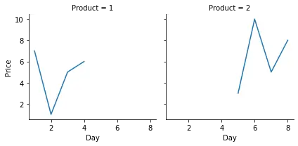
We plotted the lineplot() between the data after customizing the grid for multiple plots. It should be noted that different seaborn plots like relplot(), lmplot() and catplot() use this object by default.
Use the seaborn.PairGrid() to Plot Multiple Seaborn Graphs
This function is very similar to the FacetGrid() class. It takes a DataFrame and plots each column to the column and row of the grid, plotting multiple axes. We can use the hue parameter here for categorical data, with each color representing different categories.
The following example will explain its use.
import pandas as pd
import matplotlib.pyplot as plt
import seaborn as sns

df = pd.DataFrame(
    {
        "Price": [7, 1, 5, 6, 3, 10, 5, 8],
        "Product": [1, 1, 1, 1, 2, 2, 2, 2],
        "Day": [1, 2, 3, 4, 5, 6, 7, 8],
    }
)

g = sns.PairGrid(df, hue="Product")
g.map(sns.scatterplot)
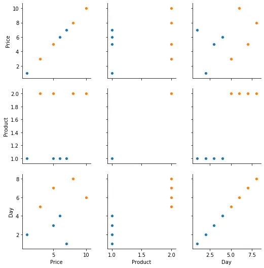
In the above code, we take our DataFrame and plot the scatterplot() between the variables.
Use the seaborn.pairplot() to Plot Multiple Seaborn Graphs in Python
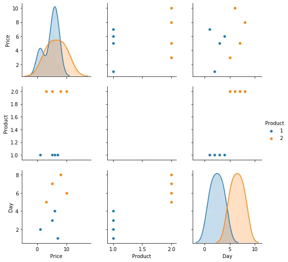
It is used to plot pair-wise distribution between the columns of the dataset. It also plots all the columns of the DataFrame on both the axes, which display a matrix of plots showing different types of graphs, similar to the PairGrid() class. Different types of plots are shown here.
For example,
import pandas as pd
import matplotlib.pyplot as plt
import seaborn as sns

df = pd.DataFrame(
    {
        "Price": [7, 1, 5, 6, 3, 10, 5, 8],
        "Product": [1, 1, 1, 1, 2, 2, 2, 2],
        "Day": [1, 2, 3, 4, 5, 6, 7, 8],
    }
)

g = sns.pairplot(df, hue="Product")

plt.show()

Manav is a IT Professional who has a lot of experience as a core developer in many live projects. He is an avid learner who enjoys learning new things and sharing his findings whenever possible.
LinkedIn