HOWTO · React
reactTable のヘッダー スタイルを変更する
この記事では、reactTable ライブラリを使用して React でテーブルを作成し、そのヘッダー スタイルを手動で変更する方法を説明します。
このページの内容
reactTable は、魅力的なテーブルを作成するための React の組み込みライブラリです。 ライブラリを使用してプログラミング言語でテーブルを作成する場合、常にテーブルに変更を加える必要があります。
すべてのコンポーネントをカスタマイズ可能にするライブラリはほとんどありません。 この記事では、reactTable ライブラリを使用してテーブルを作成し、カスタム CSS をテーブルのヘッダーとボディに適用する方法を学習します。
styled-components React ライブラリを使用して reactTable のヘッダー スタイルを変更する
以下の例では、reactTable ライブラリを使用してテーブルを作成し、styled-components を使用してテーブルのスタイルを設定しています。 両方のライブラリをインストールするには、プロジェクト ディレクトリでターミナルを開き、次を実行します。
npm install styled-components react-table
また、ユーザーは reactTable のデフォルト CSS を import "react-table/react-table.css"; のようにインポートすることで使用できます。 ただし、それを使用すると、ユーザーはテーブルのスタイルに最小限の変更を加えることができます。
そのため、styled-component ライブラリを使用して手動でテーブルのスタイルを設定することにしました。 React のコンポーネント全体にスタイルを追加します。
まず、画面に表示する列とテーブル データのオブジェクトの配列を作成し、それを Table コンポーネントに props として渡しました。 また、Styles コンポーネント内に Table コンポーネントを埋め込み、Styles で定義された CSS を適用します。
<Styles>
    <Table columns={columns} data={data} />
</Styles>
その後、Table 機能コンポーネントを作成し、react-table の useTable を使用して、columns と data から状態と小道具を取得しました。
const { getTableProps, getTableBodyProps, headerGroups, rows, prepareRow } = useTable({columns,data,});
HTML の <table> タグを使用してレンダリング コンポーネントを作成し、<thead> タグを使用してヘッダーを作成しました。 headerGroups にはすべてのヘッダー要素が含まれており、JavaScript の .map() メソッドを使用してすべてのヘッダー要素を反復処理し、カスタム ヘッダー コンポーネントを作成しています。
次に、getTableBodyProps を使用して、テーブル本体の行と列を作成しました。 また、<th> タグを使用してヘッダーを作成し、<tr> タグを行を作成し、<td> タグを使用して列を作成しました。
<table {...getTableProps()}>
    <thead>
        {headerGroups.map((singleHeader) => (
        // create table header
       ))}
    </thead>
    <tbody {...getTableBodyProps()}>
        {rows.map((tableRow, i) => {
            // create table row
        })}
      </tbody>
    </table>
Table コンポーネントをスタイリングするために Styles 変数を初期化しました。 ユーザーは以下のように styled-components を使用できます。
const Styles = styled.div`
    // style for the component elements
`
App.js ファイルの完全な作業コードを以下に示します。
コード例:
//  import required libraries
import React from "react";
import styled from "styled-components";
import { useTable } from "react-table";
// creating the style component
const Styles = styled.div`
  // style for the body
  text-align: center;
  padding-left: 50px;
  padding-top: 50px;
  // style for the whole table
  table {
    border-spacing: 0;
    border: 0.2rem solid black;

    //  style for every column
    td {
      margin: 0;
      padding: 0.5rem;
      border-bottom: 0.1rem solid black;
      border-right: 0.1rem solid black;

      :last-child {
        border-right: 0;
      }
    }
    // style for every header
    th {
      padding: 0.5rem;
      border-bottom: 0.1rem dashed black;
      border-right: 0.1rem solid black;
    }
  }
`;

// function table creates the table from props and returns the table
function Table({ columns, data }) {
  // The useTable, returns the state and props from the header and table data
  const { getTableProps, getTableBodyProps, headerGroups, rows, prepareRow } =
    useTable({
      columns,
      data,
    });

  // Creating the table component
  return (
    <table {...getTableProps()}>
      {/* creating the header */}
      <thead>
        {/* iterate through every header and create the single header using the <th> HTML tag. */}
        {headerGroups.map((singleHeader) => (
          <tr {...singleHeader.getHeaderGroupProps()}>
            {/* create a column for every single header */}
            {singleHeader.headers.map((singleColumn) => (
              <th {...singleColumn.getHeaderProps()}>
                {singleColumn.render("Header")}
              </th>
            ))}
          </tr>
        ))}
      </thead>
      {/* creating the table body */}
      <tbody {...getTableBodyProps()}>
        {/* iterate through every row of table */}
        {rows.map((tableRow, i) => {
          prepareRow(tableRow);
          return (
            // create table row
            <tr {...tableRow.getRowProps()}>
              {/* create table column for every table row */}
              {tableRow.cells.map((tableColumn) => {
                return (
                  <td {...tableColumn.getCellProps()}>
                    {tableColumn.render("Cell")}
                  </td>
                );
              })}
            </tr>
          );
        })}
      </tbody>
    </table>
  );
}

function App() {
  // header data
  const columns = [
    {
      Header: "Programming Langugage",
      accessor: "ProgrammingLangugage",
    },
    {
      Header: "Rating",
      accessor: "Rating",
    },
  ];
  //  table data
  const data = [
    {
      ProgrammingLangugage: "JavaScript",
      Rating: 8,
    },
    {
      ProgrammingLangugage: "Python",
      Rating: 7,
    },
    {
      ProgrammingLangugage: "C",
      Rating: 8,
    },
    {
      ProgrammingLangugage: "C++",
      Rating: 8,
    },
    {
      ProgrammingLangugage: "NodeJs",
      Rating: 9,
    },
    {
      ProgrammingLangugage: "MongoDB",
      Rating: 8,
    },
  ];

  return (
    // embedded the Table component inside the style component to apply style on the table
    <Styles>
      {/* passed columns and data as props in Table component */}
      <Table columns={columns} data={data} />
    </Styles>
  );
}
export default App;
出力:
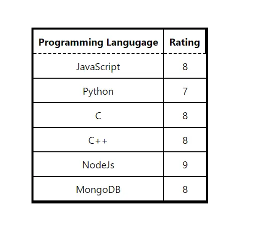
ユーザーは、出力のヘッダーの破線の境界線を確認できます。 また、要件に応じてスタイルを変更することもできます。
Table コンポーネントを 1つのファイルに作成しましたが、ユーザーはそれを別のファイルに作成して再利用可能にすることができます。