Matplotlib-Tick-Label in wissenschaftlicher Notation
In diesem Beitrag erfahren Sie, wie Sie Matplotlib ticklabel_format() verwenden, um Ticks-Label in wissenschaftlicher Notation anzuzeigen.
Matplotlib-Tick-Label in wissenschaftlicher Notation
Zu große oder zu wenige Zahlen, die leicht in Dezimalform angegeben werden können, können mit wissenschaftlicher Notation ausgedrückt werden.
Importieren Sie zunächst die erforderliche Bibliothek:
import matplotlib.pyplot as plt
Geben Sie die Werte zusammen mit den x- und y-Achsen an:
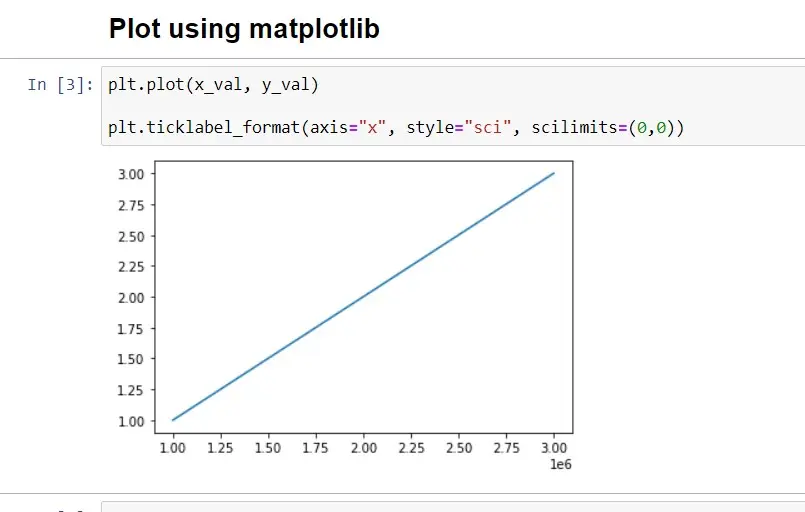
x_val = [1000000, 2000000, 3000000]
y_val = [1, 2, 3]
Lassen Sie uns diese Zahlen mit Matplotlib darstellen:
plt.plot(x_val, y_val)

plt.ticklabel_format(axis="x", style="sci", scilimits=(0, 0))
Ausgang:
Zum Plotten verwenden wir die Funktion ticklabel_format(), die den Parameter axes und style=sci übernimmt, was die wissenschaftliche Notation angibt.

Shiv is a self-driven and passionate Machine learning Learner who is innovative in application design, development, testing, and deployment and provides program requirements into sustainable advanced technical solutions through JavaScript, Python, and other programs for continuous improvement of AI technologies.
LinkedInVerwandter Artikel - Matplotlib Ticks
- X-Achse drehen Beschriftungstext in der Matplotlib ankreuzen
- Wie man die Schriftgröße von Tick Labels in Matplotlib einstellt
- Ausblenden von Achsentext-Ticks und/oder Tick-Etiketten in Matplotlib
- Anzahl der Ticks in Matplotlib festlegen
Verwandter Artikel - Matplotlib Axes
- X-Achse drehen Beschriftungstext in der Matplotlib ankreuzen
- Wie man die Schriftgröße von Tick Labels in Matplotlib einstellt
- Hinzufügen einer y-Achsenbeschriftung zur sekundären y-Achse in Matplotlib
- Wie werden logarithmische Achsen in Matplotlib gezeichnet
- Wie man einen quadratischen Plot mit gleichen Achsen in Matplotlib erstellt
- Wie man Grenzen für Achsen in Matplotlib setzt