在 Python Matplotlib 中添加趋势线
Maxim Maeder
2023年1月30日
Matplotlib
Matplotlib Trendline
本教程将讨论在 Matplotlib 中向绘图添加趋势线。
在 Matplotlib 中生成要绘制的数据
在使用绘图之前,我们需要设置我们的脚本以使用该库。我们首先导入 Matplotlib。
我们从 random 模块加载 randrange 函数以快速生成一些数据。因此,请记住,这对你来说会有所不同。
import numpy
from matplotlib import pyplot as plt

x = [x for x in range(0, 10)]
y = numpy.random.rand(10)
在 Python Matplotlib 中使用 NumPy 添加趋势线
趋势线显示数据是增加还是减少。例如,地球上的整体温度可能看起来在波动,但它们正在上升。
我们用 NumPy 计算趋势线。为此,我们需要 x 轴和 y 轴。
然后我们使用 NumPy 的 polyfit 和 poly1d 函数。最后,我们绘制趋势线。
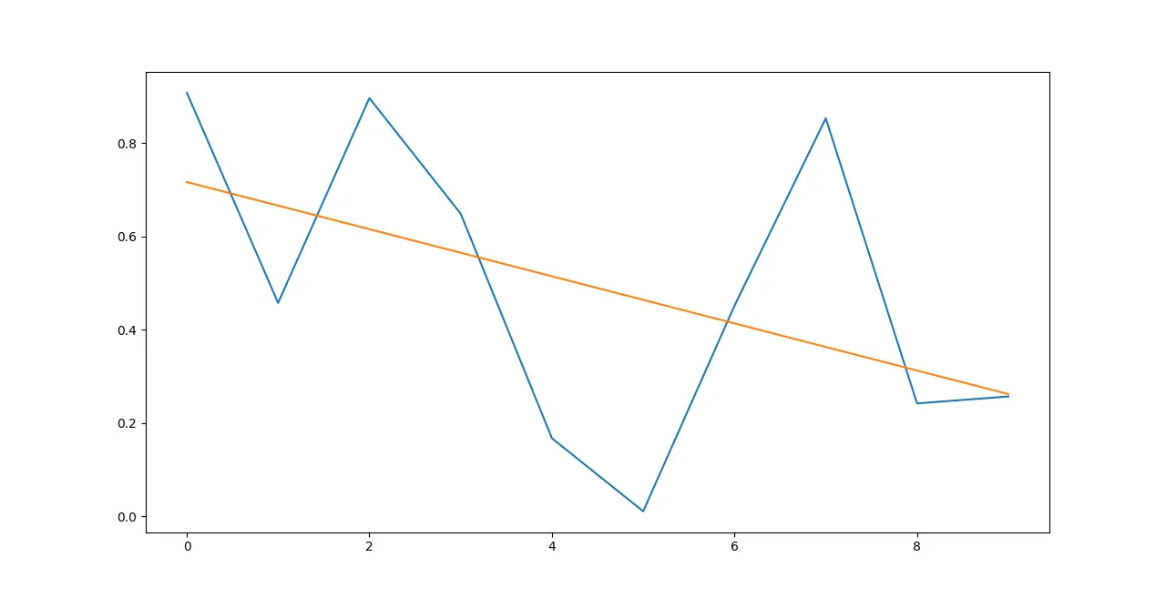
# Plot the Data itself.
plt.plot(x, y)

# Calculate the Trendline
z = numpy.polyfit(x, y, 1)
p = numpy.poly1d(z)

# Display the Trendline
plt.plot(x, p(x))
输出:
完整代码
import numpy
from matplotlib import pyplot as plt

x = [x for x in range(0, 10)]
y = numpy.random.rand(10)

# Plot the Data itself.
plt.plot(x, y)

# Calculate the Trendline
z = numpy.polyfit(x, y, 1)
p = numpy.poly1d(z)

# Display the Trendline
plt.plot(x, p(x))

plt.show()
Enjoying our tutorials? Subscribe to DelftStack on YouTube to support us in creating more high-quality video guides. Subscribe
作者: Maxim Maeder

Hi, my name is Maxim Maeder, I am a young programming enthusiast looking to have fun coding and teaching you some things about programming.
GitHub