在 Pandas 中繪製帶有資料點的直線圖圖

Pandas 是 Python 中的一個開源資料分析庫。它提供了許多內建方法來對數值資料執行操作。
資料視覺化現在非常流行,用於通過視覺快速分析資料。我們可以通過一個名為 Matplotlib 的庫來視覺化 Pandas 資料框中的資料。
它提供了多種圖表來繪製資料。
在 Pandas 中繪製帶有資料點的單線圖
直線圖圖是一種圖形,它顯示了一系列稱為標記的資料點,由直線連線。它表示資料點或趨勢隨時間的變化。
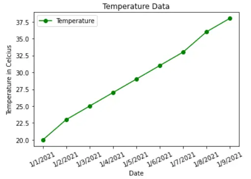
在以下示例中,我們有天氣資料。要繪製日期和溫度之間的關係,首先,我們必須使用 list() 方法將所需的列轉換為列表。
在 plot() 的幫助下,我們可以通過指定 x 和 y 來繪製直線圖圖。
我們可以通過指定線條 color、linestyle、marker 和 label 來進一步裝飾圖形。我們還使用 xlabel() 和 ylabel() 方法為兩個軸提供了標題。
為了旋轉 x 標籤,我們使用了 xticks() 方法。為了清晰起見,legend() 在圖表的角落顯示帶有顏色的線條標籤。
最後,我們呼叫 show() 方法來顯示直線圖圖,說明日期和溫度之間的關係。
示例程式碼:
# Python 3.x
import matplotlib.pyplot as plt
import pandas as pd
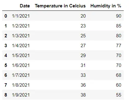
df = pd.read_csv("weather_data.csv")
display(df)
date = df["Date"]
temp = df["Temperature in Celcius"]
x = list(date)
y = list(temp)
plt.plot(x, y, color="g", linestyle="solid", marker="o", label="Temperature")
plt.xlabel("Date")
plt.xticks(rotation=25)
plt.ylabel("Temperature in Celcius")
plt.title("Temperature Data")
plt.legend()
plt.show()
輸出:
用 Pandas 中的資料點繪製多條線圖
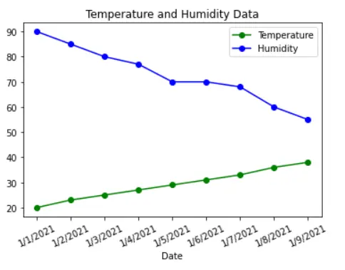
假設我們想在圖中視覺化 Pandas 資料框的多個屬性。在這種情況下,我們必須建立許多線圖,每個線圖對應一條線。
每行都有不同的顏色和標籤。我們在以下示例中顯示了每個日期的溫度和溼度的線圖。
在這裡,圖例有助於區分代表溫度和溼度的線條。
示例程式碼:
# Python 3.x
import matplotlib.pyplot as plt
import pandas as pd

df = pd.read_csv("weather_data.csv")
display(df)
date = df["Date"]
temp = df["Temperature in Celcius"]
humidity = df["Humidity in %"]
x = list(date)
y1 = list(temp)
y2 = list(humidity)
plt.plot(x, y1, color="g", linestyle="solid", marker="o", label="Temperature")
plt.plot(x, y2, color="b", linestyle="solid", marker="o", label="Humidity")
plt.xlabel("Date")
plt.xticks(rotation=25)
plt.title("Temperature and Humidity Data")
plt.legend()
plt.show()
輸出:

I am Fariba Laiq from Pakistan. An android app developer, technical content writer, and coding instructor. Writing has always been one of my passions. I love to learn, implement and convey my knowledge to others.
LinkedIn