如何在 Matplotlib Pyplot 中顯示網格
mo abdelazim
2023年1月30日
Matplotlib
Matplotlib Grid

本教程介紹瞭如何在 Python Matplotlib 中在圖上畫一個網格。我們將使用 grid() 函式來實現這一目的。它還演示瞭如何使用 grid() 函式引數來自定義網格的顏色和形狀,甚至只畫垂直或水平線。
在 Matplotlib 中繪製正態分佈圖
讓我們先建立兩個列表來表示 x 和 y 值,並使用它們來繪製一個圖。呼叫 plot() 函式並傳遞 x 和 y 列表作為引數,然後呼叫 show() 函式。
使用 title()、xlabel 和 ylabel() 函式為你的圖新增標題和標籤,使其易於理解。
from matplotlib import pyplot as plt

x = [10, 20, 30, 40, 50, 60, 70, 80, 90, 100, 110]
y = [200, 300, 300, 350, 380, 450, 500, 500, 520, 525, 530]

plt.title("MyPlot")
plt.xlabel("X Axis")
plt.ylabel("Y Axis")

plt.plot(x, y)
plt.show()
輸出:
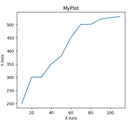
但是,普通的畫圖似乎很無聊,缺少了一些東西。現在,我們需要給我們的繪圖新增一個網格。
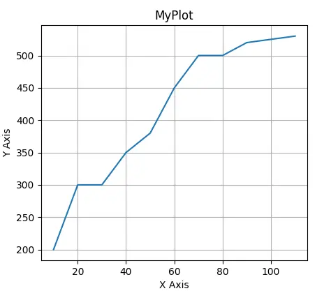
在 Matplotlib 中的繪圖中使用 grid()
我們將使用 Matplotlib grid() 函式在圖上畫一個網格。
我們需要在 show() 之前呼叫 grid() 函式,這樣就會在前面的圖上畫出一個網格。
請看下面的程式碼。
from matplotlib import pyplot as plt

x = [10, 20, 30, 40, 50, 60, 70, 80, 90, 100, 110]
y = [200, 300, 300, 350, 380, 450, 500, 500, 520, 525, 530]

plt.title("MyPlot")
plt.xlabel("X Axis")
plt.ylabel("Y Axis")

plt.plot(x, y)
plt.grid()
plt.show()
輸出:
改變 Matplotlib 中的網格屬性
grid() 函式接受引數來定製網格的顏色和樣式。我們可以像 grid(color='r', linestyle='dotted', linewidth=1) 這樣呼叫 grid() 來得到一個紅色、點狀和細線的網格。
from matplotlib import pyplot as plt

x = [10, 20, 30, 40, 50, 60, 70, 80, 90, 100, 110]
y = [200, 300, 300, 350, 380, 450, 500, 500, 520, 525, 530]

plt.title("MyPlot")
plt.xlabel("X Axis")
plt.ylabel("Y Axis")

plt.plot(x, y)
plt.grid(color="r", linestyle="dotted", linewidth=1)
plt.show()
輸出:
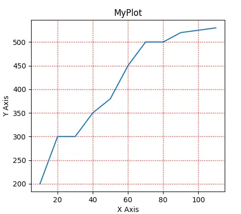
線寬是浮動資料型別,這裡有所有的顏色程式碼和線型供你選擇。
有效的顏色程式碼。
| 程式碼 | 顏色 |
|---|---|
b |
藍色 |
g |
綠化 |
r |
紅色 |
c |
青色 |
m |
洋紅色 |
y |
黃 |
k |
黑色 |
w |
白色 |
有效的行式。
----.:None- ``
soliddasheddashdotdotted
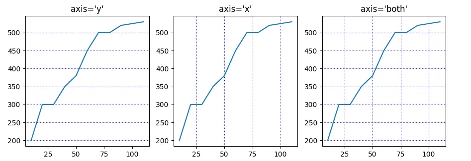
繪製垂直或水平線
grid() 函式的預設值是同時繪製水平軸和垂直軸,但你可能也想自定義它。你可以使用 axis 引數來實現這一點。呼叫 grid() 時,使用 axis='x'只畫垂直線,或者 axis='y'只畫水平線,或者 axis='both'兩者都畫,這是預設選項。
請看下面的程式碼和它的輸出。
from matplotlib import pyplot as plt

x = [10, 20, 30, 40, 50, 60, 70, 80, 90, 100, 110]
y = [200, 300, 300, 350, 380, 450, 500, 500, 520, 525, 530]

_, (a, b, c) = plt.subplots(1, 3)

a.grid(axis="y", linestyle="dotted", color="b")
a.plot(x, y)
a.set_title("axis='y'")

b.grid(axis="x", linestyle="dotted", color="b")
b.plot(x, y)
b.set_title("axis='x'")

c.grid(axis="both", linestyle="dotted", color="b")
c.plot(x, y)
c.set_title("axis='both'")

plt.show()
輸出:
Enjoying our tutorials? Subscribe to DelftStack on YouTube to support us in creating more high-quality video guides. Subscribe