Matplotlib 教程 - 座標軸標籤
Jinku Hu
2024年2月15日
在本教程中,我們將學習 Matplotlib 中的座標軸標籤、標題和圖例。這些可以提高繪圖的自解釋性。
Matplotlib 座標軸標籤
matplotlib.pyplot.xlabel(label, fontdict=None, labelpad=None, **kwargs)
它用來設定 x 軸的標籤。同樣的,matplotlib.pyplot.ylabel 用來設定 y 軸的標籤。
引數
| 名稱 | 描述 |
|---|---|
label |
標籤文字 |
fontdict |
標籤文字字型字典,例如字型系列、顏色、粗細和大小 |
labelpad |
標籤和 x 軸之間的間距 |
# -*- coding: utf-8 -*-
import numpy as np
import matplotlib.pyplot as plt

x = np.linspace(0, 4 * np.pi, 1000)
y = np.sin(x)

plt.figure(figsize=(4, 3))

plt.plot(x, y, "r")
plt.xlabel("Time (s)", family="serif", color="r", weight="normal", size=16, labelpad=6)

plt.show()
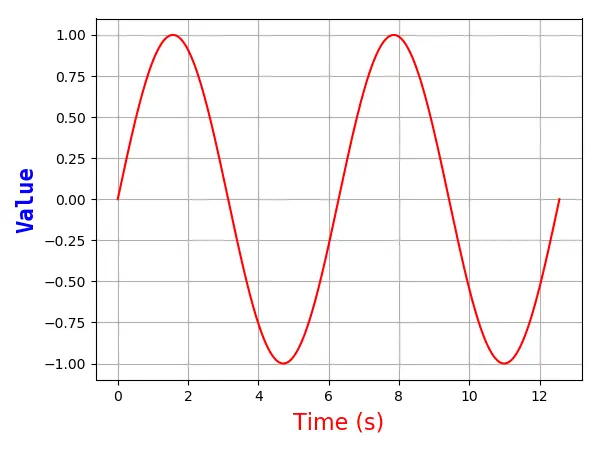
它指定 x 軸的標籤如下,
plt.xlabel("Time (s)", family="serif", color="r", weight="normal", size=16, labelpad=6)
以下是詳細說明,
-
Times (s)這是 x 軸的標籤文字
-
family='serif'它指定標籤文字字型系列為
serif。你可以從熱門選項中選擇字型,例如[ 'serif' | 'sans-serif' | 'cursive' | 'fantasy' | 'monospace' ]。 -
color='r'字型文字為紅色。請參考上一章的顏色選項以選擇更多顏色。
-
weight='normal'它指定標籤文字具有正常的粗細。選項是
['light', 'normal', 'medium', 'semibold', 'bold', 'heavy', 'black']。 -
size=16它將字型大小設定為 16。
-
labelpad = 6x 軸與標籤之間的距離為
6px。
Enjoying our tutorials? Subscribe to DelftStack on YouTube to support us in creating more high-quality video guides. Subscribe
