在 Seaborn 中繪製時間序列資料
-
在 Seaborn 中使用
seaborn.lineplot()函式繪製時間序列資料 -
在 Seaborn 中使用
seaborn.tsplot()函式繪製時間序列資料 -
在 Seaborn 中使用
seaborn.barplot()函式繪製時間序列資料
時間序列資料是一種特殊型別的資料,我們在其中觀察一段時間內的一些觀察結果。記錄每個觀察的時間戳。當我們談論股票價格、感測器資料、應用程式監控資料等時,通常會處理此類資料。
在本教程中,我們將學習如何使用 Seaborn 模組在 Python 中繪製此類時間序列資料。
我們將為繪圖建立我們自己的樣本時間序列資料。
在 Seaborn 中使用 seaborn.lineplot() 函式繪製時間序列資料
線圖是該模組最基本的圖之一。它通常用於跟蹤與時間有關的事物;這就是為什麼它被高度用於時間序列資料。
在以下程式碼中,我們使用 seaborn.lineplot() 函式繪製時間序列資料。
import pandas as pd
import matplotlib.pyplot as plt
import seaborn as sns

df = pd.DataFrame(
    {
        "Date": [
            "01/01/2019",
            "01/02/2019",
            "01/03/2019",
            "01/04/2019",
            "01/05/2019",
            "01/06/2019",
            "01/07/2019",
            "01/08/2019",
        ],
        "Price": [77, 76, 68, 70, 78, 79, 74, 75],
    }
)
plt.figure(figsize=(15, 8))
sns.lineplot(x="Date", y="Price", data=df)
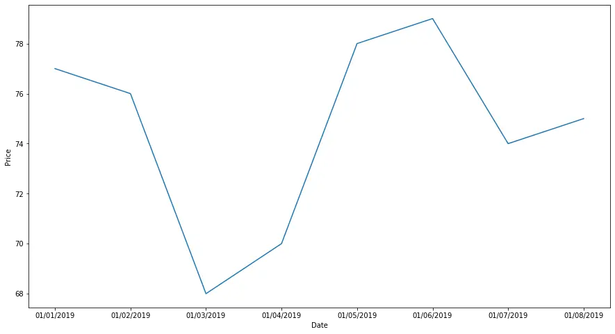
請注意,在將 DataFrame 與函式一起使用之前,我們必須對其進行處理。我們必須確保 Date 列是日期時間格式,這是使用 pd.to_datetime() 函式完成的。
plt.figure() 命令用於改變最終圖形的大小。
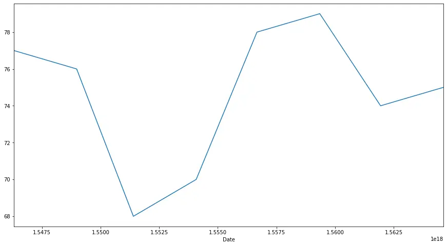
在 Seaborn 中使用 seaborn.tsplot() 函式繪製時間序列資料
seaborn.tsplot() 是該模組最新版本的一個相對較新的補充。當我們有可用資料的時間戳時使用它。它用於繪製一個或多個時間序列資料。資料可以是長資料幀的形式,也可以是具有單位和時間維度的 N 維陣列。
下面的程式碼展示瞭如何使用這個函式。
import pandas as pd
import matplotlib.pyplot as plt
import seaborn as sns

df = pd.DataFrame(
    {
        "Date": [
            "01012019",
            "01022019",
            "01032019",
            "01042019",
            "01052019",
            "01062019",
            "01072019",
            "01082019",
        ],
        "Price": [77, 76, 68, 70, 78, 79, 74, 75],
    }
)
df["Date"] = pd.to_datetime(df["Date"], format="%d%m%Y")

plt.figure(figsize=(15, 8))
sns.tsplot(data=df["Price"], time=df["Date"])
在 Seaborn 中使用 seaborn.barplot() 函式繪製時間序列資料
條形圖用於表示矩形條中的觀測值。Python 中的 seaborn 模組使用 seaborn.barplot() 函式來建立條形圖。
條形圖可用於顯示連續的時間序列資料。
例如,
import pandas as pd
import matplotlib.pyplot as plt
import seaborn as sns

df = pd.DataFrame(
    {
        "Date": [
            "01012019",
            "01022019",
            "01032019",
            "01042019",
            "01052019",
            "01062019",
            "01072019",
            "01082019",
        ],
        "Price": [77, 76, 68, 70, 78, 79, 74, 75],
    }
)
df["Date"] = pd.to_datetime(df["Date"], format="%d%m%Y")

plt.figure(figsize=(15, 8))
sns.barplot(x="Date", y="Price", data=df)
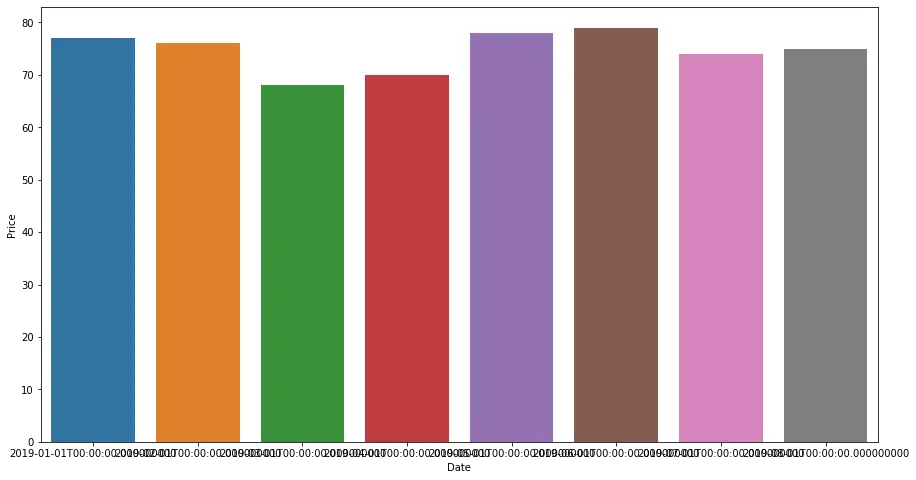
前兩種方法使用線條繪製資料,因此這為時間序列資料提供了另一種視覺化。

Manav is a IT Professional who has a lot of experience as a core developer in many live projects. He is an avid learner who enjoys learning new things and sharing his findings whenever possible.
LinkedIn