Pandas 以表格樣式顯示 DataFrame
-
使用
IPython.display模組的display()函式在表格中顯示 PandasDataFrame -
使用
tabulate庫以表格樣式顯示 PandasDataFrame -
使用
dataFrame.style在表格中顯示 PandasDataFrame -
Pandas 的樣式表
DataFrame

Pandas 是一個非常流行和有用的資料科學庫。今天,每個參與資料科學的人也廣泛使用 Pandas。它以表格形式顯示資料,這與我們在 Excel 工具中看到的格式非常相似。使用 excel 工具,我們可以通過新增各種顏色和樣式來自定義我們的工作或資料表,使其對其他使用者更具吸引力和可讀性。通過各種表格樣式顯示 Pandas DataFrame 增加了資料視覺化。
我們將介紹如何使用不同的表格樣式以表格的形式顯示 Pandas DataFrame,例如 tabulate 庫、dataframe.style 和 IPython.display 模組。
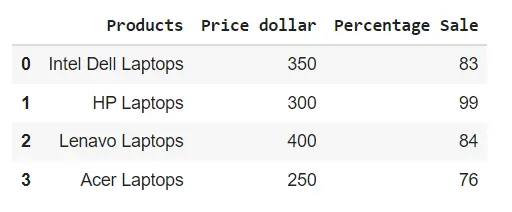
使用 IPython.display 模組的 display() 函式在表格中顯示 Pandas DataFrame
以表格樣式顯示 Pandas DataFrame 的最簡單和最簡單的方法是使用從 IPython.display 模組匯入的 display() 函式。此函式以互動式且格式良好的表格形式顯示 DataFrame。
請參閱以下示例以更好地理解 display() 函式:
示例程式碼:
from IPython.display import display
import pandas as pd

# creating a DataFrame
dict = {
    "Products": ["Intel Dell Laptops", "HP Laptops", "Lenavo Laptops", "Acer Laptops"],
    "Price dollar": [350, 300, 400, 250],
    "Percentage Sale": [83, 99, 84, 76],
}
dataframe = pd.DataFrame(dict)

# displaying the DataFrame
display(dataframe)
輸出:
使用 tabulate 庫以表格樣式顯示 Pandas DataFrame
使用上述方法,我們可以以有組織的表格樣式格式顯示 Pandas dataframes。我們將使用一個名為 tabulate 的庫。這個庫由不同的樣式組成,我們可以在其中顯示 Pandas dataframes。
在以下示例中,我們將使用 pretty 樣式來顯示 Pandas DataFrame:
示例程式碼:
import pandas as pd
from tabulate import tabulate

# creating a DataFrame
dict = {
    "Students": ["Intel Dell Laptops", "HP Laptops", "Lenavo Laptops", "Acer Laptops"],
    "Price dollar": [350, 300, 400, 250],
    "Percentage Sale": [83, 99, 84, 76],
}
dataframe = pd.DataFrame(dict)

# displaying the DataFrame
print(tabulate(dataframe, headers="keys", tablefmt="pretty"))
輸出:
+---+--------------------+--------------+-----------------+
|   |      Students      | Price dollar | Percentage Sale |
+---+--------------------+--------------+-----------------+
| 0 | Intel Dell Laptops |     350      |       83        |
| 1 |     HP Laptops     |     300      |       99        |
| 2 |   Lenavo Laptops   |     400      |       84        |
| 3 |    Acer Laptops    |     250      |       76        |
+---+--------------------+--------------+-----------------+
tabulate 庫包含以下 styles,我們可以使用它們來為 pandas DataFrame 設定樣式:
plainsimplegithubgridfancy_gridpipeorgtbljiraprestoprettypsqlrstmediawikimoinmoinyoutrackhtmllatexlatex_rawlatex_booktabstextile
使用 dataFrame.style 在表格中顯示 Pandas DataFrame
我們可以使用 Pandas Style API 以表格樣式顯示 Pandas DataFrame。我們將在以下程式碼中使用 dataframe.style。當我們使用 dataframe.style 時,它會返回一個 Styler object,其中包含用於顯示 pandas dataframes 的不同格式設定方法。
示例程式碼:
import pandas as pd

# creating a DataFrame
dict = {
    "Students": ["Intel Dell Laptops", "HP Laptops", "Lenavo Laptops", "Acer Laptops"],
    "Price dollar": [350, 300, 400, 250],
    "Percentage Sale": [83, 99, 84, 76],
}
dataframe = pd.DataFrame(dict)

# displaying the DataFrame
dataframe.style
輸出:

Pandas 的樣式表 DataFrame
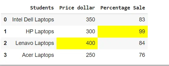
為了增強 Pandas DataFrame 表的樣式,我們可以通過與 styler object 連結來使用各種內建函式。
突出顯示最大值
請參閱以下示例,其中我們通過與樣式器物件連結來使用 highliglight_max() 函式。
示例程式碼:
import pandas as pd

# creating a DataFrame
dict = {
    "Students": ["Intel Dell Laptops", "HP Laptops", "Lenavo Laptops", "Acer Laptops"],
    "Price dollar": [350, 300, 400, 250],
    "Percentage Sale": [83, 99, 84, 76],
}
dataframe = pd.DataFrame(dict)

# displaying the DataFrame
dataframe.style.highlight_max()
輸出:
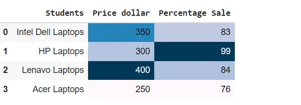
使用 background_gradient() 函式建立 heatmaps
在下面的示例中,我們通過與樣式器物件連結來使用 background_gradient() 函式在 pandas DataFrame 表中建立熱圖。
示例程式碼:
import pandas as pd

# creating a DataFrame
dict = {
    "Students": ["Intel Dell Laptops", "HP Laptops", "Lenavo Laptops", "Acer Laptops"],
    "Price dollar": [350, 300, 400, 250],
    "Percentage Sale": [83, 99, 84, 76],
}
dataframe = pd.DataFrame(dict)

# displaying the DataFrame
dataframe.style.background_gradient()
輸出:
在 Pandas DataFrame 中設定表屬性
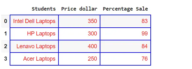
我們可以使用 set_properties() 函式增加 Pandas DataFrame 表裝飾,如下所示:
示例程式碼:
import pandas as pd

# creating a DataFrame
dict = {
    "Students": ["Intel Dell Laptops", "HP Laptops", "Lenavo Laptops", "Acer Laptops"],
    "Price dollar": [350, 300, 400, 250],
    "Percentage Sale": [83, 99, 84, 76],
}
dataframe = pd.DataFrame(dict)

# displaying the DataFrame
dataframe.style.set_properties(**{"border": "1.5px solid blue", "color": "red"})
輸出:
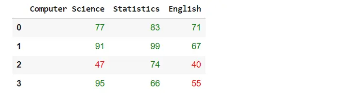
建立自定義功能
我們還可以將自定義函式與 styler object 一起使用,如下所示:
示例程式碼:
import pandas as pd
import numpy as np


def table_color(val):
    """
    Takes a scalar and returns a string with
    the css property `'color: red'` for less than 60 marks, green otherwise.
    """
    color = "green" if val > 60 else "red"
    return "color: % s" % color


# creating a DataFrame
dict = {
    "Computer Science": [77, 91, 47, 95],
    "Statistics": [83, 99, 74, 66],
    "English": [71, 67, 40, 55],
}

dataframe = pd.DataFrame(dict)

# displaying the DataFrame
dataframe.style.applymap(table_color)
輸出: