How to Create Correlation Heatmap in Seaborn
Correlation is a critical underlying factor for data scientists. It tells how variables in a dataset are related to each other and how they move concerning each other. The value of correlation ranges from -1 to +1. 0 Correlation indicates that two variables are independent of each other. A positive correlation indicates that the variables move in the same direction, and a negative correlation indicates the opposite.
We can plot the correlation matrix using the seaborn module. It helps to understand the dataset easily and is used very frequently for analysis work.
This tutorial will introduce how to plot the correlation matrix in Python using the seaborn.heatmap() function.
The heatmap is used to represent matrix values graphically with different color shades for different values. It visualizes the overall matrix very clearly.
In the code below, we will represent a correlation matrix using a heatmap in Python.
import pandas as pd
import matplotlib.pyplot as plt
import seaborn as sns

df = pd.DataFrame(
    {
        "Day 1": [7, 1, 5, 6, 3, 10, 5, 8],
        "Day 2": [1, 2, 8, 4, 3, 9, 5, 2],
        "Day 3": [4, 6, 5, 8, 6, 1, 2, 3],
        "Day 4": [5, 8, 9, 5, 1, 7, 8, 9],
    }
)

sns.heatmap(df.corr())

The above code creates a basic correlation heatmap plot. The corr() function is used to return the correlation matrix of the DataFrame. We can also calculate other types of correlations using this function. Notice that the color shade for each value in the color axis bar.
We can also customize the final figure using different parameters. See the below code.
import pandas as pd
import matplotlib.pyplot as plt
import seaborn as sns

df = pd.DataFrame(
    {
        "Day 1": [7, 1, 5, 6, 3, 10, 5, 8],
        "Day 2": [1, 2, 8, 4, 3, 9, 5, 2],
        "Day 3": [4, 6, 5, 8, 6, 1, 2, 3],
        "Day 4": [5, 8, 9, 5, 1, 7, 8, 9],
    }
)

sns.heatmap(df.corr(), vmin=-1, vmax=+1, annot=True, cmap="coolwarm")
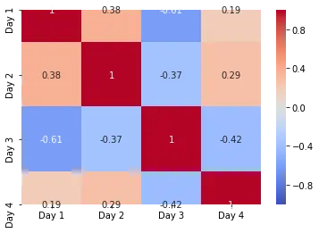
Notice the use of so many parameters. The vmin and vmax arguments are used to specify the scale for the color axis. the cmap argument here alters the color scheme used for the plot. The annot parameter is used to display the correlation values on the squares. We can further use the linewidth and linecolor parameters to darken the squares’ borders and specify the border’s color. We can customize the color bar using the cbar_kws argument.
Notice that if you remove half the data on one side of the main diagonal, you won’t lose any important information since it is repeated. Due to this, we can create a triangular plot also.
The code snippet below achieves this.
import pandas as pd
import matplotlib.pyplot as plt
import seaborn as sns
import numpy as np

df = pd.DataFrame(
    {
        "Day 1": [7, 1, 5, 6, 3, 10, 5, 8],
        "Day 2": [1, 2, 8, 4, 3, 9, 5, 2],
        "Day 3": [4, 6, 5, 8, 6, 1, 2, 3],
        "Day 4": [5, 8, 9, 5, 1, 7, 8, 9],
    }
)

upp_mat = np.triu(df.corr())

sns.heatmap(df.corr(), vmin=-1, vmax=+1, annot=True, cmap="coolwarm", mask=upp_mat)
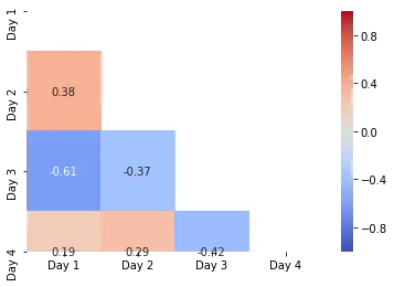
In the above code, we first use the numpy.triu(), which returns the upper triangle of the matrix, and then we mask this using the mask argument of the heatmap() function. Similarly, we can mask the lower triangle using the numpy.tril() function.
Another interesting representation we can get is that we can map only one variable and find its correlation with different variables.
For example,
import pandas as pd
import matplotlib.pyplot as plt
import seaborn as sns
import numpy as np

df = pd.DataFrame(
    {
        "Day 1": [7, 1, 5, 6, 3, 10, 5, 8],
        "Day 2": [1, 2, 8, 4, 3, 9, 5, 2],
        "Day 3": [4, 6, 5, 8, 6, 1, 2, 3],
        "Day 4": [5, 8, 9, 5, 1, 7, 8, 9],
    }
)

upp_mat = np.triu(df.corr())

sns.heatmap(df.corr()[["Day 1"]], vmin=-1, vmax=+1, annot=True, cmap="coolwarm")
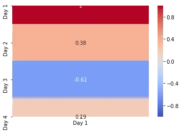
In the above example, we plot the correlation of the Day 1 variable with other variables.

Manav is a IT Professional who has a lot of experience as a core developer in many live projects. He is an avid learner who enjoys learning new things and sharing his findings whenever possible.
LinkedIn